CHGO DSGN [Chicago Design] is a major exhibition of recent object and graphic design by 100+ of the city’s leading designers. Chicago has long been regarded as an international center for design, and this retrospective celebrates the region’s creative and innovative spirit. Rick Valicenti, 2011 recipient of the prestigious Smithsonian Cooper-Hewitt National Design Award, curated the exhibition with displays designed by Tim Parsons, Associate Professor of Designed Objects at the School of the Art Institute.
We chat to Valicenti about the curation and designs on display.
What criteria did you use to select the designs that are featured?
The designers in this collection are people who are creating their own rules, they’re not painting by numbers. They challenge the status quo of design. Their passion for their craft, and their willingness and desire to revolutionize design, is exciting and infectious. In their own way they practice the unspoken: “Demand more; never settle for less.”
I’ve seen a lot of design – so when I was researching the work to include in this show, I thought that if it excites me, if it puts a twist on the familiar and at the same time delights the objective, it deserves a place in the exhibition. These Chicago designers are allowing themselves to co- exist with the design. The work is informed by who these designers are. Their own sensibilities are front and center.
There are so many wonderful designers doing great work – it would be impossible to include everyone.
Three adjectives "surprise, invention, and risk" have been used to describe the works on display. In putting the exhibition together were there any specific works that surprised you?
Absolutely. Surprise in many instances is what drew my attention to the work and made me want to include it. Without question there is an element of conceptual surprise in what these designers craft. They take the idea of something – whether it’s a table, or a business card, or a book – and turn it on its head, completely redefining our experience with that object or design. That’s what makes this exhibition so exciting
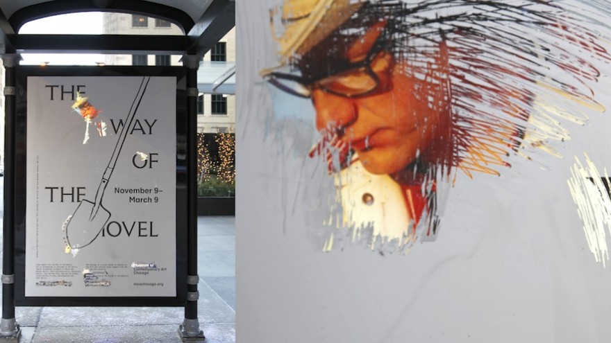
Of the graphic design work included in CHGO DSGN, the MCA’s bus shelters for The Way of the Shovel, designed by Michael Savona and Romain André, exuded the element of surprise. To collaborate with the public in the notion of archeology, the designers created a scratch-off interactive experience on bus shelter advertisements to promote the MCA Chicago’s exhibition, The Way of the Shovel: Art as Archaeology. The ads gave users the opportunity to become archaeologists themselves and archive their own histories through the familiar experience with lottery scratch-off cards. When users scratched off the silver layer, which depicted a shovel they revealed Tony Tasset’s colorful self-portrait as Robert Smithson, as well as an offer for two-for-one admission.
These bus shelter ads are now in the museum’s permanent collection, and we are honored to have one of the four on display in CHGO DSGN.
In terms of object design, the Savage Chair_Black from Jay Sae Jung Oh’s Savage collection continues to not only surprise me, but also expand my perception of home. It’s an obsessive construction that embodies the memory of a family – filled with discarded objects, and then wrapped in jute and black cowhide leather. It makes us look at our furniture through a new lens.
Which of the works would you say testify to real invention?
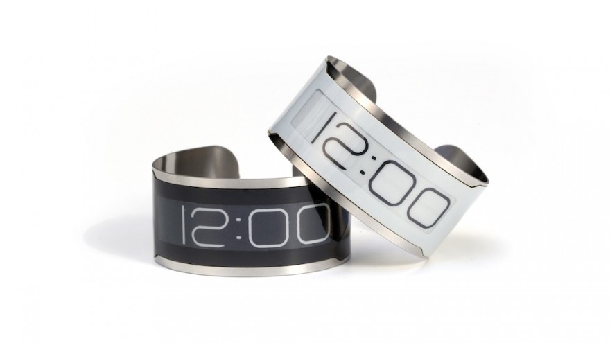
The concept behind the world’s thinnest watch, CST-01 (Central Standard Timing) is making its debut at CHGO DSGN. CST-01 is a perfect example of real invention. Designers Jerry O’Leary and Dave Vondle were inspired when working with e-paper and a special typeface created for another IDEO project. Together they toyed with the idea of creating a wristwatch from these two ingredients. The artists used Kickstarter, the Chicago- based crowd-sourcing investment tool, to raise the funds they needed for production. It succeeded raising over a million dollars while only needing $200 000 to reach their goal.
The Living Book produced by Plural embodies true invention in graphic design. Living Book is a multi-media installation environment created by Plural and The Center For Book Technology. Living Book transforms the gallery space into an automated book production facility. Using custom-software, viewers in the space are captured in real time (every 60 seconds) from an overhead camera and projected onto the wall. Each capture is then printed onto single pages of a book in production. In addition, a keyboard allows viewers to author their own page(s), creating a spontaneous performance environment where a database of individual choices becomes a collective narrative. Plural engaged in this process each day for 25 days, and the result is a 300-page collated book of this real-time experience that not only documents the installation, it reflects on the on-demand printing solutions in our industry today.
And which of the works would you say are the product of serious risk-taking?
Risk-taking in design is prevalent in so much of the work included in CHGO DSGN. Leviathan’s set design for Brazilian musician Amon Tobin and VJ Vello Virkhaus, as it is completely dependent on live, real-time experiences.
Michael Savona’s work for the Graham Foundation was an exercise in risk. The advertising page had no logo, and used a distorted wave of text type concealing the entity being advertised. The approach to design blurred the line between editorial art and advertising.
The T-5 terminal mural created by John Pobojewski of Thirst is another example of risk in graphic design. When the International Terminal 5 of O’Hare was renovated, Thirst was asked by the Westfield Group to design wayfinding. Instead Thirst chose to design a static image with a kinetic emphasis that directed the public movement without the convention of an arrow or typography. The result is a 400+ foot two story glass entry wall and mezzanine mural.
The diversity of objects and graphics that form part of the show is very rich. In bringing all of these items into the same context, did you pick up any interesting connections, trends or common themes that run through some of the designs?
There’s a common sense of respect for Chicago’s storied design past that exudes from all the work. The designers all share a willingness to breathe new life into the familiar genres of design. Whether the designers are producing a chair, a business card, a website, an App, or a table – there’s a nod to the past with a full-on indulgence with the ideas of our time. This is CHGO DSGN.
Do you think the objects and designs collectively reflect a sense of place or provenance, of Chicago?
Chicago has held a long tradition of being a city of building and making design. In the early part of the 20th century, Chicago was America’s epicenter for printing and typography. By 1944 Chicago was also home to the fully functional New Bauhaus. These two early 20th century forces have been reverberating within our local culture ever since along with the fact that in the mid-70s, Chicago was the place where American modernism came to life. These three chapters in Chicago’s design history inspire and inform the work of today consciously or unconsciously.
I believe the work in CHGO DSGN represents a demographic cross section of the many personalities Chicago is home to. Whether you’re a designer, a businessman, an architect, or just an explorer of this city’s offerings – you’ll find something to connect with in CHGO DSGN that turns your perception of what design can be on its side.
What is the value of exhibiting design in this way?
CHGO DSGN presents the work in a unique manner that is something like a carnival and a flea market. Objects and graphics are juxtaposed creating unexpected relationships and mirroring the fact that most of the designers do not really see what others are working on. CHGO DSGN is an opportunity to celebrate and bring the community of design together. The CHGO DSGN talent, invention, and artistry within this exhibition are second to none.
This exhibit, at the Chicago Cultural Center, is free and runs from 31 May to 2 November 2014.

