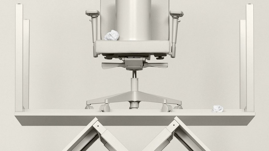
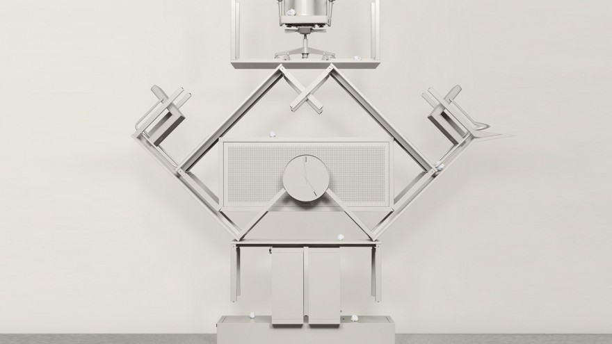
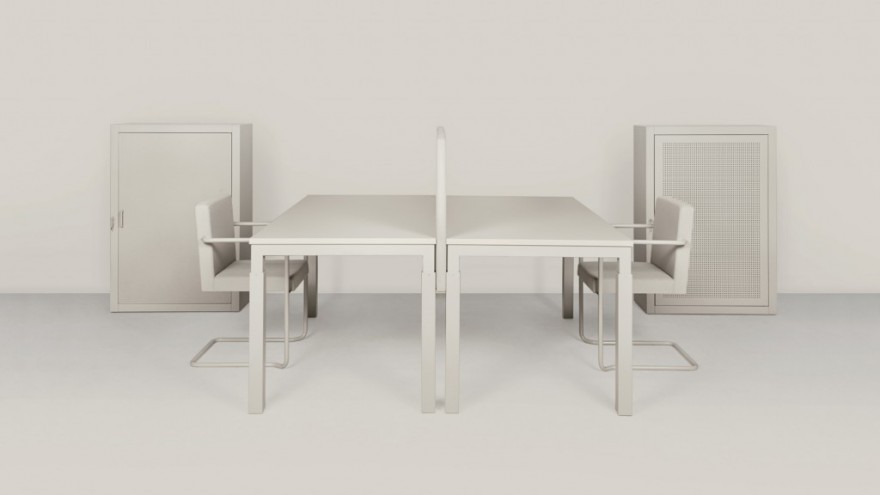
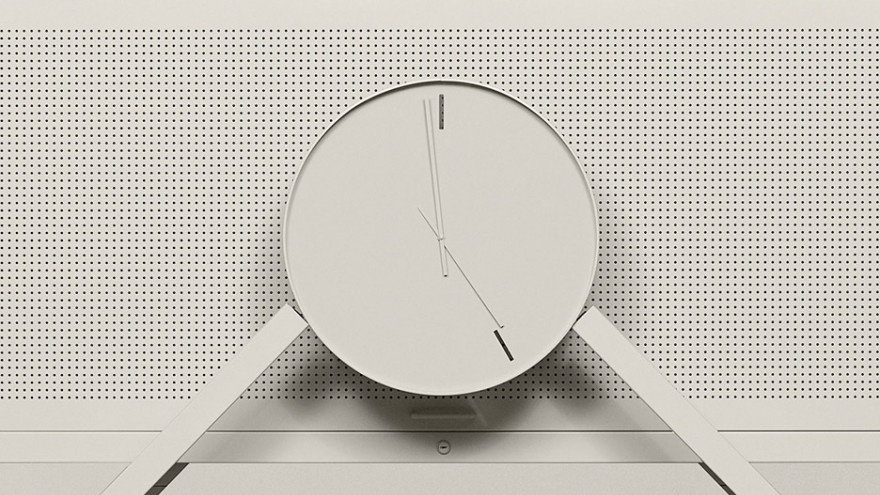
It is the ever-changing atmosphere of modern office life that inspired this collection of furniture. With a view to question the essential function of office equipment, architecture firm Space Encounters (in partnership with Lensvelt) has designed the Boring Collection.
The collaboration between these distinct Dutch design houses was spurred on by the trend of modern and avant-garde office architecture to be, in the view of Space Encounters’ designers, reduced by lowest-common-denominator office furniture.
The designers recognised a tendency of office furniture in workplaces across the globe to detract from artful décor and stylish architectural features. According to them, there are a few reasons as to why some beautifully designed spaces are spoiled by awkward pieces of office equipment.
There are stringent European regulations regarding the design of office furniture. The standards that guide the form and function of modern workplace furniture are hard and fast. This makes it quite difficult for office furniture designers to innovate or create something that is attractive in and of itself while adhering to the mandates. There is not much room for creativity in the design process of office furniture.
Though it is possible to find some furniture design collections that are more appealing than others, the majority of office administrators will choose the most cost-effective set of furniture to keep their budgets low. The result is that some architects go at length to design stylish and bespoke workplaces only to see it peppered with the same cheap, squeaky chairs and rubbery ferns as the next building.
From this aesthetic frustration comes the Boring Collection. The designers at Lensvelt and Space Encounters decided to reject the idea that office furniture should make its own attempt at being eye-catching. The Boring Collection is designed to, instead, recede to the background completely. It is the mission of this collection to satisfy the international decrees of ergonomic office furniture and make as little visual impact as possible – nothing else. Shifting focus away from the visual value of furniture is expressed further in the Boring Collection’s tagline, “Because it’s not about furniture”.
The Boring Collection features no upholstery patterns or “modern” curvature in its designs. The pieces are all manufactured in a single, uniform shade of subdued grey. By removing the aspiration of style from the furniture design completely, the designers have created a collection that has the special ability to fade into the scenery with ease. It has no pretence or frills. By being unconcerned with attention, the furniture gives rise to its surroundings. Any centerpiece of architecture or artwork against the wall would retain its bold quality, unchallenged by the Boring Collection.
Though it was the intention of the designers at Lensvelt and Space Encounters for the collection to express modesty and be visually dim, it can be argued that the overall effect of the Boring Collection is quite pleasant and restful. The success of its utterly supportive nature is dubious – some may view the Boring Collection as fashionably minimalistic, for better or worse.
Dutch artists Lernert & Sander were drafted to create the promotional images for the Boring Collection as well as the short film below.

