Part of the Project
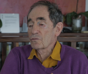
It’s about taking pride in the little things, says former consititutional judge Albie Sachs on why he nominated his business card, a design by Carolyn Parton, for Most Beautiful Object In South Africa.
To anyone who has met this celebrated figure of justice in South Africa, it should come as no surprise that this unassuming piece of graphic design reflects the openness and personal triumph of its namesake. The centrepiece of this simple yet impactful card is Sach’s own handwriting, which he describes as “uncorrected schoolboy handwriting”.
“I’ve spent most of my life on the grand schemes to transform the whole world to make it a better place, and I’m very proud to have been involved with that, but sometimes it’s lovely to concentrate on just a tiny detail that is meaningful in itself and doesn’t have to wait for the whole world to catch up with it,” says Sachs.
On the design itself, Parton describes the inspiration as being directly derived from Sachs as a person – it is the ability to relate to the humanity in every person that he meets that moved Parton to make the design choices behind this black and white card.


