

Yves Béhar has collaborated with Nivea to create a unanimous brand design across all their products.
As Nivea products are sold in 170 different countries, with over five million women using a product every day, the company approached world-renowned industrial designer Yves Béhar with a unique creative challenge.
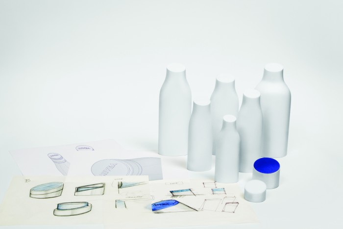
In order to simplify a proliferation of shapes and logos on shelves, Béhar simplified the initial visual language of Nivea to reduce complexity and create uniformity.
Design is important because it adds value to an object’s function, says Béhar.
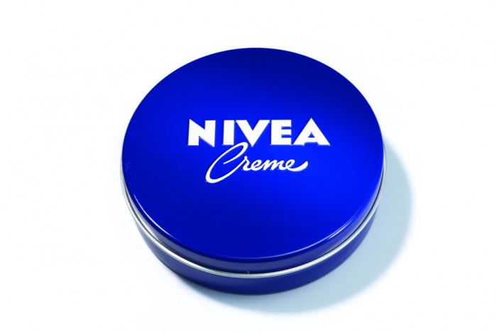
Taking inspiration from the iconic round-shaped blue tin, Béhar opted for a logo reflecting the world-known product’s packaging. By drawing on the blue tin the new design offers a fresh forward-facing look for the brand as well as enforcing Nivea’s history.
Unlike other skin care brands; Nivea isn’t geared to a specific culture, gender or age group. I was particularly drawn to this design project by the vast emotional potential of the Nivea brand and its 100-year heritage, says Béhar.
The overall design of packaging further enhances the circular shape of the product’s logo. Caps and closures are redesigned to reveal symmetry in the silhouette of the bottles and Nivea’s new engaging logo. The new design allows for material reduction and sustainability.
The gradual introduction of the new design language for the entire Nivea skin and body care portfolio will start in more than 200 countries in January 2013.

")