It's a sign

We often take for granted the graphic signs that help us navigate our environments. Here are four excellent examples of wayfinding designs from our archive.

Good signage and wayfinding graphics are invaluable in helping us to orientate ourselves in a new building or city, choose a route and know when you've arrived where you need to be.

Often these systems are designed in a site-specific manner that complements the environment or architecture to create a coherent visual language.

These subtle graphic cues, whether in the form of maps, signs, colour coding or icons, contribute to our overall experience of a place. 

We round up four wayfinding systems that illustrate that . 


You are here

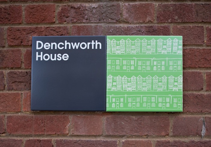
Hat-trick collaborate with local artists to create a striking wayfinding system that represents the diverse population of Stockwell, London. See more here

Turn left here

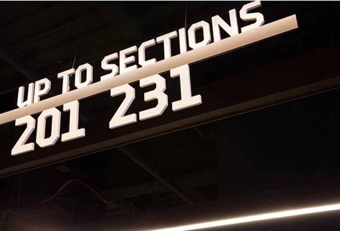
Michael Bierut gives the home of the Brooklyn Nets basketball team a graphic makeover that complements the building’s unusual, weathered-steel framework. Read more here

Walk this way

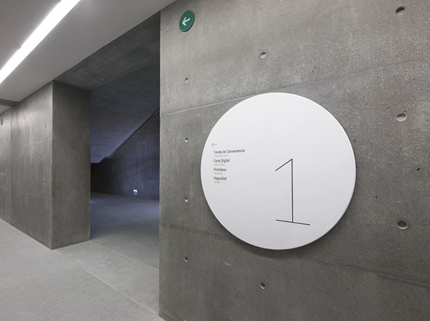
Abbott Miller’s crisp signage for the Centro Roberto Garza Sada arts centre at the University of Monterrey complements the buildings’ raw concrete structure. See it here

Get lost

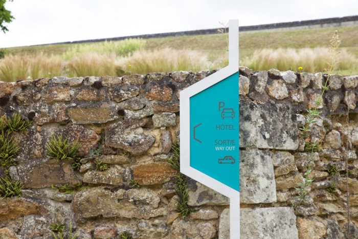
Matali Crasset plays with the idea of getting lost and finding your way again to encourage exploration of the Royal Fontevraud Abbey in France. Read more here

Watch the Trailer with Michael Bierut