From the Series


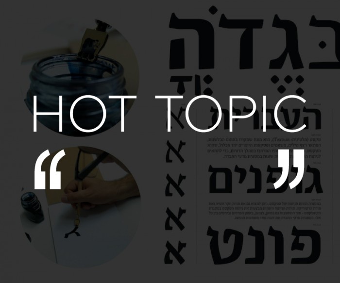
Kerning, leading, point sizes and x-heights – while the scale of crafting typographic work is minute, its impact is enormous. The meticulousness of this particular discipline seems to require a fanatical attention to detail. It's a fastidiousness that applies to most graphic designers, whether they work with type or not. (Think about how easy it is to pick out which desk in the office belongs to the graphic designer...)
We asked four graphic designers if obsession is a job prerequisite.
Erik Spiekermann, typographer, designer and professor at University of the Arts Bremen
Wrong question. Every craft requires attention to detail. Whether you're building a bicycle, an engine, a table, a song, a typeface or a page: “The details are not the details, they make the design,” Charles Eames is quoted as saying.
Concepts don't have to be pixel-perfect, and even the fussiest project starts with a rough sketch. But building something that will be used by other people, be they drivers, riders, readers, listeners, users everywhere, it needs to be built as well as can be.
Unless you are obsessed by what you're doing, you will not be doing it well enough.
Typography appears to require a lot of detail, but so does music, cooking and carpentry, not to mention brain surgery. Sometimes only the experts know the difference, but if you want to be an expert at what you're making, you will only be happy with the result when you've given it everything you have.
I strongly believe that the attention someone gives to what he or she makes is reflected in the end result, whether it is obvious or not.
Inherent quality is part of absolute quality and without it things will appear shoddy. The users may not know why, but they always sense it.
I admit to being obsessive about my work, but I refuse that to be classified as weird and unusual and obsessiveness being limited to certain disciplines.
Christoph Niemann, graphic designer, illustrator and author
Technically I have very little work in my book that really fits the idea of "typographic meticulousness". Most of my type work these days is hand lettering. The end result is supposed to look loose and spontaneous. But like with traditional typography, small changes in brush size and tilt, ink flow etc. may be barely noticeable in a letter, but quite dramatic when you write a word or a whole line.
Oded Ezer, graphic designer and typographer
A typographer deals with the design and structure of letters; the building blocks of printed language. His/her role in society and culture is a serious one that carries with it a tremendous amount of responsibility. It's also a fulfilling path that breathes life into one's creative soul.
Of course, an outsider may see the tendency to work on small details as an obsession. But I don't see my work as obsessive, I see it as a 'serious play' that gives me a peacefulness that is almost meditative, providing both clarity and pleasure simultaneously.
Stefan G Bucher, graphic designer and founder of 344 Design
For me, typography certainly requires an obsessive attention to detail. Typography is shaping text into an illustration. I'm not just saying that about custom lettering or headlines or special effects type. Give ten designers the same text, ask them all to use Univers 55 at a size of 12 points on an 8.5 x 11 inch sheet of paper – hell, tell them all to set the type flush left – and you'll get ten completely different pieces of art.
Just placing a paragraph of type on an otherwise empty page creates a composition. The way you break and space the lines makes a difference, as does the way individual words are kerned. Good typography is as much about making those positive choices as it is about fixing errors – adjusting poor default kerning, for example. As such, the process never gets faster, because with every piece you learn to notice more things you like and more you don't.
I've been setting type for almost 20 years now.
At one point, I had to stop designing books, because I noticed too many things.
The automated flush left provided by InDesign was no longer precise enough for me, for example. I had to go in and adjust the start of each line to create a visually smoother edge for the paragraph. This is madness. Nobody but me would notice this, but having noticed it myself, and – crucially – having defined it as an error, I couldn't absolve myself from the duty of fixing it.
This is a bit of a problem with my design work in general: I see it as my job to fix things. If information comes to me in an ugly state, I take it upon myself to make it beautiful. If something is already beautiful, I don't always understand the need to simply make it different. (Of course, in a marketing sense it is a problem if something has simply ceased to be new, but that gets into a philosophical discussion. Right now, I'm worried how my response to this question will look online, where I can't control the line breaks.)
Good typography is about creating balance and beautiful details. Lines should break in harmony with the rhythm of the writing. They should make a pleasing shape, in the way of a natural coastline. The fun comes in hiding little surprises – a particularly nice alignment with other elements on the page, say, or a colour change for just one word in a dozen pages. It's about creating hidden systems – systems that may not be discovered, but that will be felt. That sort of thing requires love, and love requires time. Sure, you can bash out a piece and be done with it, but why? Slow your breathing and tend to the garden.


