Can you describe your approach to the design/direction of the Black Sails title sequence?
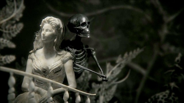
Michelle Dougherty (co-director on this piece) and I met with the show runners Jon Steinberg and Robert Levine to begin the process. They explained this was a show about “working pirates”, not the Pirates of the Caribbean fantasy, but people who were trying to survive on the seas or in the New World any way they could. They were up against the European establishment of the 18th century. So that led us to explore the art of the time – all the statues and paintings that represented the court, the church and civilization. The carved ships and figureheads were also an inspiration. While brainstorming, art director Alan Williams suggested that we use these elaborate, baroque styles to depict this wild society of rebels. We began to think of archetypes that represent themes in the show: the bride-like maiden, the prostitute, the band of outsiders, the statesmen, blind justice. Black Sails is set in an interesting place — the world’s trade converges on the Caribbean; there’s a mix of cultures as the ships and treasures pass through. We wanted to mix in classical references, like sculptures by Bernini and Rodin, but contrast them with the kinds of statues found on graves and crypts. Contemporary artists Pablo Genoves and Kris Kuksi were also influences. Both artists create amazing work that riffs off familiar art history themes. The more we collaged motifs and symbols together, the wider range of things we found we could include to express this unconventional world that had ties to a very traditional one.
White and black, light and dark, life and death – these contrasts seem to be a theme in the title sequence. Can you tell us a little more about this?
Thanks for noticing! Jon Steinberg really responded whenever we showed him compositions that reflected the duality of this world. So, it became part of the design goal to weave in many different pairings for example a classical European musician juxtaposed with a skeleton playing an African drum; or the land vs. the sea, represented by the horse and the octopus. We consciously limited the materials to two; one light like marble or granite, one dark like the bronze Rodin used.
This is an action-packed series. Why the decision to use inanimate objects and camera movement rather than animation or live action?
From the start, we knew that the power of the gestures and emotions would be stronger as frozen moments. I’ve always admired the Halo video game spot that uses inanimate toy soldiers …your mind completes the action. By using camera movement and not animation, you can really capture the drama in a way that feels iconic. The audience doesn’t need to judge it against reality, in that way it can feel bigger than live action. We titled this concept “Allegory” – these are not actions or specific characters in the show, but symbols for what the show will explore.
How does the choice of music guide/influence the mood and execution?
The show’s composer, Bear McCreary composed the music, which we got at the beginning of editing. Music is a huge component – it can make or break a sequence – and this piece especially worked against the sober grandness of the imagery. I especially like it when the score provides tension with the visuals — it’s a richer experience.
You mentioned before that a title sequence needs to transports the viewer from reality into fantasy. How does this sequence achieve this?
A title sequence isn’t about duplicating exactly what’s in the show to follow, but about easing the audience into a world. Black Sails aims to do this by using the highly stylized visuals to introduce the show’s themes. Perhaps you first register the rococo sculptures as a period reference but as the sequence progresses, it becomes stranger, more bizarre. There’s a threat. The rising water also provides a progression, and hopefully, a sense of doom. Hopefully you are drawn into this age of piracy, and want to explore it further.
What makes this unlike anything you've done before?
In the beginning I have to admit we were nervous about the sheer amount of detail and intricacy that would need to be created in CG for this to work as a photorealistic piece. The team of artists we worked with brought a whole new level of modelling, lighting and texturing to the studio. I learned a lot about what’s required to execute something that hopefully passes as shot in-camera.
You’ve changed course since the production of the title sequence. Tell us what you are doing now.
At the beginning of this year I joined McG’s production company, Wonderland Sound and Vision, as its president. We produce TV shows and feature films. I’ve always loved the storytelling aspect of title sequences and commercials, and now I’ll be part of creating the larger stories. It’s a very exciting time to be developing content, as the worlds of TV and film are rapidly changing, with more interesting ways to distribute and experience narratives. Wish me luck as I set sail!
Credits for Black Sails title sequence:
Designed & Produced by: Imaginary Forces (IF)
Directors: Karin Fong & Michelle Dougherty
Art Director: Alan Williams
Lead Producer: Brian Butcher
Producers: Keith Bryant, Jon Hassell
Concept Illustration: Alejandro Lee, Vincent Lucido, Bernard Custodio
Lead Modeler: Meats Meier
Modelers: Jamin Joseph-Lackie, Margaret Dost, Odel Palmer, Aamir Karim, Justin Fields
Lead Lighting & Texturing: Joseph Langmuir
Camera & Previz: Kevin Ferrara
CG Lighting & Texturing: Kevin Ferrara, Steven Hensley, Greg Ruane, Michael Colarik
Editors: Caleb Woods, Gladys Bernadac
Assistant Editor: Michael Radtke
Lead Flame: Rod Basham
Flame: Eric Mason
Assistant Flame: Michael Radtke
Coordinator: Joseph AbouSakher
Production Assistants: Dominick Guglielmo, Alex Frankel, Nicole Zschiesche
Design Interns: Hunter Thompson, Lisa Chen
Client: STARZ
Executive Producer: Jonathan Steinberg
Producer: Jonathan Brytus
Post-Production Supervisor: Brennan Parks
Music Composer:
Bear McCreary


