Part of the Project
From the Series
First Published in
Alexander Gelman: I know at least four designers who have the New York magazine logo in their portfolio. Did you actually redraw it?
Michael Bierut: It's complicated. As designers, our first impulse is always to invent something brand new. Instead of sweeping everything off the table so I can have plenty of room to work, I've become more deliberate as I've gone along. I find that actually helps keep the clients more focused and honest too.
Deliberate meaning "not immediately killing" what came before you?
Yeah, or if they say, "Hi, we need a new logo," instead of saying "Great," I'll say, "Why?" Sometimes I may not even like their logo and I'll say "Your logo is ugly, but that's just my taste. Obviously if you're a successful company, something's working about it." If you can clarify those questions, it immediately helps you separate taste from whatever the process is.
The objectives?
It makes them stay to objectives that aren't just dictated by taste. I think taste is important too, and good and bad are still things we have to navigate between, but I think that in the end, it always helps to have objective criteria to refer to. In the case of New York magazine, for instance, it started as the Sunday magazine of the New York Herald Tribune with Clay Felker as the editor. It was like the New York Times magazine. And then when the Herald Tribune went out of business, Felker and some other people, including Milton Glaser, I think, bought New York magazine to run it as a weekly.
Yeah, that's what I've heard.
The art director of the original Sunday supplement was this guy named Peter Pallazzo. People who are a little older than us all say, "Oh, Peter Pallazzo, he's great, just great." He was just a classic, old school typographer. The Herald Tribune had a wonderful, classic Times of London appearance. Now when Milton [Glaser] took it on, he single-handedly invented the city magazine as a genre. It just didn't exist anywhere in the United States. More or less, between him and Felker, they defined the terms. In those early years, when Clay Felker and Milton and Walter Bernard were designing it, all the graphic genres they established, in terms of the front and back of the book, the way the features were handled: this all became the template upon which every other city magazine was built.
It's the standard, yeah.
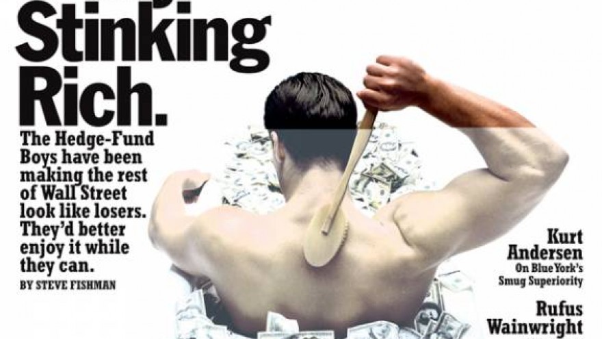
Then I think Murdoch bought it, then Murdoch sold it, then someone else bought it, then something else sold it, art directors came and left, and that format started degenerating slightly, then a little bit more and more. And in the midst of it, it must have been ten years ago, they brought in Kurt Anderson to be the editor. Kurt called me up to pick my brain on where the magazine could go in a design direction, and he said, "Well, what about the logo?" Milton had designed a logo that was based on Bookman Italic Swash, with a couple more swashes. It had never been changed.
Yeah, Bookman was very big at that time.
Try Bookman, if you want to revive something. Times is easy. Give Bookman a shot!
I think Bookman is easy, because Clarendon is very popular, and that's not a big leap. But Times Roman is a pretty beat-up typeface.
Yeah, although I have to admit there are classic paperback book covers that I remember so well. The paperback edition of Brave New World by Aldous Huxley was Times Roman set really tightly and stacked so that "Brave" tucked in above the "New." Ahh, nice. And it was on a white background with grey and black type. The cover of Catcher in the Rye, that's Times Roman too. There was a famous book in the 1970s called The Greening of America, that had a Bookman Italic Swash cover, that was just like - wow.
At any rate, what Milton was doing was updating Peter Pallazzo's logo. Peter Pallazzo's logo was Caslon Italic, with some swash elements. And so I said that I agreed that the logo was looking tired and it needed something. I came back with two alternatives. One was a brand new logo. But the other thing was inspired by something I saw on Kurt's desk. I had never seen a copy of the real Peter Pallazzo Sunday supplement edition of New York, the one that preceded Milton's version of the magazine. And that magazine was sitting on Kurt's desk, and I thought, "That looks really great. It just looks really great."
So what we basically did was we took Peter Pallazzo's logo, and redrew that, digitised it and fine-tuned it. I remember the new issue came out on a Monday. I was walking along with Steff Giessbuhler, and I said, "Look, that's the new logo that I did for New York magazine!" And he looked at it and said, "Uh, why is it a new logo? What did the old logo look like?" Luckily, inside was one of those blow-in subscription cards, and they hadn't changed the logo on it yet. So that had Milton's Bookman Swash logo on it. It was a good before and after. But you know, after two more weeks, even if you could tell what was different, you couldn't tell what was different exactly.
So what does that say about our profession? It's kind of a useless exercise?
Is it really?
So much effort and no one can even tell the difference.
I think there are tons of things. Philosophically, I don't think that the role of all design is to be seen, to scream, "Notice me!" A lot of it does its job beautifully when it just kind of runs under the surface of your consciousness. It was different, I mean it was demonstrably different. And it was different in a meaningful way, particularly in a sort of way that the people at the magazine understood. Sometimes it gets carried to an extreme, like as in redesigning the MoMA logo, which actually just got mocked so much by people.
That's another logo that is in the portfolio of like half-a-dozen people.
Yeah, yeah. Bruce Mau commissioned Matthew Carter to redraw a recut of Franklin Gothic to be the official MoMA version of Franklin Gothic. Then they showed the before and after m-o-m-a, and you can't tell the difference. I mean you can tell the difference between my New York logo and Milton's logo. These two, you cannot.
Then Base took a crack at it right? And Ken Carbone before that. (laughing) It's still a crappy logo. It's still Franklin Gothic.
I think it's beyond good and bad. Do you think you can improve it?
I think I can do something better, yeah.
I don't think I could.
You mean it doesn't need it. That's what you were trying to say.
I mean, it's an example of a piece of graphic design that is no longer defined by whatever formal characteristics it has.
It's not about good or bad, it's just MoMA's logo.
Yeah. It's sort of like the Coca-Cola logo. The associations are so powerful. Coca-Cola went to a big identity firm that will remain nameless...
In the 1970s, right?
No, they went to Lippincott in the 1970s, and did this great piece for them.
(returns with book)
In 1969, Lippincott and Margulies were asked to do an organised corporate identity for Coke. So here they're linking it all to this idea of what the 1970s would be like, so they show the dreamy flower children, and the high-paced husband and wife, and people flying around in SSTs, and people having drugs or something. Beautiful Helvetica. I love it. That metal type Helvetica.
And look at this leading, it's perfect.
They had ways of writing Coca-Cola and then they had this fabulous argyle pattern, and "Drink" and "Enjoy." So that was the past. Here they're about to reveal the new wave. Clear white page. That's fantastic. So they say there are four elements: the word Coke, written in Times; the logo untouched the way it was; the colour red; and the shape of that bottle. And then they just put those pieces together, like that, and then they take that thing and turn it into the Coca-Cola wave.
Oh, so they did that?
Yeah, Lippincott did that in like 1969. And then, just like mathematics - just one two three four - and put them all together to conceive this beautiful thing.
But they cleaned up some elements.
Yeah, they changed the supporting type to Helvetica. Then if you look at these pages, they're all really about red. Then there's this little knock-down to a square logo that I thought was impressive. I've actually done a lot of presentations that have exactly this pace and cadence. At any rate, in the mid-1980s, Coke went to another firm and asked, can you update our logo? It was the time of new Coke, and they wanted to freshen up their logo. So the new firm did this stupid redrawing of it, for no reason at all. I mean, there was no earthly reason to do it that I could tell, it was just because.
Because the client came.
Because the client came, and there was money to be made. So I think sometimes there's meaningless change, sometimes there's change that means something. I favour change that means something. That's a pretty nicely drawn curve, actually.
That was such a difficult thing to make, a curve like this.
Can you imagine? It was probably done on some huge hunk of cardboard.
Designers usually go to art school and get an art education. Therefore there is a struggle between the artistic ego and the designer's mission to be invisible. How do you deal with that personally? You're not just sitting in your office drawing letters. You're speaking, writing, you're involved in all kinds of stuff.
One of the things that I like about graphic design is that it's a social activity, and it's a democratic activity. When I was considering a career in art, whether or not I had any artistic ability to succeed at it aside, one of the things that seemed unpleasant about it was that it appeared to be very hermetic. You had to act kind of like a hermit and just sit alone in a room and examine your soul, and decide, you know, if you were Frank Stella, that you were going to make these curves, if you were Franz Kline, that you were going to slash canvases with big black paint paintbrushes.
Well, those decisions were very pragmatic though.
(laughs) Well, in a way. But I always thought that making things was fun, but that in a way it was cheating to just make it up any way you want.
Oh, it certainly is.
It just seemed more interesting to engage with something, with real content and then figure out what to do. I think that there's a whole range of personality types and motivations among designers. There are some that really do approach it as an artistic activity, and look for clients that can serve as patrons for their work. I've never had enough conviction about my design solutions to do it that way. I need a specific kind of context and problem to get me started, then I can live within that and work on that. I have to admit that I'm open-minded to a fault about design. I like lots and lots and lots of different things. And I know, I've worked for, and I've worked with people who have much stronger opinions about design.
Your acceptance of things, probably even things that you don't particularly like or understand, is it a result of your spending ten years with Massimo Vignelli, whose approach was kind of rigid in regards to graphic design?
Well...
Or was he?
Well, what I like about Massimo is that he stays very engaged with what's happening in design. To me, better you should be looking at new work and getting very angry about it, and saying it stinks, and making a speech saying it stinks, than just retiring to your office and pretending none of it is happening. And Massimo is actually open to the possibility of changing his mind, of talking to the people who are doing that work and finding out what their motivations are, and having inspiration go from side to side across the battlefield, instead of just building a big wall there and calling a truce. I started out as a self-taught graphic designer. I decided that I wanted to become a graphic designer before I had met any graphic designers or gone to graphic design school. I was 15 and in high school.
So, as an alternative to an artistic career, you said, "I want to have a purpose and that's where I can be an artist and have a purpose at the same time"?
Yes. The high school that I went to had a big print shop in the basement. They did the printing for the entire school system. And they had a programme where they had taught some of my classmates to become printers. So I just went down there and said, "If you guys need art for these things, anything you want, I'll do it really fast, and I'll do it for free." So by the time I graduated high school, I think I had like 60 printed pieces. Almost all of them absolute crap.
Seriously crap? Or are you just...
Oh, I'd put them up against the work of any other 15-year-old graphic designer in the world. And a couple of them, well there's at least one that I think is genuinely a good, smart design solution that I would be proud to do today, exactly as I did then.
I'd really love to see those.
I've got them all in the basement somewhere. A lot of them were just illustration-style, I had an R. Crumb period of cartoony illustration.
And you didn't know any designers at that time?
No. But they had two things in the local library in Parma, Ohio, where I grew up. One book that had graphic design in the title, and they had Graphic Design Manual, by Armin Hoffman. And then I decided that I wanted to own it, so I asked my parents to give it to me for Christmas. So they went into a store and said, "Do you have this book, Graphic Design Manual?" My mom probably read it off a piece of paper, and they said, "Yeah, we just got that. It's expensive, though." It was a coffee table book that was Milton Glaser's book. And they gave it to me for Christmas.
Oh, that's a great book.
They're both great. I finally bought a copy of [Armin Hoffman's] Graphic Design Manual, and I have that on my desk, and I have Milton Glaser's Graphic Design on my desk. If you think, the two of them are like this (spreads arms apart). People say that Massimo and someone like David Carson were like that, but I always thought that they were a lot closer than either of them might want to admit. In the way that they thought about design, in the way that they approached work. But there was a basic premise of graphic design that was so different between Armin Hoffman and Milton Glaser. In Armin Hoffman's work it's all about clarity, it's all about reduction, it's all about eliminating ambiguity. Whereas Milton's work, particularly in that book, it's all about excess and addition and everything. And what's interesting, it's not just formal excess.
Sure, he was celebrating form and colour and texture -
And images and references.
It's a very rich book.
But the Armin Hoffman book, there was no page where he would admit anything that was inspired by anything outside of the eternal nature of the stars or something. Whereas Milton Glaser was constantly saying, I was inspired by Giorgio Morandi or, I was inspired by an old engraving, or I was combining the style of this with what I knew about that. I really found the work in both of those books really inspiring, and for different reasons. And I always felt that it was sort of unfair and mean that you had to sort of pick one. Why can't you like both? The thing that's hard, though, which I learned, is to actually do both. That's the thing. Once you start doing your own work, you have to have some point of view that structures the way you approach things.
Well, I don't think you can do both really well, but you can do something in between really well. Whether leaning to one side or another.
I think Michael Vanderbyl says that his mission has been to marry Joseph Muller-Brockmann and Pushpin. And he does it. His work has a simplicity, but also a richness and joy to it. So people do find their own ways based on what is inspiring. But what I've discovered is that if we just keep doing work, you'll do four things that are just sort of whatever. Then you'll do the fifth thing, and for no obvious reason, you just nail it. It's a beautiful, effortless success. So you take all of those successes and add them up, they all basically look like something that comes from the same place, and that place is you. But the danger, of course, is that if you get too cautious about it, just staying in the safety of whatever that place is, shutting down all the other areas, then you end up just being redundant. You end up repeating yourself. You have to keep trying to stretch, trying new things.
So you think it was a good thing for you to be exposed to those polar ideas, in a very early stage, where it started you thinking about things? You've kind of continued questioning. And it's the same question as between being a designer and being an artist.
Design is a lot of different things, even just within graphic design. The design of a perfume bottle versus the design of a train schedule versus the design of a poster for something at midnight on Friday night versus the design of a lost cat sign versus the design of an annual report. There are all forms of graphic design, and they require different kinds of skills. And one designer, of course, can do all of those things. But I do think that the way a perfume bottle communicates is different in some fundamental way than the way in which a train schedule communicates. Who is the audience? What do they want out of the solution? I think part of what makes graphic design so interesting is that we have that range of things that we can engage with. I think that stops it from being boring. You know, being an architect, comparatively, I think would be maddening. Just buildings, buildings, buildings! And that's if you're lucky! Just killing yourself over another building.
Or just paper buildings, paper buildings, paper buildings.
Yeah, yeah.
Architecture is beyond anybody's patience. So you decided you wanted to be a graphic designer, you went to school, and then you obviously learned about other designers, and you came across Vignelli. How did that happen? And how did you get a job there?
Before I even graduated from college, I was in New York on a holiday. I had my portfolio with me. I knew a guy who knew someone who worked for Massimo. And he said, oh if you're going to New York, you should have this guy who works for Vignelli look at your work. Maybe give you some advice. So I called him up, he didn't have time to see me, so I dropped my portfolio off. And when I went to pick it up the next day, the receptionist got my name, and made a call to the back, and Massimo Vignelli himself comes out! He said, "You have a fantastic portfolio. You have to come work here after you graduate." It was a dream. As it turned out, there were a couple of reasons why this happened. For one thing, I did have a pretty good portfolio. But more importantly, I think, I actually included sketches in the portfolio, that without knowing it at the time, were exactly the same kind of sketches that Massimo does. So Massimo must have had this weird, eerie sort of shock of recognition when he saw it.
He told me a while ago, that you reminded him of himself, you know 20 years younger, or, I don't know what the age difference is. And that he immediately thought that he wanted to work with you.
When I think about it now, I think it must have seemed sort of startling to him. I mean, I didn't know what other people's portfolios looked like, I didn't know what his sketches looked like. And I loved all his work. I certainly loved working there.
People accuse Vignelli of being super dry, but for Vignelli, graphic design is just one of the activities he does. He designed amazing chairs, beautiful glasses and tableware...
You put your finger right on it. Massimo is content to develop his repertoire of graphic design things very slowly, the same way an architect develops his or her form of language. It's because he is different from someone who just does graphic design like me: when I get bored, I'll think, "Oh, I've used that typeface three times in a row. I've gotta use another typeface." When Massimo gets bored, he says "I've used that typeface three times in a row, I think I'll make a chair." You know? It must be very liberating. There were two things that I really got from working with him. One, like you just said, Gelman, he had this great way of putting graphic design in perspective. Where, you know, if it was a book design, he wouldn't spend his time coming up with some clever place to put the page numbers or some clever little graphic tricks, the way a lot of book designers, many whom I admire do. I think Massimo would just focus on the bigger experience: the picture selection, the pacing. And he would get the pace exactly right.
And they are beautiful books.
They're beautiful books! With Massimo's books, if you showed me two spreads, I could predict what the rest of the book would look like. They're that consistent and beautiful and clear. And Massimo is never better than, if a publisher comes to his desk, and says, I have this box of pictures, this box of drawings, this manuscript, these diagrams... and Massimo would have that all sorted out for you by lunchtime. And in a beautiful system, which hardly anyone can do anymore.
So what sort of system? A certain rhythm?
He did these guidebooks for the Audubon society, and then that got him a whole range of guidebooks for American antiques, pets, flowers, a whole series of beautiful little books. And those things are just staggering. They each have beautiful typography that organises everything absolutely consistently. He sets up some rules that are never broken, and yet you never feel the constraint of the rules. He could do it with any subject. I remember some neurosurgeon had done this atlas of the brain, you know, how things move from one part of the brain to the next. And Massimo did this incredible book. I was flabbergasted. Another designer, Tony Russel, had a friend who collected Hummel figurines, you know what those are? They were these little, kitschy, like kitschy beyond kitsch, cute little statues, originally designed by German nuns. Little apple-faced kids holding umbrellas, or little fluffy dogs: absolutely disgusting! Tony Russell said, "I'm not sure I can deal with these things, they make me want to vomit." And the guy came around to Massimo, who took it on as the ultimate challenge. Wait, I think it's in his monograph…
(returns with book)
Oh yeah, here's the brain thing. This is gorgeous. There is the atlas of the brain I was talking about. It's just beautiful. And then these are those guidebooks. That's the guide to flowers, guide to toys, cats and dogs.
Oh, these are brilliant. Those rules, with the text kind of attached to them...
It's just enough, you know. Oh here they are! It was these little fuckers. (laughs) But listen to what he says in the caption: (reads) "The Hummel book is a favourite example of how to turn kitsch into art. The idea was to photograph the little figurines from the ground as if they were real people. A graduated light background enhanced the illusion. A documentary section follows, describing the making of the figurines. That section gives dignity to the whole operation, by showing the skills of the artist and the craftsman. The book is at once a celebration of that art, and a sublimation of it."
Isn't that great? I gave a copy of it to my mom, actually, because she likes those things! Now I kind of wish I had one, actually. I wish I had it. It's really a collector's item. So Massimo had this great ability to operate almost independent of the subject matter. Whereas I think there are a lot of designers I know, who can't work enthusiastically unless they feel truly sympathetic to the subject.
Do you think design was a sort of craft, craft of putting type and images on paper, and it's never included consideration of the subject matter?
No, I don't think so. I think there are plenty of designers from the 1950s and, 60s like Alvin Lustig, Lester Beall, the Eameses, Erik Nietsche, that were really engaged in visual storytelling of the subject matter. I'd say, above and beyond just resolving it formally and properly. To me, I mean, if you put Armin Hoffman on one end of the scale, or Massimo, and Milton Glaser at the other end, or someone else... Milton, it seems to me, is a designer who actually loves mess and variety. He loves to design a magazine because it has so many different moving parts. If Massimo was designing a magazine, he would say, "Okay, what do I have to do to turn this thing into a book?" A book that looks organised and elegant. Whereas Milton goes the other way. And Milton could design a grocery store really beautifully, because he understands that it has to look messy to look convincing. Otherwise it doesn't look like a real grocery store, it looks like a pharmacy. Whereas other designers would just be repulsed by the mess, or would try to design it into submission.
It's funny, Milton once told me a story of when he was young and travelling through Europe, he went to Switzerland and visited some of the designers. Don't remember exactly, I think Jan Tschichold was one of them. He saw the office with all the books lined up, and all the pencils perfectly sharpened and organised, and he said, "Wow, one day I'll have an office like this." And he never managed to. I guess he had a real appreciation for that, but it wasn't matching his personality.
Yeah. And I know a couple of designers who are our age, who you can tell have this idea in their head about what kind of designer they want to be. And you go to their offices, and you see that they've created this stage set for them to work in. To me, it's never as convincing as someone who is more confident in who they are, and their environment just sort of expresses that naturally.
Cultivating that attitude of, "I'm a designer. I have to be dressed like a designer, I have to have a designer pencil and paper, and…"
Well, the other thing about design, which is complicated, and that can't really be taught in school, is that any of the design arts, whether it's graphic design or industrial design or architecture, is that usually you have clients, and someone has to enable you to do your work. You don't just go off and do it independently. So that means that you have to be able to somehow convince them to first let you do it, and then persuade them that the way you want to do it is the way they should do it. It can be hard once the clients start asking these complicated questions.
Yeah, I remember you called me once asking if Russians understand the ampersand. (laughing)
(laughing) That was definitely one of those times! And you know what? I called Maxim Zukov, and oh man. You guys both gave me advice, but he sort of gave me incredibly comprehensive advice.
Well, he's a total type nut.
He sure is. He was sending me transcripts of the proceedings of the 20th Typographic Congress in the Czech Republic, something like that. Perfect.
Oh yeah, don't get him started.
Now, that client was like one of these big organisations where I had been asked to do a simple job. We had some different ideas, and we said we liked that one the best, and they should have just said, thanks, we'll do it… Instead, because these big organisations have these different offices around the world, they send the work around and say, "Here's a new logo, before we approve it, please comment on it." Well, of course they'd like to comment on it! So, the logo had an ampersand in it. Someone from one of their European offices asks: "Do they have ampersands in Russia?" So they write down: good question - no ampersands in Russia? And before you know it, we're getting all these e-mails about ampersands. It's just a factor of all these different people kind of piling on and second-guessing things. As a designer, it's almost impossibly hard work to steer a good design safely into port. And sometimes, no matter how hard you try, it doesn't turn out as good as you want, and you have to settle for something less. But other times, if I don't seem to be getting to the solution, I'll just stick to it until I can make it work. What's odd about clients is that sometimes this back and forth process actually does make the work better. They push you to somewhere that's actually superior to where you started.
Very rarely.
No, I've actually found it a few times. It's happened enough that I've become very careful when clients come back with ideas that seem stupid. And, of course, one of the problems is that they're always trying to be helpful, but they usually just have some kind of problem, and simply can't express what it is.
And that's your role, to figure out their problem?
The difficult thing is that, in the end, there always comes a point when they have to simply make a leap of faith. You can't prove to them that red is the right colour, or that this certain kind of curve is any better than any other kind of curve.
But you see, sometimes they become fed up with all these myths about design. Stuff that everyone blindly believes in and never questions. That serif typefaces are more readable, that black on white is more readable than white on black, although on the screen it's actually the opposite. And you're doing a website, and they say, "No, no, we need to have a white background because it will read better" without really looking at it and asking themselves, "Can I read this? Does it work better or not?"
One of the reasons that Business Week magazine loves writing about product design is because of all the design disciplines, that's the most quantifiable one. If you design a toothbrush, you can say that 98% of the people who used it said it felt better, then the dentist actually looks in their mouth and says they actually got out the stuff, you know? You can't do that with a colour or a curve. Graphic design's function is so simple. As long as you can make out the picture and read the words, it's functioning. So everything else is up for grabs. Whether it's serif or sans-serif, whether it is big or small, on a red background or a green background. So people have just made up those myths just to sort of simplify their decision-making process.
And designers have invented a lot of it just to get their way.
To manipulate their clients? Maybe. I think these myths suppress innovation on one hand, and inspire capriciousness on the other hand.
I think it really clutters our profession. It makes things unnecessarily difficult.
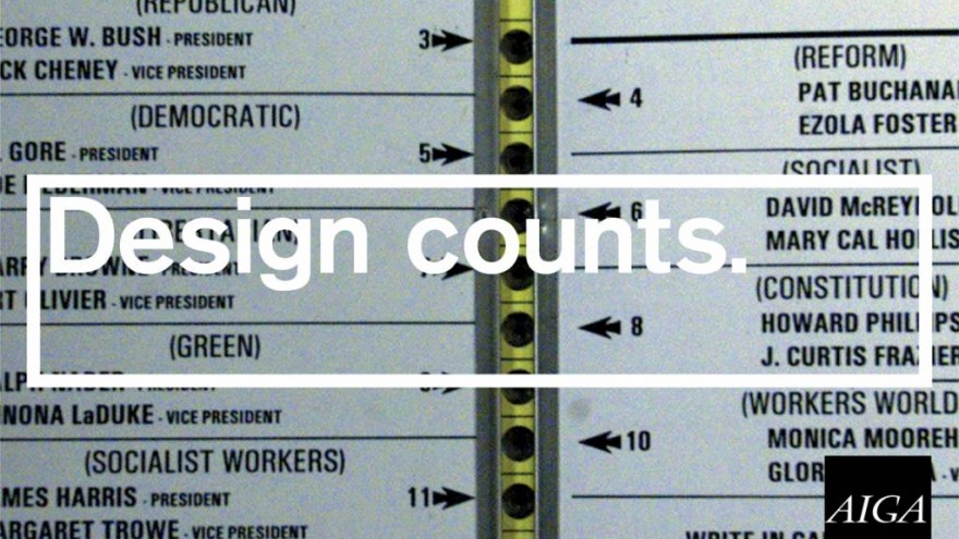
I think so too. When I was president of the AIGA, I was always hearing about how we should go out and educate our clients more to make them into better clients. And I always thought that clients weren't the problem. The problem is that designers are their own worst enemies. They're not as smart as they should be, they don't listen as carefully as they should, they don't think enough about the consequences of their decisions. It's too tempting for us to just live in a world that's just you, the mouse, the screen, and the thing coming out of the printer.
And they're too quick also to give up their positions.
And they don't do what it takes to earn that position. What designers want is some sort of bomb to drop on the world that will let out this gas that will make everyone think, "Oh, from now on, let's give designers the respect they deserve." But there is no such bomb, and that day is never going to come. That makes it the responsibility of each designer to make the best case they can for their work, for their profession, for the value of what we do. If you want to be valued, you really have to be able to demonstrate that you provide something of value. That's what designers should be doing today.

