Part of the Project


Enjin: Why publish the magazine?
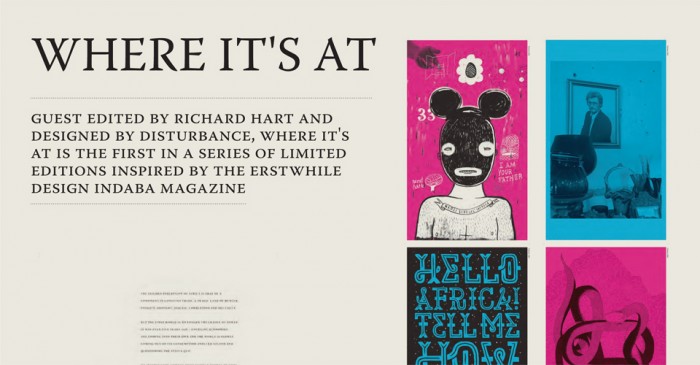
Richard Hart: Well, firstly the intention was for it to be something more than a magazine...not quite a book but not quite a mag either (Ravi [Naidoo, founder of Interactive Africa, the organisers of Design Indaba] calls it a mook. I'm partial to boogazine!) so it is immediate, it's about the moment and therefore has the periodical nature of a mag – while perhaps being bookish in its presentation and its ambition. Secondly, I think it's important because it makes a very earnest (though subjective and highly debatable) attempt at documenting the state of design in SA right now.
E: How did you decide who to feature? How did you decide on the content and design?
RH: That's where the subjective bit comes in...I covered friends, people who interest me. I wanted something deeper than the usual glossy design mag shtick where smoke is ceremoniously blown up the arses of all the usual suspects. So I was pretty blatant in finding some angles and stories that interested me personally and that hopefully gave a refreshingly skewed take on things...Although representative too, I hope.
E: How do you see the role of SA design in a global context? Can a publication like this help get the word out?
RH: The publishers [Design Indaba] imagine South Africa as becoming a world design hub. Being to creativity what India is to call centers. I'm a bit more circumspect. But what I'm hugely encouraged by in the last few years is our collective sense of self-worth and self-confidence. It seems we are increasingly happy with ourselves as an audience – and I think ultimately that becomes quite sexy to the rest of the world. Which I think is a healthy place to be.
E: How long did the project take?
RH: Two very long months.
E: Tell us more about the printing.
RH: The dust jacket is a huge, full colour die cut-map of Africa that folds down. Very lavish. By contrast the inside is all printed in two colours – black and a spot grey. I wanted it to go against the grain of conventional design publishing which is slick and glossy. The paper was intended to be a cheap and cheerful 'cartridge' type stock – but it actually turned out to be pretty pricey and, eventually, a compromise had to be made. We finally printed it on coated paper which, ironically, printed way nicer than the cartridge paper would have.
To order a copy of Where It's At, drop a mail to hello@designindaba.com.
Originally published in Enjin 56 2012


