Watch the Trailer
-
Watch a short trailer to get a taste of this conference talk.
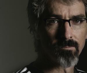
Graphic designer Richard Hart spoke at Design Indaba Conference 2011 giving a broad overview of his work and examples of design creating ecstatic truth and creative alchemy.
Starting his presentation with a motion-picture animation of his life so far, Hart characterises his early childhood by a love of animals and knives.
At the age of six, Hart designed his first logo for a nature club he started and thereafter his love for graphic design started.
After graduating with a graphic design diploma, Hart got a bursary to study abroad. After his abroad studies, he returned to South Africa “full of vim, vigour and vegetarianism”, he says. He then began his first studio with his sister and named it disturbance, with a small d: “This name was very punk-rock we thought,” he says.
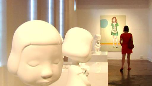
Hart’s presentation starts off with a selection of works done by artists around the world. The examples given reveal that simple and useless design can be very beautiful and poetic.
I believe that the moment of creative perfection is when design becomes about finding pieces and putting them together – Richard Hart
For Hart, examples of this creative process can be found in designs such as creating a mirrored floor by filling a container with car oil, a record player, a red wax structure, floating cubes and replicas of iconic cameras.
Often objects are useless and pointless but beautiful and poetic, says Hart.
The second part of Hart’s presentation focuses on examples of his work when he believes he found that magic moment.
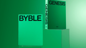
Hart created a poster collection book where he invited 20 African designers and 20 European designers to collaborate on posters around a certain theme. The main concept of the book is centred round the notion of tolerance and people coming together. African posters were designed in green and red while European posters were done in blue and yellow. When the book is opened all four colours overlap to symbolise the idea of people coming together. Hart’s poster used a year’s worth of Sunday Times headlines. Each headline was grouped into a category and the category assigned a graphic illustration.
Another project titled Along the Way sprouted from an urban art project where a route was mapped out and a publication created where people along the route’s lives were documented. Hart interviewed 10 people and assigned each a colour. The age of each participant was revealed on the cover of the publication through stripes of colour proportioned to the age of each participant.
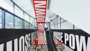
I’m very interested in words, letters, typography and language. It’s a thread that runs through all my work, says Hart.
Watch the Interview with Richard Hart
