Tony Brook is a London-based graphic designer and publisher whose work is informed by years of designing vinyl record sleeves as a young creative. Now, he leads Spin Studio, a multidisciplinary design practice that focuses on creating contemporary identity designs for international clients.
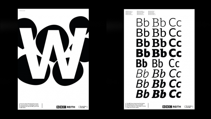
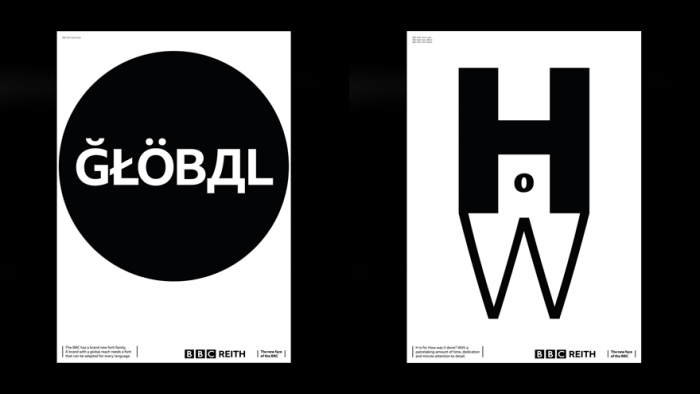
Spin Studio was recently commissioned to create a design campaign around the release of a brand new typeface for the BBC. The typeface was named after the organisation's founder John Reith, before Spin Studio was tasked to articulate the new style and advantages of BBC Reith in campaign posters.
"For our part, we worked in collaboration with BBC Creative, the in-house team, to make a campaign which introduces the new face to the organisation in a memorable, entertaining, informative way. The campaign articulates the many advantages of BBC Reith, including increased legibility on and off-screen, a distinctive personality, greater creative possibilities, versatility in its variety of weights and styles, and huge cost savings," says Brook, a Design Indaba 2018 speaker.
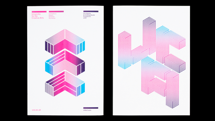
Brook's career and creative vision is rooted in the adaptation and evolution of typography. Since starting his own business in 1992, Brook has overseen the publication of a number of monographs that explore the expressive nature of letterforms. Colour, shape, size and configuration are the ingredients with which he builds font-based layouts.
While Brook has a love for the craft of printed design, he is also enthusiastic about changing the graphic design community and closing the gap between artist and audience. In 2009, in partnership with designer Adrian Shaughnessy, Brook founded Unit Editions to publish books ‘by designers for designers’.
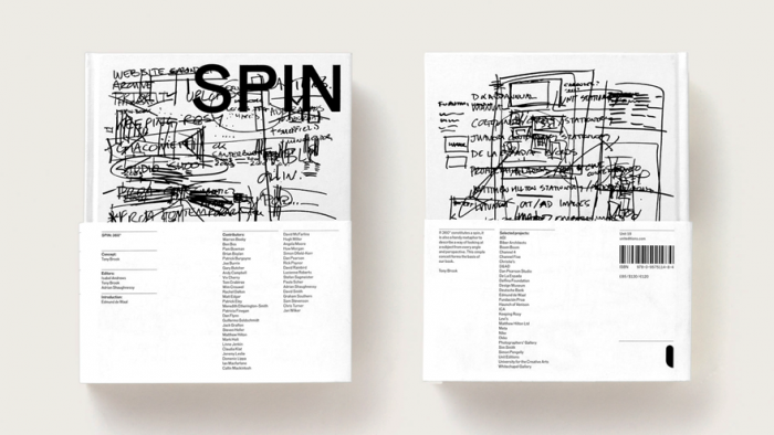
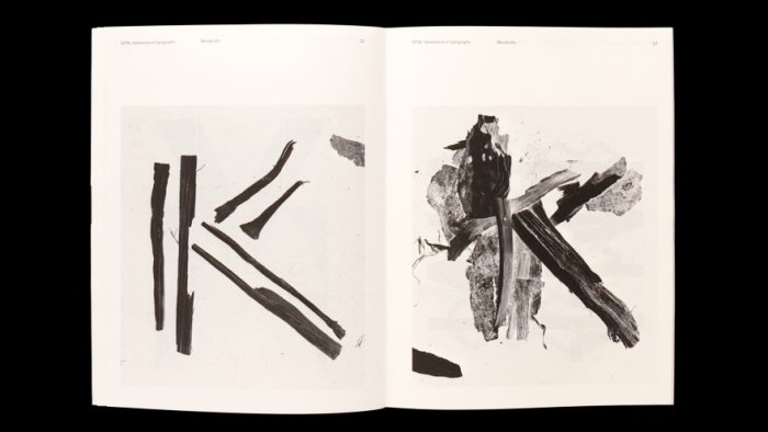
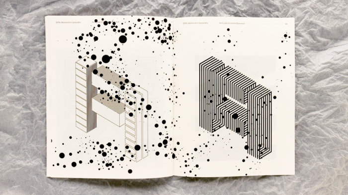
Following this, Spin Studio published Spin: 360 in 2015. It is an influential tome that showcases the company’s exploits in print, motion graphics and digital design through the years. This resulted in a follow-up monograph called Spin: Adventures in Typography, which explores the more playfully irreverent side of the font world in contrast to the rigidly controlled and commercial side of it.
“In a way, it’s a love letter to typography,” said Brook of the book. “We’ve always had a reverence for all aspects of type and wanted to make something that gave us the opportunity for experimentation in the form of playful expressions.”
Spin: Adventures in Typography records the studio’s creative output through a wide-ranging series of monochrome experiments and compositions. Using subtle tools of visual communication and dissecting the quality of letterforms we take for granted every day, Brook and his colleagues map out the vast spectrum that is the printed word. It is their aim to prove that typography can be every bit as complex and elementary as the person who commits it to paper or pixels.
“Essentially typography has two extremes, the rigorous, refined and legible, and the irreverent, expressive and barely legible (if at all).”


