As possibly the best known event across the globe, the Olympics is a brand that is as – if not more – recognisable as giants like Coca-Cola, Google and Apple. Interestingly, however, the Olympics has never had one brand identity, relying instead on the well-known logo and individual designs for each game. After 125 years, the International Olympic Committee (IOC) decided to bring the legacy of the games into the modern world with a comprehensive visual identity.
The Head of Brand Management at the IOC, May Guerraoui, explained that the decision to design a singular brand identity arose after the team recognised how the games had become increasingly more universal, progressive, diverse and flexible, yet did not have an identity to match. As a result, a new visual identity was created to be applicable and easily transferable to various mediums and channels in the world.
“For 125 years the Olympic Games have conveyed a message of inclusivity, universality and hope,” explains the Brand Management Director at the IOC Marie Sallois. “It was time to bring together these timeless values in a comprehensive Olympic brand identity that's present not only during the Games, but also from flame to flame.”
The IOC collaborated with Canadian agency Hulse & Durrell and a team of three international artists, Francesco Ciccolella, Abbey Lossing, and Karan Singh, to create a comprehensive design system that is as vibrant, colourful and exciting as the games themselves (with almost as many rules!).
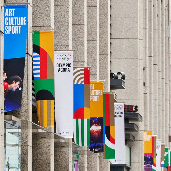
The modern Olympics are synonymous with the logo of five rings – blue, black, red, yellow and green – which was designed by Pierre de Coubertin in 1913. The new design system expands on the existing logo to include custom-made typefaces, a series of graphics and illustrations and a set of guidelines for using the identity. While the logo and its colours remain unchanged, the colour palette has been expanded to include additional darker and lighter shades of the original colours, as well as gold, silver and bronze hues to represent the three medals.
The full brand rollout is expected to be completed in time for the Paris 2024 Olympic Games, and the updated brand identity will be used across all mediums, including on banners, press releases and social media platforms. In the future, the IOC is expected to release new brand elements as well as a set of Olympic pictograms that provide a language-neutral, gender-neutral icon system for the brand.
Read more:
A Gold Medal for design at the Tokyo Olympics.
Credits: International Olympic Committee