Paula Scher has relooked and redesigned her graphic identity for Jazz at Lincoln Centre.
Ten years since the Pentagram partner first designed the graphic identity for one of the US’s top Jazz centres, she has revised her original work, making it simpler in order to be more contemporary and up-to-date.
The original identity accompanied Jazz at Lincoln Centre’s 2004 move into its home at the Time Warner Centre. Now that Jazz is recognised as a major cultural institution in its own right, the updated graphic removes the “at Lincoln Centre” part of the name and instead refers to the organisation as exactly what it is: Jazz.
We had hoped that the organisation would eventually ‘own’ Jazz and that any other explanation of the place would become unnecessary. The new identity formalises this arrangement, which was the original intent, says Scher
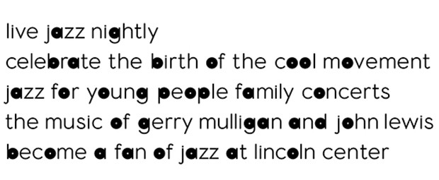
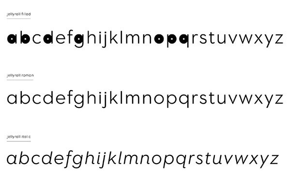
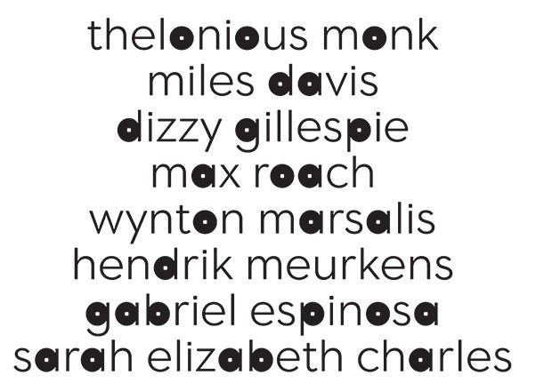
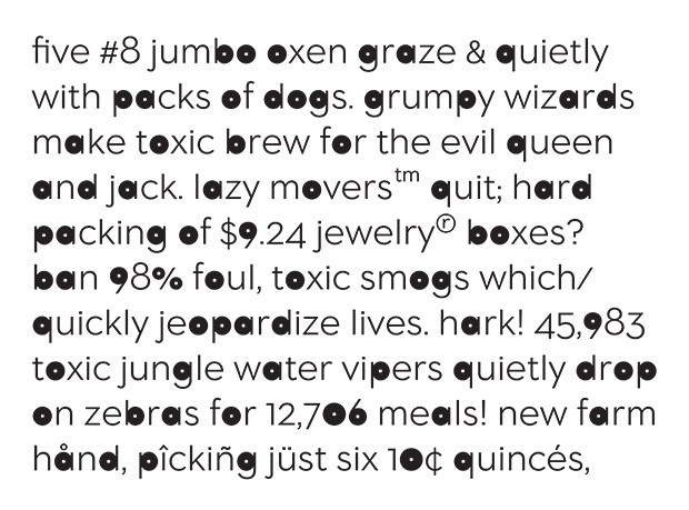
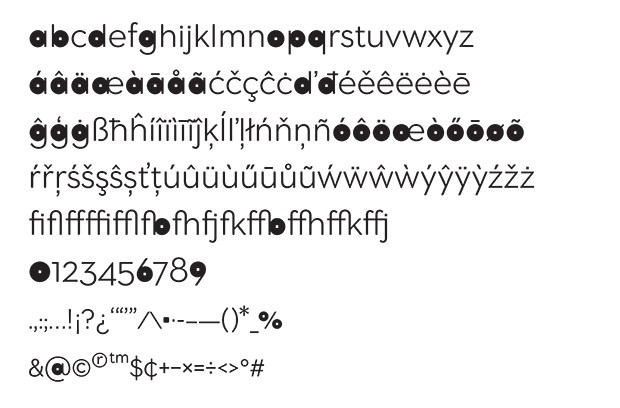
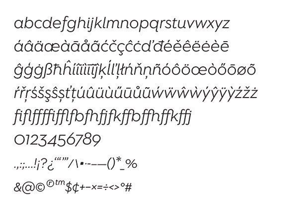
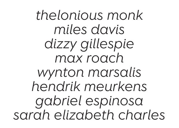
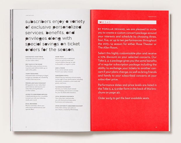
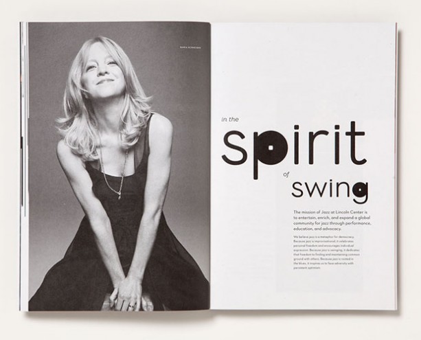
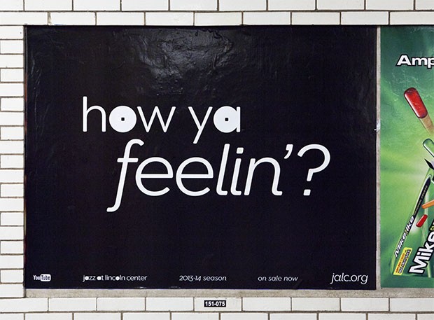
For the new identity, Scher and her designers redrew the existing logo using Neutraface, rounded the square dot in the “a” and made the letterforms slightly heavier. This was extended to create an entire digitised alphabet where the circular forms of the rounded letters are filled in.
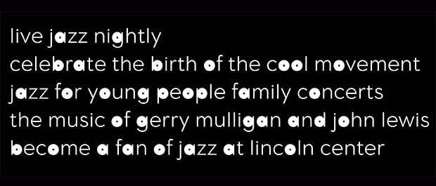
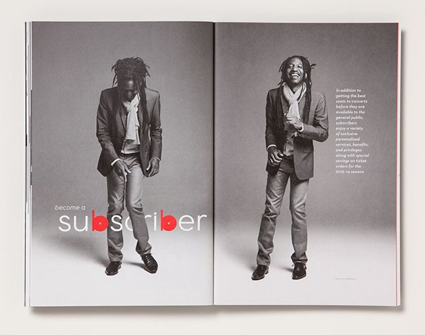
In applications of the identity, the distinctive circular forms of the typography playfully punctuate the graphics like musical notes, creating a kind of visual rhythm that is unmistakably Jazz. The circles can be used in many different ways to become the basis of a flexible graphic system for the institution.
The unique typography appears in Jazz promotions and on the website, and will eventually be applied to environmental graphics at the theatre.


