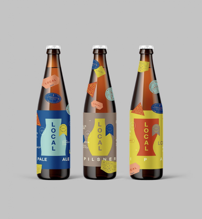
Designer and illustrator Daniel Ting Chong, a Design Indaba Emerging Creative in 2008, doesn’t normally apply his talent in the service of alcohol brands, largely because he’s genetically intolerant to alcohol, like many Asian people. But he was drawn to community-focused Local Brewery & Co., which approached him in 2019 to come up with a visual identity for Local Lager, their affordable casual lager.
The business uses environmentally friendly production procedures, recyclable packaging and locally sourced materials – and “there’s a good backbone to their story, with beer the vehicle that supports a good cause”, Ting Chong reveals.
“I love working with start-ups in South Africa – it’s a privileged space for a designer,” he tells Design Indaba. “Even though I don’t drink beer myself, it was exciting to get behind the owners’ dreams as they’re really nice people.” The owners, Euan Johnstone and Lee Geldenhuys, take a scientific approach to brewing (Euan has a master’s in biochemistry), and they sell small-batch rotating beers at their taproom, even taking requests.
They asked Ting Chong to approach their brand from a unique perspective. “There’s something very masculine about beer brands, which comes across in their choice of colour and typefaces,” Ting Chong says. “We wanted to depart from stereotypes and explore interesting angles – for example, making beer is very scientific, like baking, and Euan and Lee can help you brew, bottle and label your own beer from start to finish. They wanted the brand to be inclusive, unique and playful.”
Each beer flavour comes in a differently shaped bottle, which put Ting Chong in mind of different beer glasses in different countries. “I brought the idea of travel into the design – each bottle has a label consisting of small stickers that represent passport stamps – a way of internationalising the local story,” he explains. “Beer drinkers like to peel the labels off their bottles, so in this case, they can peel off the stickers. The experience is interactive and makes each bottle shape on the packaging unique– and there’s an element of the handmade about each bottle as the stickers aren’t applied by machine.”
Ting Chong chose an earthy palette to invoke Africa without being too obvious about it. “The red orange is inspired by the sand you see in the Karoo, and the oxidation of metal in the mountains,” he explains. The type on the wraparound labels on each bottle sits on a grid, so no matter the angle at which you hold or rotate your bottle, there is a visual window of interest to whomever is looking at it. “It’s not like looking at a left and a right page,” Ting Chong explains.
The in-demand designer typically presents just one concept to a client. “Other people practice a three-direction approach, but I think this bottlenecks the process,” he explains. “I spend a lot of time with a client beforehand, asking a lot of questions, so I get a good sense of exactly what they’re after.”
He admits that his design was not an immediate hit. “Euan and Lee were initially uncomfortable with what I presented, but they sat with it for a week, and when they came back to me, they didn’t change anything, except for the bottle shapes on the labels,” he reveals. The pandemic alcohol bans meant the product launch was stalled, but the team had time to brand the taproom and co-working space at the company’s Woodstock premises, with which Ting Chong was also involved. He contributed some illustrations to the space, and also helped to make the signage. “The blue lightbox had to be reinforced – we bolted it to the wall because of the strength of the wind in the area,” he says.
Ting Chong, who worked for Peet Pienaar at The President for a year and a half before it closed down, works largely for South African brands, with 30% of his work devoted to international companies. “My most fulfilling work is with start-ups and small and medium-sized businesses,” he explains. “I like watching people’s businesses grow, and growing with them.”
Read more:
Generative design creates new ways to form a brand’s identity.
Brand new for beer.
Time flies.
Credit: Supplied


