


The year 2011 marks the 125th time that the prestigious Wimbledon tennis championships take place. And the All England Lawn Tennis & Croquet Club, or simply Wimbledon, thought it time to give this quintessentially British establishment a brand identity overhaul.
Hat-trick Design were chosen to serve up the makeover, which focussed on aligning and re-energising the club’s identity in print and digital communications. Both Wimbledon and Hat-trick felt that there was a visible disconnect between the “state-of-the-art venue and hallowed status of the brand and the communication produced on its behalf”.
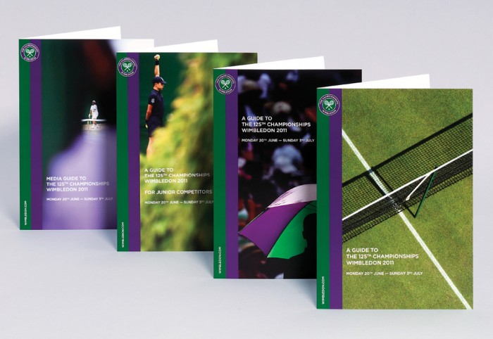
Hat-trick’s creative process included tidying up the logo to make it more legible and less dated. The club’s distinctive green and purple colourways were a retained though Hat-trick introduced a double stripe device featuring the colours for Wimbledon’s website and print communications.
As an institution steeped in heritage, Hat-trick were keen to convey the passion and mystique of this attribute. Before the Hat-trick revamp, the website did not feature any grass, a major selling point of the tournament since it is the only Grand Slam tournament still played on that sort of grass.
In addition to the website, Hat-trick also created some 400 pieces of literature for Wimbledon and extensive brand guidelines for corporate, retail, digital, broadcast and third-party use.


