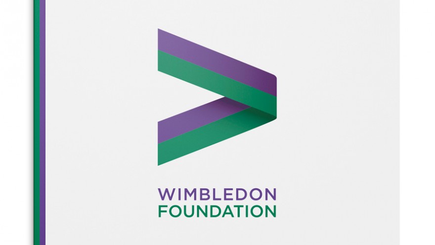
Hat-trick have designed a new identity for the Wimbledon Foundation, a newly-established body that brings together all the community and charity work that the tennis organisation does.
While the Wimbledon Foundation has its own distinct personality, the visual language also had to tie in to that of Wimbledon and the Championships, the design of which Hat-trick have also been involved in over the past three years.
Positioning the Foundation as a force for good was the key message the visual strategy had to communicate, explains Gareth Howat of Hat-trick. “For our concept we used two distinctive colours in ribbon-like form, based on a ‘greater-than’ mathematical symbol to create a simple but strong mark.”
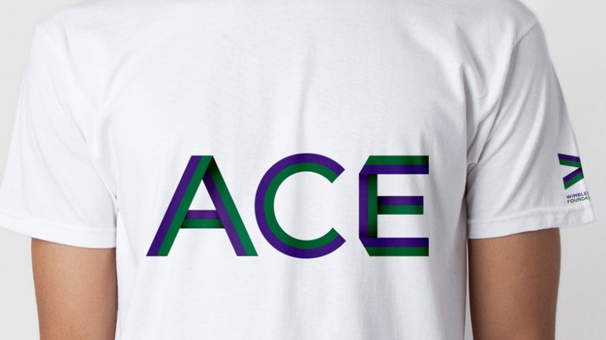
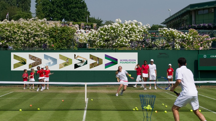
Simple in form, the mark can easily be applied to a variety of channels, including online, print collateral and even uniforms.
Also take a look at Hat-trick's other work for Wimbledon here and here.

