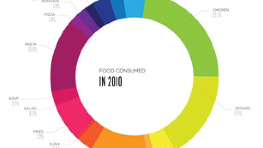
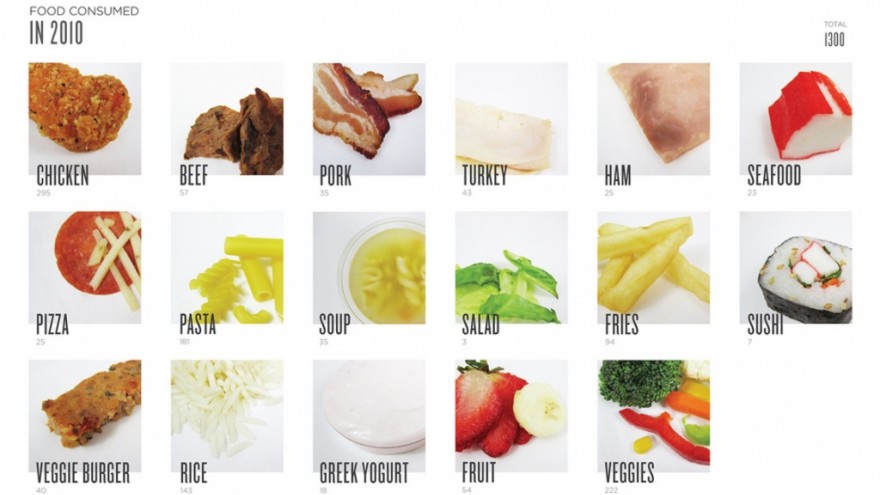
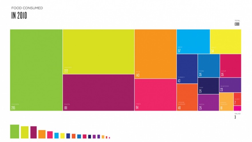
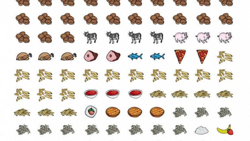
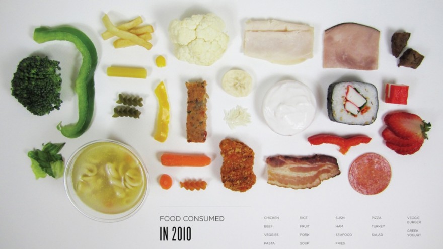
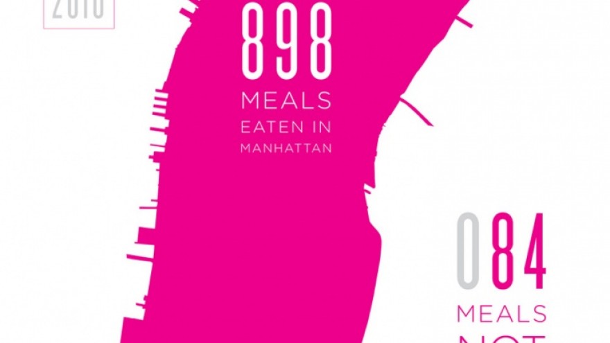
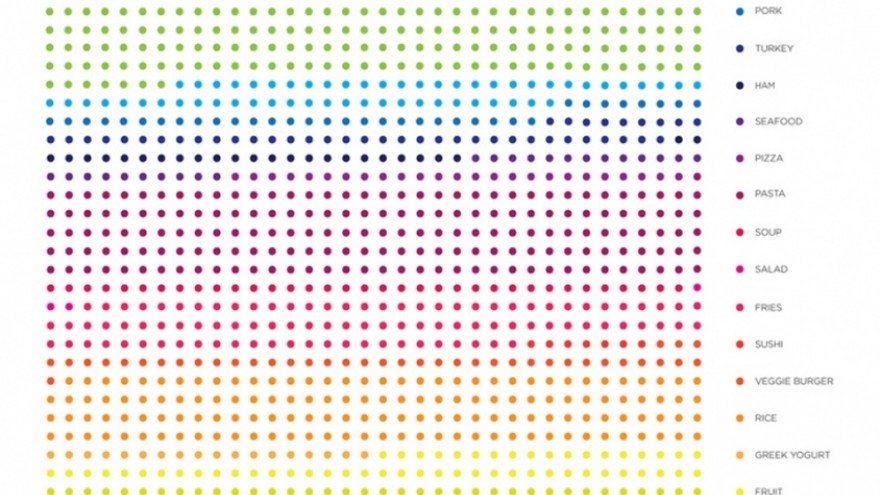
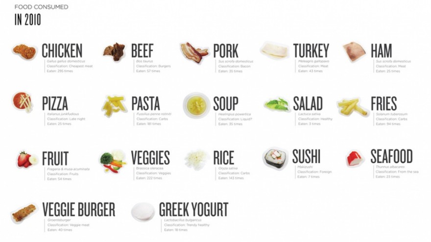
Graphic designer Lauren Manning documented what she ate, and all its information, for two years.
The result of her impressive data collection is 40 different visualisations of her consumption.
She explains her motivation as being an exploration into the effectiveness of different types of infographics. “Exploring various methods, techniques, styles, degrees of complexity, degrees of additional context and many other elements, a true ‘apples to apples’ comparison has emerged,” she says.

