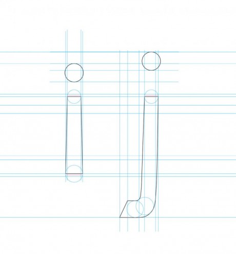
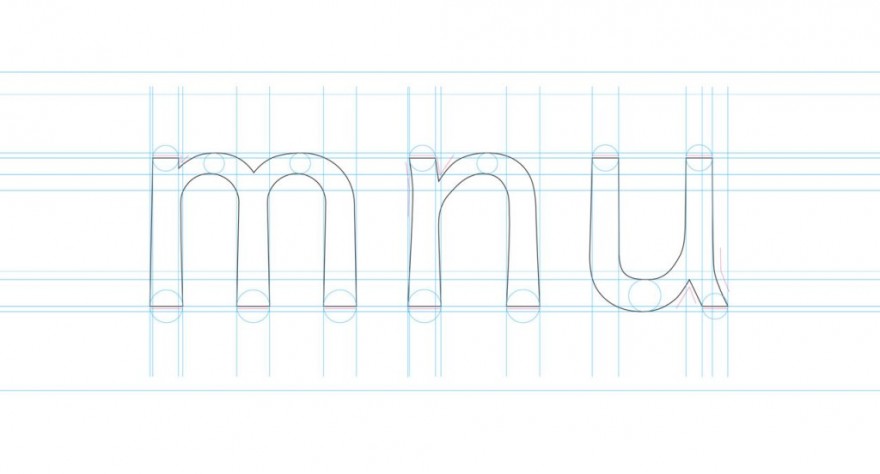
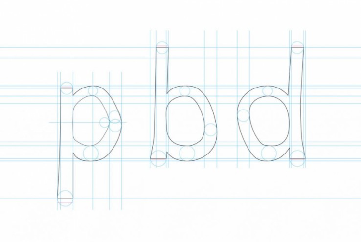
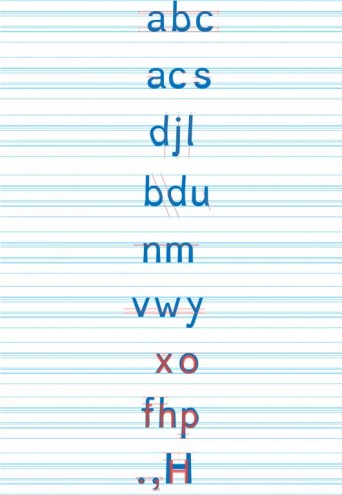
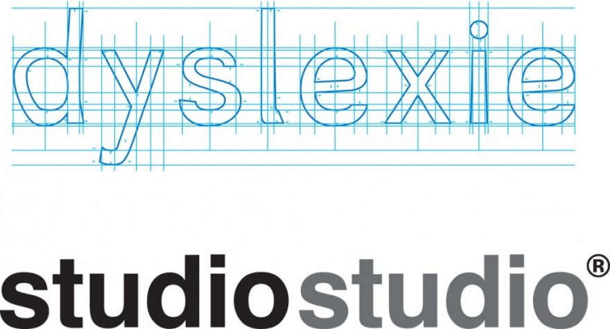
Dutch designer Christian Boer has created a typeface, Dyslexie, that could make reading easier for those suffering from dyslexia.
This exploration into finding a typeface that helps make the reading experience easier for those suffering from this condition, started as a personal project in 2008 when Boer, dyslexic himself, was a student.
In creating this Dyslexie typeface, Boer enlisted the help of eight other dyslexics to help him iterate through the different rounds of design. The result is a typeface that adds extra visual weight to the bottom half of the letters. Boer explains that this helps pin the letters to the baseline, which makes them easier to distinguish.
An independent study by the University of Twente in the Netherlands showed that dyslexics did make less errors when reading text set in Dyslexie. All the text on Boer’s website is set in Dyslexie.

