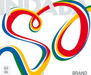
First Published in
Like a true thespian, Pluto Panoussis wears many masks. During the course of his creative career, he has been an architect, a writer and the director of a number of award-winning shows, which span a range of media, including film, television and the stage. Besides these accomplish-ments, he has also designed the full corporate identities of 17 companies, including the Cape Town Opera and the Jazzart Dance Theatre.
We met him at yet another of his successes, Cafe 41, to talk about One Decade: Ten Years of Theatre Posters by Pluto Panoussis, an exhibition curated by Alfrieda Dreyer and held at the Fried Contemporary Gallery in Pretoria, from 13-27 May 2006. One Decade challenges that stubborn old line between fine art and graphic design. Panoussis's work manoeuvres in the liminal space between these two established frequencies. He started designing posters almost exactly a hundred years after Toulouse Lautrec's revolutionary Moulin Rouge (1891) poster, which elevated the form to the status of a fine art, and his own career has continued this tradition of throwing down the gauntlet to those who slavishly comply with academic categorisations.
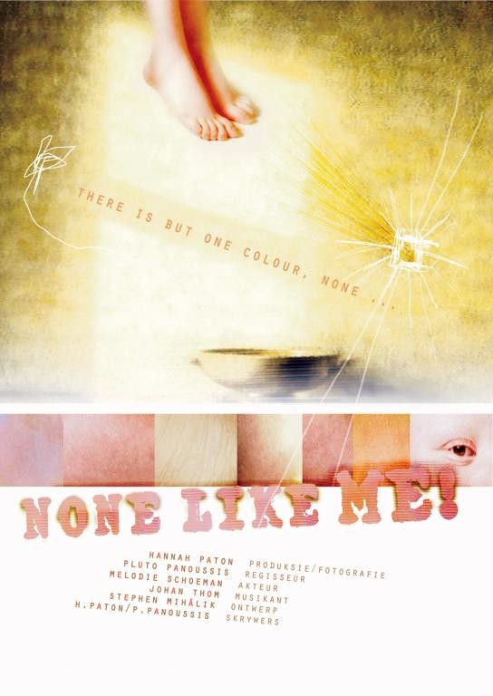
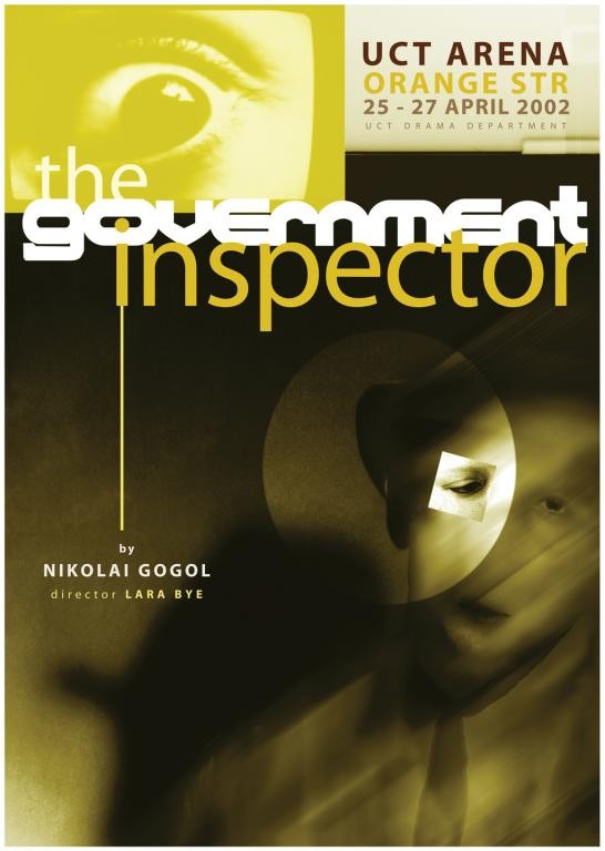
For instance, Panoussis's first suggestion for a poster design (for a production of Tom Stoppard's Travesties, directed by Roy Sargeant) was rejected because it did not conform to accepted design criteria. Instead of giving up, he continued to pursue his "significantly different" vision. Once it was completed, he managed to persuade the director of its merits despite the fact that, as he says, "it broke the rules of a lot of poster design. First of all, it was a landscape layout, which they don't favour... And also it consisted of a lot of different elements."
It was a personal turning point: Panoussis proved - to himself and the world - that flouting the conventions of format, composition and complexity needn't automatically lead to career suicide. On the contrary, between 1996 and 1999, while working as a freelance designer in Cape Town, his designs dominated the marketplace - a remarkable achievement for an individual competing with the bigger agencies. In this way, he managed to infiltrate the mainstream from the margins, and made a career out of design without compromising his personal style. Panoussis has long been fascinated by the concept of "bridging" worlds. As an architect he spent a year in Eastern Europe researching "the city and its relation to the river", and he's been exploring metaphorical and metaphysical bridges ever since. In a sense, his posters can also be seen as a bridge between the theatrical event and the audience on the street.
Based on his own experiences and research, Panoussis firmly believes that designs - even for relatively closed-circuit events, like opera and theatre - can affect people and change the market by luring them over the threshold of one reality and into another. "I try to get the man on the street" he says, "you're always hoping [to attract] the boundary person who wouldn't think of going to the theatre. And it does work..."
Instead of centering his designs on trying to capture a climactic moment of the play - which the viewer would, in any event, only recognise after having seen the production - Panoussis tries, rather, to distil an "attitude" or a "feeling" from the style and approach of both the text and its director. Instead of trying to force information onto the viewer, he tries to induce an emotional reaction; he tries to seduce one into the world being offered, so that one would "feel compelled to participate" in the world of the production. His approach favours a subtle invitation, and tries to allow the mood or spirit of the performance to spill over into the design, instead of going for a literal interpretation.
These theatre posters also provide a digital bridge between performance and the plastic arts. Translating action, rhythm, pace, movement and gesture into a fixed graphic representation is not always easy. Drama only lives in performance. It requires actions orientated around the dynamics of conflict. But Panoussis's posters also unsettle and resolve tensions, as any good drama might.
His graphic "world in-between" does not purport to be pure or perfect, but rather, depicts a flawed reality: "If it's too much like a photograph, it doesn't feel right to my eye... And if it's too much like a painting it doesn't feel right either". For example, Panoussis's unusual treatment of his poster for a production of Cabaret involved a deliberate degeneration of the image. Giving 21st century technology the finger, he concedes: "I had the most amazing high definition photographs, but I couldn't work with them - they were too good! So what I did was to photocopy it about six times and then paint over it to try to create that 'bad quality' and lack of definition."
A number of his posters incorporate blurred, indistinct figures. "Yes," Panoussis confesses, "I do like blurred lines. I find they enhance the ambiguity. Blurred figures focus your eyes on the surroundings - they draw your attention to the world and not the figure". He tries, "to get a variety of images, connected to the same idea; which is different from most approaches which use one image as a logo" and declares that he is "anti logo" and "anti-branding".
This expressive approach is also in keeping with what could loosely be termed an "African aesthetic", placing him within a tradition where symbol and design become the vehicles of stories, myths and ideas. Panoussis advocates the poster as a "distillation of a concept, an idea" and shows an open scepticism for the Western obsession with base symbologies in which the bottom line is a sexy woman and a shiny car.
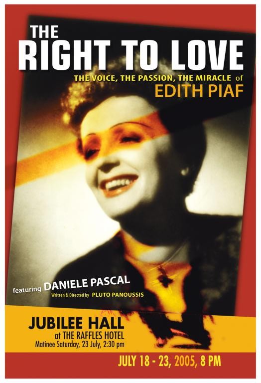
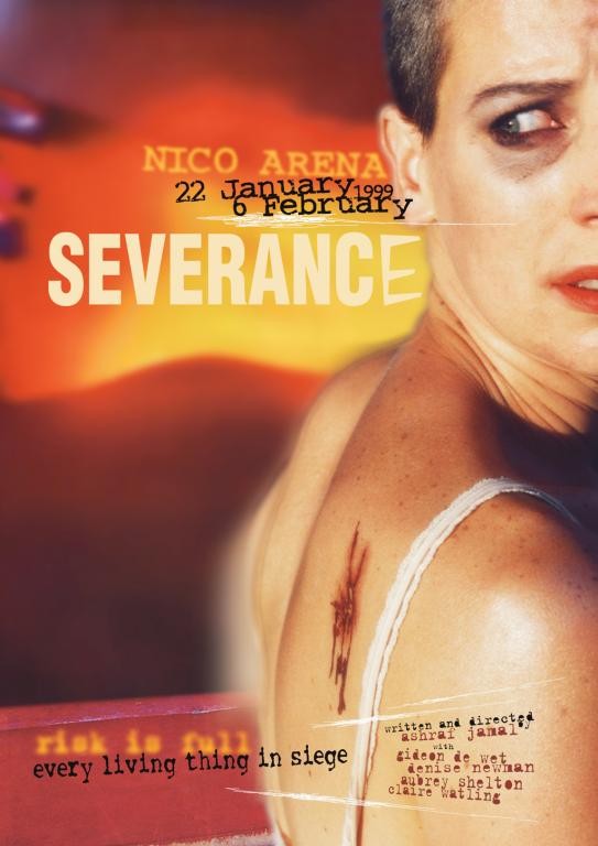
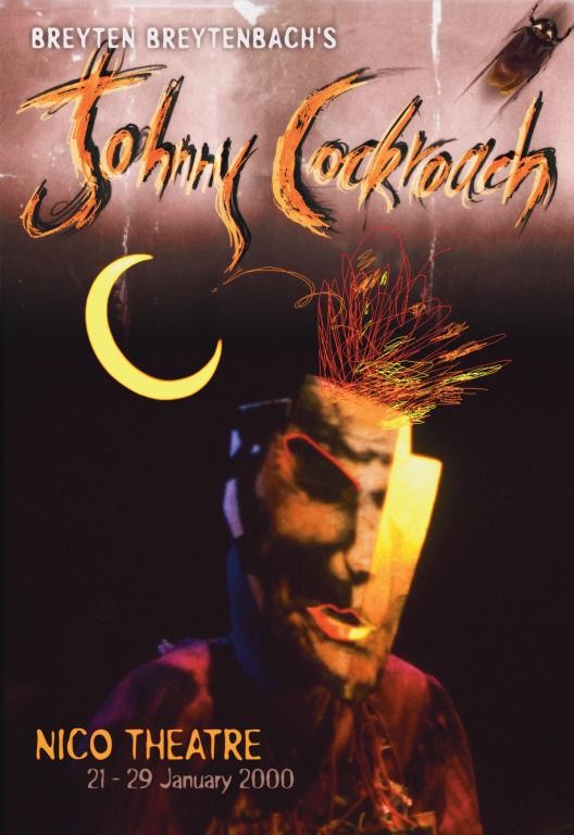
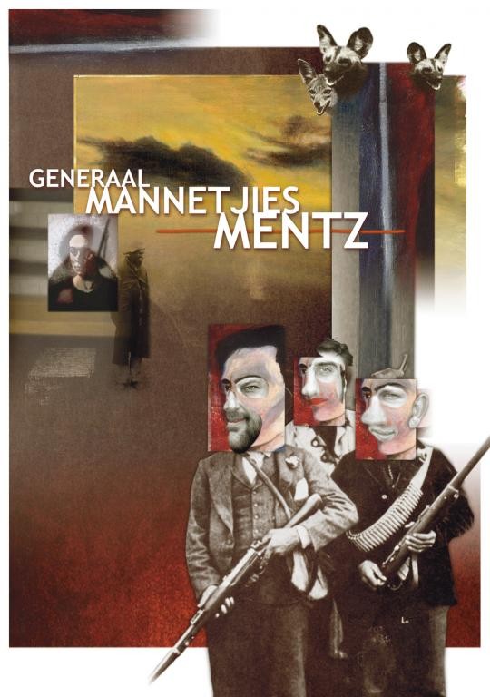
From the quirky collage of Travesties, to the brash pulp of Severance, to the kitsch nostalgia of The Visit, Panoussis's posters freely move in and out of multiple realities and worlds. In his design for Generaal Mannetjies Mentz, the all-too-familiar sentimental sepia of Boer War memorabilia rubs up against a nightmarish blur of Baconesque brutes. For Edith - a performance by Danielle Pascal, which was also written and directed by Panoussis - the abstract precision of Constructivism meets the storm und drang emotion expressed in a close-up, hand-coloured photograph of the singer Edith Piaf. Breyten Breytenbach's The Life and Times of Johnny Cockroach, (which originally starred the late Johannes Kerkorrel) translates the frenetic rock and roll lifestyle into an electric cool scarecrow with digital doodles for hair and a warping mask-like visage under a hovering sickle moon. Having serendipitously embarked on a career in poster design just over a decade ago, Panoussis's work spans the years of South Africa's democracy. It also overlaps the digital revolution that has transformed design during the last ten years. The work in this collection thus serves as a useful barometer of the many innovations and changes that have been seen in terms of both a public consciousness and the technology which feeds it.
Drawing on seemingly endless forms for his expressive designs (including painting, drawing, photography and sculpture), Panoussis's work suggests that the time is ripe for an integration of the arts; for an expanded awareness of how separate arenas might be able to connect and to benefit each other. He is holding this exhibition in part to demonstrate that one might be able to meet the client's brief while still blurring the boundaries.
About the authors
Miranthe Garbett is a freelance art reviewer and lectures Art Theory and History of Graphic Design at the Tshwane University of Technology and the Midrand Graduate Institute.
Anton Krueger is 1.79 m. He is going bald and wears glasses. (His published work includes plays, poems, and prose; as well as interviews, reviews and academic articles. His unpublished work includes shopping lists, dream journals and great ideas scratched onto the backs of packets of cigarettes at three in the morning. He teaches in the Department of English, University of Pretoria.)


