


First Published in

HKLM used the words of Nelson Mandela's 1994 inaugural speech, as re-iterated by Thabo Mbeki in 2005 as inspiration. The team engineered a succinct brand vision that embodied the spirit and purpose of South Africa: To create a truly people-centered society through driving the expansion of the frontiers of human fulfilment and the continuous extension of the frontiers of freedom and unleash the creativity of our people.
With this as our base, we then identified four brand drivers or strategic objectives that would help bring this vision of South Africa to life in the minds of people who experience it.
The four brand drivers are:
1. to celebrate our diverse culture and natural heritage by treating them as our most important exports;
2. to unleash the creativity of our people and unlock an unlimited natural resource;
3. to create a springboard for human fulfillment through social, economic and environmental development;
4. and to believe in the power of South African people to shape the future.
The next part of the HKLM process was to define the essence of the brand South Africa - the single thought that expressed the vision and strategic objectives, bringing them together into one clear brand positioning. For us, the essence of South Africa was 'real freedom'.
This essence had to ring true to three different target markets namely investors, visitors and of course, South Africans themselves. For this reason, we expressed 'real freedom' in a way that was appropriate to each target market. For investors it was more important to 'build freedom', for visitors to 'capture freedom' and for South Africans the key was to 'express freedom'.
This thinking helped us generate a range of identities which we believed captured the essence of the land, helping us to uncover the symbol that would become iconic - or instantly recognisable as the mark of South Africa.
Four of the best
After an exhaustive creative process exploring as many frontiers as we could, we settled on four options that we believed expressed 'real freedom', each in quite a different way. We also set about exploring how these logos could be applied to various elements to determine whether or not they were robust enough. By putting them to the test we would see which of the directions we had chosen was powerful enough - which of them would come through as the idea that would be embraced by tourists, investors and the nation.
Dynamic South African energy
This option depicts the vibrant energy and colours of our people and landscape. The shapes intersect each other in a dynamic, yet informal manner. The symbol has forward momentum designed to encapsulate innovation and creativity. The typeface is approachable and simple. The route is light, expressive and unrestricted. In an abstract way it reflects the nature of 'real freedom'.
Colours
The South African flag is one of the most recognized flags in the world. It has a combination of colours that not only makes it distinctive but also expresses the diversity of our nation. Our colourful flag also symbolizes the freedom of our nation because it was first unfurled at the 1994 elections, which can be viewed as the moment South Africa was welcomed back into the world community. The typeface is handwritten and personal and is juxtaposed with the clean multi-coloured stripes. The 'colours' route draws on a historic moment in time when South Africa became 'free'.
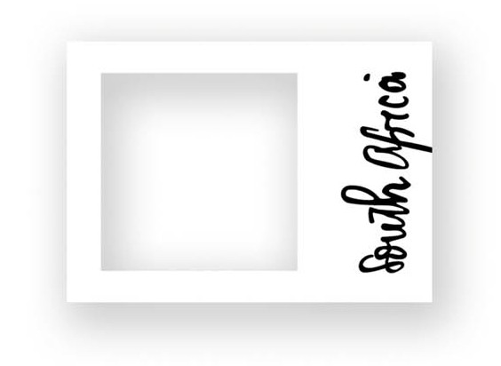
Viewfinder
The viewfinder idea allows us to explore South Africa's broad spectrum of offerings without threatening to overload the audience. It is versatile and can be used in a variety of applications. It's simple yet sophisticated. It doesn't limit or contain the viewer. There is always something beyond the borders of the frame so that while being focused, there always remains a sense of space, freedom and endless possibilities. The joy of this idea is how it encourages the audience to choose from its point of view. No matter who you are, it is an idea that offers you complete freedom.
Nelson Mandela
Nelson Mandela is still South Africa's most well known and loved icon - the same is true worldwide. The geographic shape or outline of South Africa is not well known. In fact, international research indicates that many people actually see South Africa as Africa. By using a geographic outline, this route draws attention to the fact that South Africa is the land at the foot of the African continent and by using Nelson Mandela's face, it becomes the shape of freedom. We chose to see South Africa freely.
Choosing the viewfinder
It became clear to the HKLM team that the 'viewfinder' idea was the one with the most potential. The deeper we delved into how to apply it to different media, the more it seemed to come to life and continue to grow. However, at this stage all we really had was a device.
Yes, the viewfinder allowed us to drill down into different levels of communication and make sense. Yes, it allowed us to capture a range of elements that reflected South Africa - everything from the diversity of our natural heritage to the warm smile of our people. It was dynamic and unrestricted, allowing us to leverage the strength of the country. It was simple yet effective as a tool to communicate the essence of South Africa to three different audiences - but the soul of the idea still eluded us. Something that could make this idea unequivocally South African was missing.
We asked ourselves how we could capture the powerful symbol represented by Nelson Mandela, as the man who led South Africa to freedom? By asking this question, we found what we were looking for - a letter that he had written to his two daughters during his incarceration on Robben Island, in which he explained to them the reasons for their separation and his vision for the future of South Africa. This was written simply and sincerely so that his daughters, who were young at the time, could understand. In this letter he had written the words 'South Africa'...
By extracting these two words 'South Africa' from his letter, we created a uniquely South African signature or logotype using Nelson Mandela's actual handwriting.
We hadn't just labelled our idea with a typeface and the two words 'South Africa' but instead had found a way to instill genuine South African soul into the idea.
The 'viewfinder' idea was now complete with the spirit of South Africa and 'real freedom'.
We had found the idea that would capture 'real freedom' and make South Africa a brand, creating a sense of the place in someone's heart. Now came the task to extend this concept to various types of graphic, environmental and product mediums. In terms of graphic application, the viewfinder device would be used on images as a way to focus attention and capture a particular emotion or focal point within the composition of the image.
The word 'freedom' would support this visual treatment in order to emphasise and clarify the point of the communication. Every element was in place to create a genuinely engaging brand.
How freedom works
The environmental applications involve a three-dimensional interpretation of the viewfinder device. A freestanding pillar has been designed with a viewfinder 'hole' through which a person can capture a beautiful real-life scene in much the same way someone would look through a camera or at the LCD screen of a handycam. It allows for interactivity and the transfer of inspiring images of South Africa but in a way that is determined by viewers themselves.
Other environmental applications include furniture and architectural expressions of freedom that may be used in public areas and places of interest for both local and international tourists.
To demonstrate how the viewfinder idea could come to life, we applied the design to consumer products such as flip flops, cameras, bags and iPod covers.
We can also use the device to highlight social issues like the threat of shack fires in townships where children get burned every year. We can use fireproof blankets with safety messages printed on them to educate people about how to prevent fires and how to use the fireproof blanket to douse flames.
As South Africans we were not only proud to have worked on this project, but also to have a country where we have the freedom to express ourselves. There is no shortage of inspiration when it comes to looking at South Africa as a brand.
Let's keep at it!
Design Indaba commissioned three top agencies to apply their skills to the uber brand, South Africa, because we believe that there is a gap between our country's image and reputation, and the realities of its amazing achievements since democracy. Here's what switch, two tone and hklm have come up with to help close that gap.


