Wael Morcos on using type to preserve language
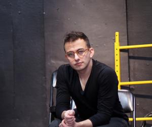
Wael Morcos studied graphic design at the Rhode Island School of Design. At Design Indaba Conference 2013, he spoke about the ways in which graphic design and typography can be used to preserve language.
As Morcos is originally from Lebanon, he learnt to speak several languages without even realising it. This lead to his fascination with languages and how they differ from each other.
One of Morcos’s first projects saw a redesign of his grandmother’s diary containing numerous poems. Using his own understanding of the world, he transformed the diary through creating typographic patterns resembling her needlework. “It was a very important project for me as it made me understand myself and see how language and type is able to connect two people,” said Morcos.
His following projects look at how people are able to trace their memories through visual cues that can preserve a person’s life.
Objects are silent but typography has the ability to give a voice to them, says the designer.
Watch the full speaker talk here.
Matthew Carter on untypical typefaces
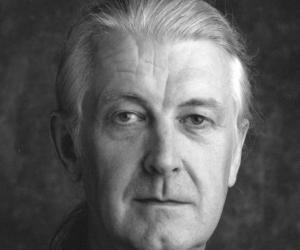
Matthew Carter is a type designer with some 50 years' experience. He has designed some of the world's most recognised fonts. At Design Indaba Conference 2013 he gave the backstories to some of the unusual typefaces he has designed.
Carter first spoke about his Mantinia project. One of the inspirations behind the typeface is lettering in paintings and engravings of Renaissance artist Andrea Mantegna. The typeface saw a manipulation of Roman alphabet letters in order to join them together and merge two letters into one. “The typeface is unusual. It includes ligatures that are not part of our typographic tradition but rather of the epigraphic tradition derived from inscriptions,” says Carter. What Carter refers to as primitive forms of advertising – lettering on buildings as well as ligatures on 17th century gravestones – also provided inspiration for this project.
It’s seldom that an influence comes to me as a single, pure form. It’s always a mess, says Carter
Watch Carter’s full speaker talk here.
Louise Fili on typography and gastronomy
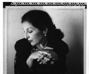
Veteran graphic designer Louise Fili specialises in designing food packaging and restaurant identities. “Italy is my greatest source of inspiration, both typographically and gastronomically,” Fili said at Design Indaba Conference 2013.
She’s been obsessively photographing all things to do with Italy and eating – two of her great passions – that has become the archive that she draws upon in her creative endeavours.
Here she talks about creating her own “typographic oasis” in New York City and the years she worked as an art director at Pantheon Books, where she designed more than 10 000 book jackets. Fili explains why one doesn’t need to shout, typographically, to be heard, and share two important lessons in running your own studio. The first lesson is to never limit yourself to just one type of work or client, and the second is that you should never just sit around waiting for the phone to ring.
Watch the full speaker talk here.
Oded Ezer on morphing typography with other organisms
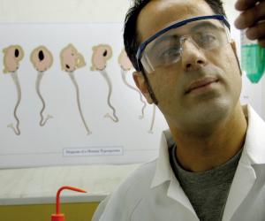
Typographer, type designer, artist and teacher Oded Ezer talks about the various influences and inspirations that have urged him to combine typography with other creative, and often unlikely, fields. Whether it be ants or plastic surgery that Ezer uses to create typographical hybrids, it's all in an attempt to "make type behave".
I love to combine typography and other fields in order to find out what else can be done with letters, says Ezer.
Watch the full speaker talk here.

