As a creative, Ekene Ijeoma sees the world through photography and as a technologist, he sees the world through data. But there’s no need to segregate the two, he says. Simply put, he is a designer who codes and a coder who designs.
In the first years of his career, the New York-based information designer worked on projects that harnessed graphic design and data to create beautiful, commercial advertisements such as Data Baby.
While projects like this were a good showcase of his skills, they were not representative of his values.
Speaking at the Design Indaba Conference 2017, Ijeoma explained: “I wanted to see data as poetic and not just pragmatic and I wanted to look at people as citizens not just consumers.”
The projects that followed each had a clear, socially conscious slant.
Ijeoma’s interactive map, the Refugee Project, showed the refugee crisis in a nonlinear way. The website follows refugees around the world showing where they left, went to and why from 1975 to the present day.
It began with the iconic photograph by journalist Steve McCurry which appeared on the June 1985 cover of National Geographic. The image of an adolescent girl with green eyes in a red headscarf looking intensely at the camera captured the hearts and minds of many.
Ijeoma wondered whether the picture elicited empathy for all refugees or for one particular refugee, and he also wondered about the data surrounding the image – how would it look and what are their stories?
In collaboration with Hyperakt, Ijeoma tracked the refugee exodus and asylum route over time, pairing their journeys with around 100 stories.
It was his first project to receive international attention and critical acclaim from institutions like the Neuberger Museum of Art, Design Museum, and Annenberg Space for Photography.
“That’s when I realised that data can be beautiful but also insightful and also that data visualisation and design could actually break the news cycle,” he says.
He went on to create Wage Islands in 2015, an installation that responded to Fight for $15, a protest calling for a higher minimum wage in New York. Assembled by hand using around 500 pieces of laser-cut acrylic, the installation floods NYC showing where workers can afford to live from low to high wages.
Then in 2016, Ijeoma released the Look Up app on Android devices in New York.
Commissioned by Google Labs, the app is designed to get New Yorkers off their cell phones and in tune with each other and the city by sending an alert to look up each time the user reaches an intersection.
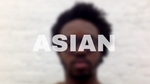
And then finally, his 2017 project, The Ethnic Filter address the lack of diversity in the design industry – design is 73 per cent white according to a major census.
Commissioned by AIGA, the filter blurs out the face of the user – the blurrier the face the lower their representation in the design industry.
“Really, a lot of the projects I did could have just been interactive maps. But I thought that they should have dedicated, committed mediums for each issue,” says Ijeoma.
For Ijeoma, thinking like a citizen and not just a creative, using data to educate rather than market to consumers, and making conversation pieces rather than masterpieces are the pillars that hold up his work.
Watch the Interview with Ekene Ijeoma