First Published in
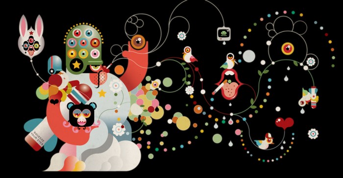
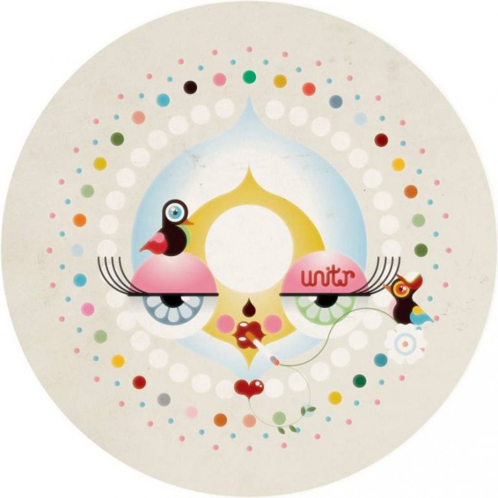
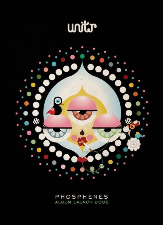
Cape Town's emo-electro outfit Unit.r have launched their debut album decked out in a full-house design campaign from illustrator Kris Hewitt aka Kronk.
Inspired by the band's unique synthesis of human and electronic sounds, Kronk decided on a style that combined geometric and organic vector illustration. For the motif he turned to the album's title - Phosphenes are the colourful "kaleidoscopic" illusions you see when you close your eyes and press hard on them.
"The characters can be accredited to the act of seeing phosphenes, where often weird shapes, figures, images and light are seen by the viewer. The detail needed to be rich so that you could not take it all in at once and, like a phosphene, there are always new things that present themselves," explained Kronk. Creating optical illusions when presenting the characters in multiples, the designs also seem to act like colour-blind tests and chimeras.
The distinctive motif has been wholly endorsed by the band and used on the album, posters, flyers, website, T-shirts and hypnotic stage projection. "We wanted to create a visual identity that set the band apart from the current visual norm in the music industry, because the band live in a category of sound that is unlike most bands in this country. They needed to be seen as innovators in sound and visuals," Kronk goes on.
Kronk is designer and illustrator at the Amicollective and has also worked on projects for Red Bull, Kidrobot, MTV base, FNB and Virgin Mobile. His favourite colour is rainbow.
Cape Town's emo-electro outfit Unit.r have launched their debut album decked out in a full-house design campaign from illustrator Kris Hewitt aka Kronk.
Inspired by the band's unique synthesis of human and electronic sounds, Kronk decided on a style that combined geometric and organic vector illustration. For the motif he turned to the album's title - Phosphenes are the colourful 'kaleidoscopic' illusions you see when you close your eyes and press hard on them.
"The characters can be accredited to the act of seeing phosphenes, where often weird shapes, figures, images and light are seen by the viewer. The detail needed to be rich so that you could not take it all in at once and, like a phosphene, there are always new things that present themselves," explained Kronk. Creating optical illusions when presenting the characters in multiples, the designs also seem to act like colour-blind tests and chimeras.
The distinctive motif has been wholly endorsed by the band and used on the album, posters, flyers, website, T-shirts and hypnotic stage projection. "We wanted to create a visual identity that set the band apart from the current visual norm in the music industry, because the band live in a category of sound that is unlike most bands in this country. They needed to be seen as innovators in sound and visuals," Kronk goes on.
Kronk is designer and illustrator at the Amicollective and has also worked on projects for Red Bull, Kidrobot, MTV base, FNB and Virgin Mobile. His favourite colour is rainbow.


")