First Published in
One Horse Town
It was a campaign for Wordsworth books, through Saatchi & Saatchi, that put One Horse Town on the map. The inventive campaign was nominated for a Loerie Award in 2009. Not only opening the door to more advertising work for Simon Berndt, it was the money from this job that helped him to pay the deposit for a studio space and to get One Horse Town properly off the ground.
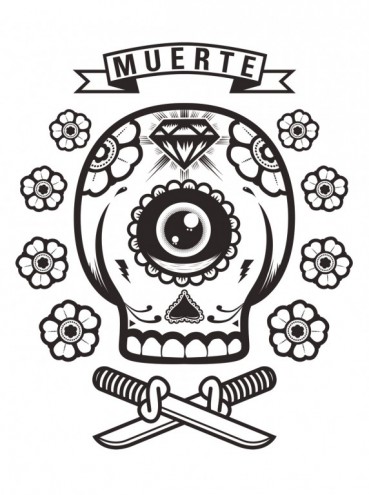
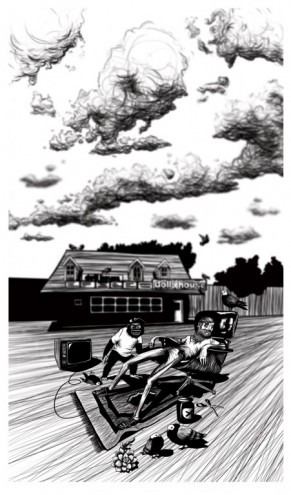
One Horse Town does a creative form of illustration, what Berndt likes to call “commercial art”, which lends itself to more creative executions. While illustration is the main focus, Berndt is open to trying as many stylistic approaches as possible. Getting non-specific briefs from clients has also allowed him the space to experiment with new visual styles. Rather than having a specific style, Berndt reckons One Horse Town’s work is merely “recognisable”. Elements like the use of colour, strong digital influences and a certain “quirkiness” are probably the most distinguishing aspects of their work.
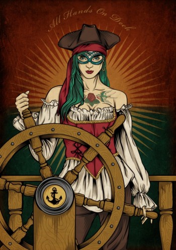
Illustration has allowed Berndt the opportunity to work on things that he is interested in but would not be able to pursue commercially. Referring to his work for KFD Skateboards and the Cape Town Tattoo Convention, Berndt says he likes that illustration allows him to get in touch with the alternative culture that exists in Cape Town.
But more than anything, Berndt likes challenging himself, whether it is selecting the right typeface, or building good relationships with clients. He says: “With illustration, no matter what the job is, there is always going to be a bit of creativity, but it also creates the opportunity to work in areas beyond illustration.”
CJ Parker
Anybody that was around in the Nineties might recognise “CJ Parker” as the name of the character played by Pamela Anderson in the popular TV series Baywatch. The 1990s is what it’s all about for Hannes Bernard and Travys Owen, collectively known as CJ Parker and based in Cape Town.
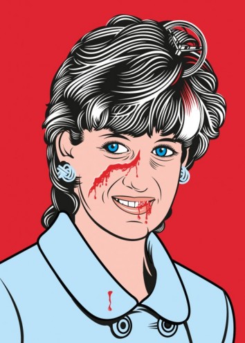
Describing their style as reflective of 1990s pop culture with a “low-fi trash feel”, CJ Parker prioritises originality to the point that they would rather create something that looks shit but is unique, than create work that looks like that of somebody else.
In their eight-month existence they’ve worked with a number of prominent clients including Saatchi & Saatchi, Cell C, the Loerie Awards and the City of Cape Town. Getting their name and work out there is important to CJ Parker who reckon designers also need to be sales people, willing to promote their own work and skills. It’s important for illustrators to always be on top of their game, Bernard and Owen believe.
“Design is a mindset, you can teach yourself everything,” Bernard says. In the future, they reckon, designers are going to need to know a little about everything, from animation to manufacturing. CJ Parker also regularly make time for their own experimental work. This allows them to try new styles, and learn more about 3D and various software packages.
Being constantly informed is key for Bernard and Owen. Looking and recording to build a database of visual references is what stimulates the process of getting to new ideas.
Adam Hill aka Velcrosuit
Adam Hill is a Cape Town-based, self-confessed “über design nerd” who likes nothing more than to challenge himself to create designs that effectively communicate while also evoking a subtle emotional response from the viewer. It was the “trial-by-fire” experience gained from his first job at Code design, where he also managed more junior designers, that prepared him for going it alone. “As a designer a lot of your inspiration stems from your life experience and in a studio environment you don’t necessarily gain that much other experience. Breaking those ties opens you up to other experiences.”
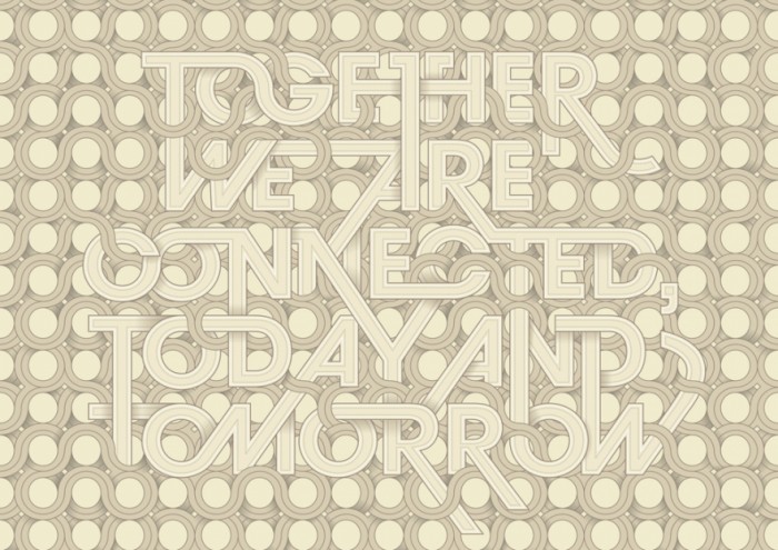
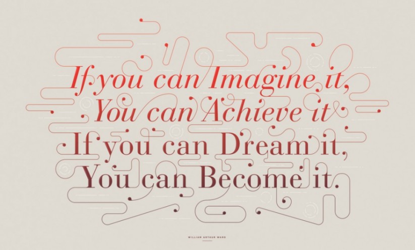
Freelancing, as he does, allows Hill the space and time to experiment and develop new styles and techniques. Though, for Hill, picking the right typeface early on is one of the most important elements of good design, believing that it can go a long way to creating the right mood. “If you don’t have a lot of budget, or strip everything down to the basics, you can still create something beautiful with typography,” Hill says.
Looking to the challenges faced by young designers working in Cape Town, Hill reckons South Africa has a long way to go in terms of baseline visual literacy but is positive that this is something that is being actively cultivated. “Designers also need to be less precious about their work, more willing to share ideas and they should also stop undervaluing themselves,” Hill says.
With his own creative portfolio encompassing band posters, magazine covers, corporate logos and stationery, CD covers, and travelling exhibitions, Hill tries with every brief to do something that he will be proud of.
Says Who
While it’s clear that Cape Town is the preferred locale of young illustrators, Says Who is based in Jo’burg and loving it: “Johannesburg is the weirdest and most beautiful place on Earth. We’re constantly inspired by this place,” says Nick Christowitz. “One advantage is that agencies up here love the fact that we can go in for meetings and have face-to-face time. Sounds silly, but it’s true. Johannesburg has been good to us.”
Christowitz, Lauren Schultz and Shaun Hill all have degrees in visual communication but focus mainly on illustration, working to constantly evolve their personal styles but also try, with each new job, to create a style that suits the brief. Since starting their studio in January 2010, Says Who have designed backgrounds for the Cadbury South Africa website, worked on the launch of the Mini Countryman with Gloo, and just recently finished their first billboard with Network BBDO for Chicken Licken.
The trio always have all the stuff they’ve learnt in the back of their mind but prefer to not adhere to any specific design principles as they believe it can be very limiting. Schultz says: “You always have to keep bettering yourself, and I see amazing work all the time. It makes me want to create stuff just as good, if not better.”
Having fun by working on their own projects is also important to Says Who. They held a successful exhibition last year and also launched Says Who Threads, their T-shirt range and their own fortune cookies. They’re also working on some top-secret graphic novels that they wouldn’t reveal anything about.

