First Published in
The creative director of Redshift Digital (www.redshift.co.za). Joe completed a national diploma in graphic design (with distinction) at the Cape Technikon. He initially embarked on a career in advertising at SmithGroup. While gaining much insight into brand-building in advertising, he soon decided to change to multimedia. This led him to HAL Interactive where he developed his programming skills.
Before founding Redshift, De Lange developed award-winning digital projects for blue chip clients (eg www.mettle.co.za; www.bayer.co.za/animalhealth) as art director for Tinkerbox Interactive Cape Town. De Lange's childhood obsession with the Commodore 64 has blossomed into a deep-seated passion for experimental programming and the delivery of meaningful online interactivity.
Here he rates his top five websites:
I have tried to choose five websites that display a cross-section of what inspires me online. Each site influences me on different levels and each in it's own way has expanded my view of what is possible online.
[01] https://www.google.com
keywords: search engine, reputation rating system
Why have I included this website? Not because of it’s aesthetics.
But think about this - search engines form a window to the internet for many web users on a daily basis. What elements of design can guaranteethat a search engine becomes popular or, in Google's case, the most popular search engine online? (FACT: Google now dominates internet search, accounting for 46% of search referrals.)
It starts with a graphically light frontend - the only graphic element is the logo. The rest of the elements are HTML fonts and an input field. In addition to this, Google runs on a unique combination of advanced hardware and software. The speed you experience can be attributed in part to the efficiency of the search algorithm and partly to the thousands of low cost PC's they have networked together to create a super fast search engine.
Google maintains a reputation rating for every site on the web and uses this data to sort the return set for searches to place the highest-quality hits on top of the list. Google derives its estimate of a website’s quality from the number of other sites that link to it (as well as some fancy maths that gives greater weight to links from more important sites and less weight to links from minor sites).
I use Google every day and the elements of design that make it successful are, for the most part, not graphical. It is, however, still one of my favourites because it satisfies my need to find things while remaining easy to use and returning high quality results.
This is a useful, well-designed digital tool that contains the right balance of elements to make it the online success story it has become.

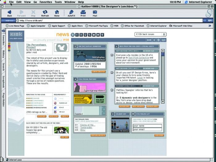
[02] https://www.k10k.net
keywords: online magazine/portal, daily content, monthly issues
Kaliber 10000, “The Designer's Lunchbox”, aims to create a truly informative and vibrant online community for designers. This is a website of Scandinavian origin, with a highly crafted interface design that is widely known as the most popular of all the online design portals.
What makes this website so great apart from it’s squeaky-clean design? The most used feature is, without doubt, the "news" section featured on the front page, which is updated daily by 22 designers from around the world.
The "issues" are created on a monthly basis by web designers chosen by the creators of the website (token and mschmidt).
This website certainly provides fresh, reliable and valuable content – the lifeblood of any worthwhile online portal.

[03] https://www.netbabyworld.com
keywords: pixel-based design style, interactive games, e-commerce
Netbabyworld.com (online in 1999) has a highly crafted design style that has virtually defined the way many web designers view pixel-based design on the internet. It's a style that draws from the Japanese console video game aesthetic and has been refined by the Scandinavians. Elements of this have more recently filtered through into some more corporate online design work.
Technologies employed include Shockwave to produce highly interactive, multiplayer games tracking high scores worldwide. You can even build your own character and build your own teams. An online store allows you to look at and buy your favourite items and accessories.
Current developments include a 3D game engine that can be modified for several types of games. The goal is to present a perfect mix of multiplayer, advanced and smaller games for the internet as well as games for wireless technology, including a wide range of Netbabyworld merchandise.
This website aims to entertain the user via its online interactive products while at the same time creating a powerful and durable online brand.

[04] https://www.preloaded.com
keywords: interactive agency, Flash, portfolio
Preloaded are an independent London-based digital media partnership, specialising in consultancy and creativity. The company is made up of individuals who hark back as far as the CD-ROM development days of the early 1990s.
The website uses the metaphor of a television to present it's portfolio of work. This is an interesting way of evaluating the idea of online interactivity against more traditional "push based" media formats like television. This harks back to the good old days of 8-bit computing when many a teenager monopolised the household television set as a display device for their computer. The simple games hidden within the navigation extend this metaphor.
While the website does not say much about the company in terms of marketing mumbo-jumbo, it says more about them as an agency than any traditional sales pitch or brochure-ware offering could. The website presents the users with an experience, drawing them in and inviting them to ask more about the company directly. They hope it will attract the kind of people they want to have conversations with.
Elegant simplicity and attention to detail make this one of my favourites.


[05] https://www.soh.internode.on.net/virtual_tour/vrtour2.html
keywords: Flash, QTVR
A self-guided tour through one of the world’s great wonders - the Sydney Opera House Virtual Tour was created in-house by a special project team. The tour was originally created for the CD-Rom "Inside the House" which shipped last year and is available on site.
Each panorama in the tour took about 10 to 12 hours of work. This included the effort of setting the shot up, lighting, multiple exposures and post processing. Twelve shots were needed per panorama and were stitched together to form the 360 degree view. Diverse lighting conditions around the house necessitated that the team take multiple panoramas at different exposure settings and then composite the multiple shots.
To assist the user on their journey through the house it was vital that a map be created. The standard floor plan did not provide enough information and was not able to display the complex multi-level aspect of the house. Using a set of floor plans, the house was broken into three levels. The team set about creating a 3D map using computer modelling and Photoshop.
This is a highly interactive work of art that reveals the heart of a truly great architectural masterpiece.


