In 2010 I was invited to a design conference in Copenhagen to speak on the subject of conceptual type. The organisers were interested in examples of typefaces whose principal design feature was not related to aesthetic considerations or legibility, but rather some underlying non-typographical idea. In my address I argued that there is no such thing as conceptual type, since type design is a discipline defined by its ability to execute an outcome; the process that transforms the pure idea into a functional font is a critical part of the discipline. Having rejected the topic of the conference, I nevertheless went on to speculate on what a true example of a conceptual typeface might be like.
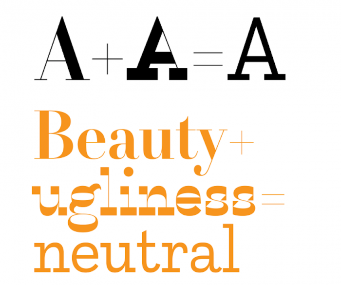
At the time I was also interested in the idea of irreconcilable differences and how two extremes could be combined into a coherent whole. As an example, I looked for the most beautiful typeface in the history of typography — as well as the ugliest one — and for a way to meld them.
The Beauty
While any choice representing beauty is bound to be very personal and subjective, many agree that the high-contrast typefaces created by Giambattista Bodoni and the Didot clan are some of the most beautiful in existence.
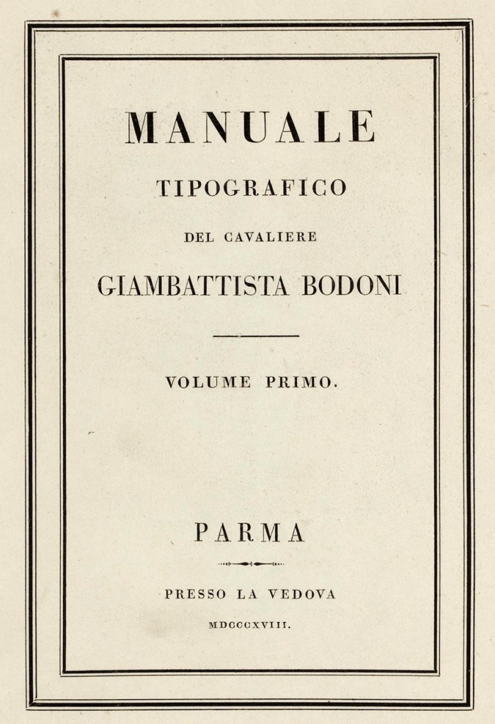
Bodoni was one of the most widely-admired printers of his time and considered amongst the finest in the history of the craft. Thomas Curson Hansard wrote in 1825 that Bodoni’s types had “that beautiful and perfect appearance, which we find it difficult and highly expensive to equal”.¹ In his Manuale Tipografico of 1818, Bodoni laid down the four principles of type design “from which all beauty would seem to proceed”, namely: regularity, clarity, good taste, and charm.
His close competitors in France were the Didots. Not only did François-Ambroise Didot invent many of the machines used in printing, but his foundry endeavoured to render the types more beautifully than his rivals Baskerville and (later) Bodoni. Some considered Didot’s works the most beautiful types that had ever been used in France (up to that period) ², though others found them delicate but lifeless³.
The Ugliness
I have to admit that dealing with ugliness was a lot more interesting than revisiting the beauty contests of the classicist printers. The search for ugliness triggers a certain primal, voyeuristic curiosity, and from the designer’s perspective there is simply a lot more space to explore. Capturing beauty has always been considered the primary responsibility of the traditional artist, and even now it is rare to find examples of skilled and deliberate ugliness in type design, (although examples of inexperience and naiveté abound).
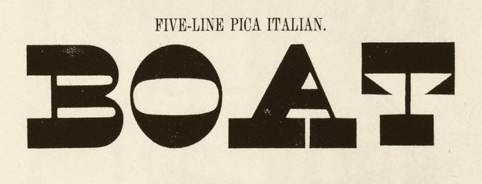
The eccentric ‘Italian’ from the middle of the Industrial Revolution was a clear choice. This reversed-contrast typeface was designed to deliberately attract readers’ attention by defying their expectations. Strokes that were thick in classical models were thin, and vice versa — a dirty trick to create freakish letterforms that stood out in the increasingly saturated world of commercial messages.
No other style in the history of typography has provoked such negative reactions as the Italian. It was first presented in Caslon & Catherwood’s 1821 type specimen, and as early as 1825, in his Typographia Thomas Hansard called the type a “typographic monstrosity”. Nicolete Gray called it “a crude expression of the idea of perversity”⁴, while others labeled it as “degenerate”⁵.
The goal of my project was to show just how closely related beauty and ugliness are. Donald Knuth, an American computer scientist with a special interest in typography identified over 60 visual parameters that control the appearance of a typeface. I was interested in designing typeface variations that shared most of these parameters, yet included both the ugliest and most beautiful letterforms.
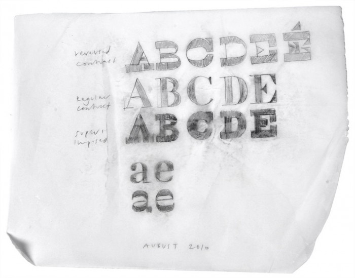
Karloff, the result of this project, connects the high contrast Modern type of Bodoni and Didot with the monstrous Italians. The difference between the attractive and repulsive forms lies in a single design parameter, the contrast between the thick and the thin.
I asked Pieter van Rosmalen for help, and both of us worked on both versions. While at the beginning I looked at the Didot from Imprimerie Nationale as a reference, Pieter departed from this model and made the project more personal. We worked on both models at the same time, trying to be very strict about mathematically reversing the contrast between two weights. The advantage of working on both versions together was that we could adjust both of them to achieve the best forms, rather than creating one as an afterthought of the other.
Towards the end of the project, I worked with Nikola Djurek, our frequent collaborator, who helped with interpolation and fine-tuning of the fonts. Having designed two diametrically opposite versions, we undertook a genetic experiment with the offspring of the beauty and the beast, interpolation of the two extremes, which produced a surprisingly neutral low contrast version. Karloff Neutral required only minimal intervention, because the master weights from which it was interpolated were well defined.
About the name
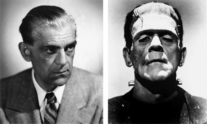
Karloff was the artistic name of the British actor William Henry Pratt. He chose this pseudonym to prevent embarrassment to his dignified family, who considered him the black sheep of the family. Although he played mainly sinister characters, in real life, Karloff was known as a very kind gentleman who gave generously, especially to children’s charities.
This article by Peter Bil'ak was originally published on Typotheque. Article credit to Typotheque and "Works That Work", a magazine of unexpected creativity.
Footnotes:
1. Hansard, Thomas C. Typographia: an Historical Sketch of the Origin and Progress of the Art of Printing, 1825.
2. Encyclopædia Americana, 1832.
3. Updike, Daniel B. Printing Types: Their History, Forms, and Use, 2001.
4. Gray, Nicolete. Nineteenth Century Ornamented Typefaces, 1938
5. Benson, John H and Carey, Arthur J. The Elements of Lettering, 1940

