1. Extremely big, extremely small and middle shapes. Or: Exaggerate.
In my first year of school, one of my favourite professors used to constantly repeat this idea: "When you plan a composition, always put together a very big element next to a very small element. Then move on and put some middle sized elements." I used to take this advice literally, and it indeed helped to create fairly good compositions. But it was only some years later that I realised that this is actually a much wider principle: Iconic design is typically built on exaggeration.
2. The Answer is not blowing in the wind, it's hidden within the Question.
Another tutor of mine used to give us the brief for a new assignment, and when we started asking too much questions, he would quietly respond: "The answer is within the question." Easier said than done - as intelligent creatures we tend to over-analyse things. But if you read carefully, you will realise that often the solution to the problem already exists within the brief. All you have to do is to spot the two to three most relevant words from it and visualise them.
3. Your grades are not as important as you think.
Well, here is the logic: Your teachers will usually give you an A+ for what they understand to be good design based on their experience. There's only one caveat, your teacher's idea of what good design is, was probably shaped 10 to 20 years ago, when they, themselves, were in school. Keep in mind that groundbreaking ideas are typically underestimated when they are first introduced.
4. Don't think how it "looks"; think how it "behaves".
When you wish to design something that looks great, you'll end up frustrated, because you will only succeed in imitating the greatness of designs you've already seen. Instead, try to think in terms of behaviour: How would your composition "behave" if it were sad? What colour palette is aggressive? Which typeface has a sense of humour?
Answering these strange questions will lead you to create fresh designs that will have your own unique voice.
5. If you don't have a good idea, it's because you haven't done enough research.
It's not because the Muses have left you, or that you are not talented enough. 99% of the time when you can't come up with a good idea, it is only because you haven't done enough research. Gather as much information as you can about the subject matter, interview people, take photos, go to the library (yes, the library), and the ideas will inevitably start flowing in.
6. Still no idea? Take a nap.
Or take a long walk. Or take a shower. These reduced consciousness activities will give your brain a break, and your subconscious the time to process all the information you have absorbed so far.
By the time you wake up, or get back from your walk or finish your shower, your mind will have more room for new ideas to emerge.
7. Design should be easy.
There are many ways to deny yourself from being creative. One of the most effective ways is to come up with an idea that is too difficult to execute. In addition, an over complicated concept will most likely confuse your audience instead of engage them. Throw it out, and start fresh.
8. Good design lives in between need and fantasy.
Charles Eames once said: "Recognising the need is the primary condition for design". I totally agree; and if I may add the second condition, it would be recognising the fantasy. A design concept that doesn't serve any need is useless, and a concept that lacks imagination is boring.
9. Do more.
Draw more sketches. As many as you can. This way you increase the chance that one of them will be surprising. When you stumble on a good idea, keep sketching. Your next one should be even better.
Another good idea is to apply the Dr Jekyll and Mr Hyde approach, and to investigate two concepts for every brief - one that makes perfect sense, and one that just makes you smile.
10. If you find yourself smiling when you're by yourself, then you're on to something good.
It's that simple.
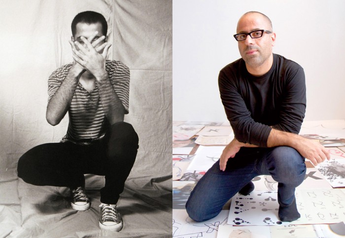
Photos: Oded Ezer 1994 – Adi Adar. Oded Ezer 2012 – Raoni Maddalena.


