First Published in
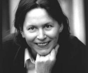
Watching Dutch book designer Irma Boom guide the Design Indaba 6 audience through her impressive body of work, there was a palpable sense of awe. Idiosyncratic, wilful, conceptual and challenging; her work explores the creative boundaries of print - and the imagination.
Despite lamenting her inability to fully articulate her thoughts adequately in English, the Yale appointed lecturer nonetheless wowed everyone. Sean O'Toole chatted to her afterwards, asking her about her enigmatic portfolio of work.
You once said in an interview, "If there is something common about my books, it is the roughness; they are all unrefined." Why unrefined?
Maybe it's my background. Becoming a designer was almost a coincidence; I was a painter. If I look at my colleagues I see that they do precise typography, they use grids very precisely, but that is not my thing. Doing things precisely, using perfect typography, perfect print. It's not my issue. I am after the concept, ideas.
In that same interview you said, "The mistake people make in looking at, for example, the SHV book is talking purely about design and style, never about the content. I always read the text of the books I design." How do you strike a balance between image and text, especially if people don't always read books anymore?
First off a book without text is not a book. A book should somehow always contain text. It was simply a fashion to have no text in books. When I design a book I read the text first, the design comes later. The text suggests inspiration and ideas. If there are no images, I will find or make them myself. But balance, that is a difficult thing. It is really case-by-case. I should mention an example. I made an artist's book that contains no text; it is a foldout book. I, however, told the artist that the book needs text. The text on that book is hidden; it's under the dust cover. If you open the dust cover, it is also hidden there. It's really a different balance in this case. I also believe that you can read images. They are not just superficial things; they are things you can read. For the SHV book, I choose the images based on the context of the text. It's always different working with text but I need text. It's a necessity.
I read everything I work on. Very often I am the editor on my projects as well. I love to read text. In Holland we have a distinction between 'ontwerpers' and 'formgewers'. The latter refers to form giving, which anyone can do. Ontwerpers or designers, people who create and make things, have to know what is being written. This allows you to play more. It's nicer to play.
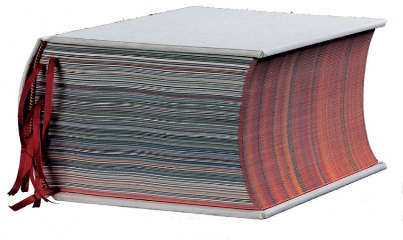
Can you elaborate a bit on the SHV book? [This was a commemorative book for Dutch multi-national SHV. Five years in the making, it had 2136 pages set in no specific chronological order.]
It was a very complicated book to make. It was a book that started in the present and went back. Archives do the opposite. They start in the past and move forward. We made the book from the present to the past, which is another way of thinking.
What lessons can a general book designer learn from your SHV book, admittedly an exceptional project?
You must look at the context of the book first. The SHV book had a patron who said we could do anything we liked, a CD, a movie, a book. What I personally learnt was process; interviewing all the people in the book myself, learning how to look through archives, editing masses of information so that it has a context. This is what I learnt, not only collecting material - everybody collects - but also doing something thought-provoking and interesting to somebody else.
You have worked with the renowned Dutch architect Rem Koolhaas. Can you elaborate on your collaborations?
I do books for him, for his presentations. Rem and I met after both working on big books - SMLXL came out at the same time as the SHV book. A mutual friend introduced us. We exchanged books. He is a very smart person. When he looked at my book he said, 'Your book is so much more interesting than my book.' [Laughs.]
Coming to a former Dutch colony, were you surprised by what you encountered visually?
I haven't seen much South African design since being here. I must say that I feel strange because the word "apartheid" is something completely different as a Dutch word, and it's horrible. What I have encountered here at the conference is remarkable. There is a hunger for knowledge, people wanting to see things and feel inspired. I am convinced that a design culture will grow out of it in the future. I am sure of it.
Do you think the government should be actively involved in fostering a design culture?
In a way that is what is happening in the Netherlands. The government is supporting a lot of designers. You get an incentive subsidy if you are starting out. Besides that art institutions like museums and galleries are getting money to produce books and shows. I think that is the best way to promote a culture. Personally I don't ask for subsidies. But all of the art institutions I work for are subsidised. I would support the idea that the government help give support.
A practical question; you say that most of the briefs you receive are uninspiring. How do you go about brainstorming a brief?
If I get stupid briefs I usually don't do a project. When I meet with a client to discuss a brief I always try to turn the thing around. If someone is asking me a question I try to ask a question in return. It's really important that you speak on the same level as your client. It's great if my client is really smart, like my SHV commissioner or Rem Koolhaas. It's really important to me that I have to work hard to be at the same level as the person commissioning the work, to even be one or two steps ahead of them. That makes it interesting; that's the trick. If there is no challenge or 'uitdaaging', then I just don't do it.

