Over the past few months we’ve been working really hard at Design Indaba to redesign and rebuild our website. In addition to upgrading the software, we’ve been implementing the findings of extensive user research to create a site that is more easily navigable, integrates our cross-platform content better and is overall a more enjoyable experience for our online visitors. Here’s some insight into the changes we’ve made.
A user-centred approach
A big challenge for us is the diversity of visitors to our website. Some seek our creative content offering of articles, videos and image galleries, for insight into global trends in design, innovation and creativity. Others come solely for information and tickets to Design Indaba events. Some want to engage further and get actively involved in initiatives like Your Street and Emerging Creatives. Others still come to shop, to take home the best of South African creativity. Building our new website, we’ve considered all our visitors’ unique needs, to make sure everyone has the best experience possible.
New look and feel
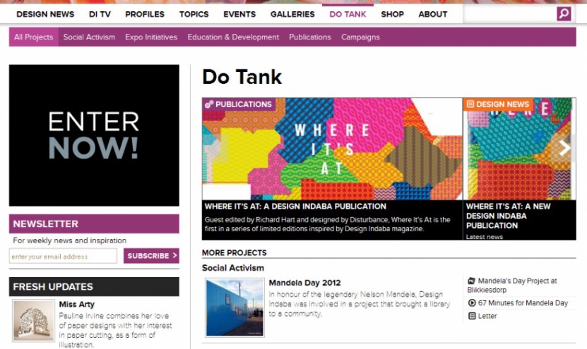
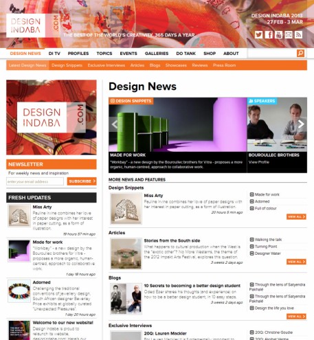
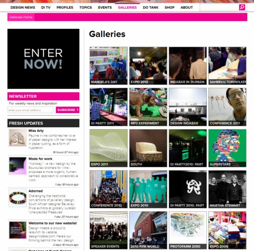
The first phase of our rebuild, launching 15 November 2012, includes a complete redesign of designindaba.com. We’ve brightened up the site to give it more character and colour-coded sections to make different areas and types of content easily distinguishable. While we were at it we made designindaba.com its own new logo, which you’ll see on the website masthead. Beneath it is a brightly coloured skin that will regularly change to feature different artworks, photos and campaign images, keeping the website fresh and updated all the time. Finally, we’ve put a lot of energy into smaller things like our new webfont, the styling of blockquotes and hyperlinks, new icons and buttons, site feedback (what happens when you mouseover or click on things) and a new gallery viewer that lets you view images in full screen, bigger and better than ever before. The devil is in the details!
Mobile-friendly videos
We’ve also ensured the site is accessible to all digital devices, with a big focus being one of our proudest offerings – our large selection of bespoke video content, branded DITV – to ensure you can watch our videos on any phone, tablet or computer. Our new video player loads in HTML5 first (flash second) and offers each video in multiple sizes, detecting the best quality video to suit the screen resolution, internet speed and operating system of the device you’re on.
Highlighting our archives
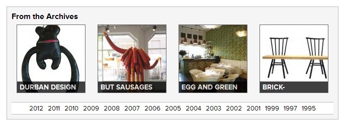
We produce a lot of online content. Up to five items a day, for the last four years. Design Indaba magazine articles, which are also all on our website, go back the last ten years. Our directory of designers, highlighting our conference speakers and expo exhibitors, dates back to 1995. So it’s really a no-brainer that we’ve created a new archive system on each landing page so you can get lost in the creativity of a few years back – it always retains relevance.
Navigation and content integration
The main criticisms of our old website were that it was hard to navigate, and it was too “silo’d”. You could land on our events pages and not know we had any videos, and vice versa. So we’ve tried to rectify that by improving on our navigation and integrating our content better. Here are some details on that.
Conference, Expo and Events
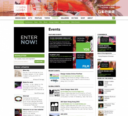
While Design Indaba is world-renowned for its Conference, Expo and other events, we realised that for a content website, our navigation was too event led. Our navigation bar rectifies that by merging Conference, Expo and Events into a single menu, simply titled Events. (You’ll still find all the information you need on the Conference and Expo, just on a new page – not that much has changed!)
Profiles and Topics
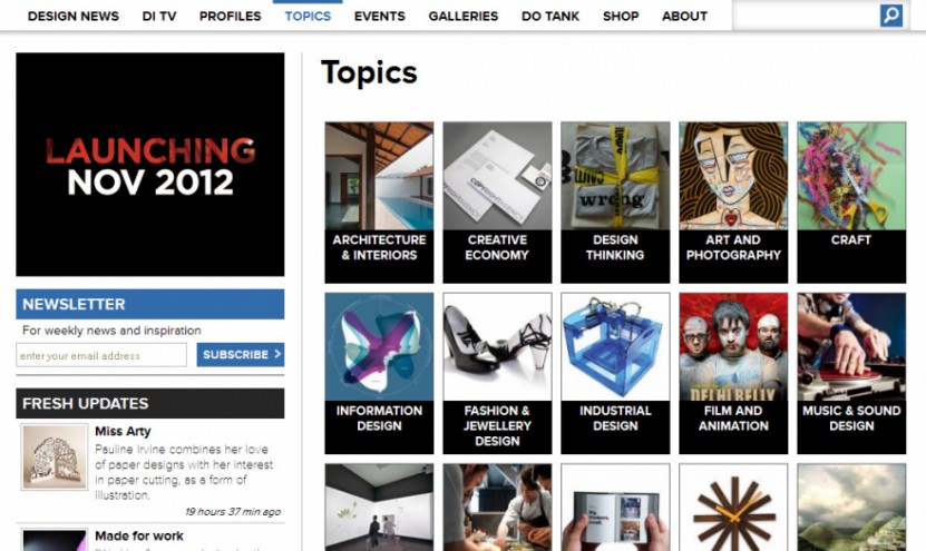
We also noticed people were searching our site for specific designers and creative figures, as well as topics, like product design or illustration. So we paid heed and added two sections to our primary navigation, Profiles and Topics, making it that much easier to search according to your interests. In addition, we’ve integrated “related content” sections onto news and video pages, so that you can easily find more about the person or topic you’re exploring, right from the page you’re on.
Do Tank
This newly named section is a capsule of information and interaction with Design Indaba and Interactive Africa projects, initiatives, publications and more – for those who like to get their hands dirty making the world a better place. Rather than going through the news or video sections, you can go straight to Do Tank to find out anything about a specific project.
Home page
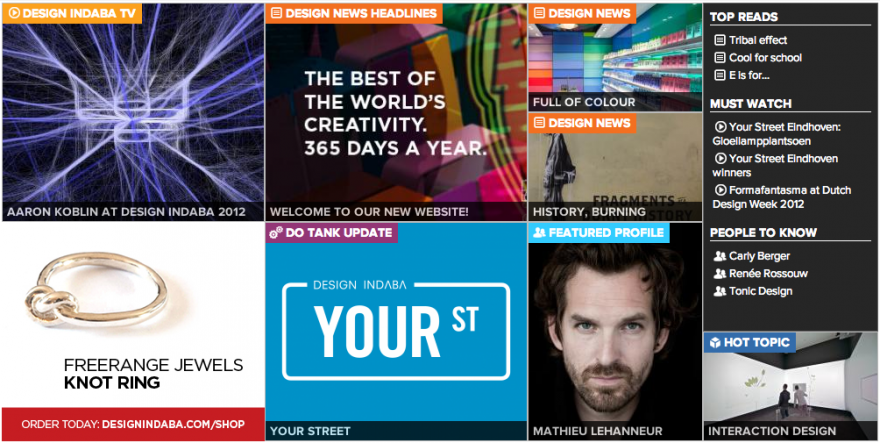
The culmination of all this, our new Home page gives a better overview of the website’s offerings, so become more of a bouquet and less of a feed. It now showcases content according to featured topics, people, projects and events, and not just by format and time. This means the diversity on offer is obvious at first glance and we can cater for all of our visitors and their different needs, and not just a small percentage.
Ticket sales and registration
We’ve timed the launch of the new site with the date that Design Indaba Conference ticket sales and registration opens online, 15 November. From this time onwards our web traffic traditionally escalates to host up to 350 000 unique visitors. So we’ve built a system that can handle the influx, and simultaneously ensure you all get to experience our vast array of creative content designed to inspire, inform and delight you, 365 days a year. Without encountering any error pages if at all possible.
What’s next?
A website is never really finished and we still have more ideas to implement, like remodelling our merchandising system, integrating an app or two and fledging out the responsiveness of the site a bit more. We’re allowing time for testing and feedback too, so you can be sure to experience more improvements to the website in the coming weeks and months.
Please send us your feedback by leaving a comment below.

