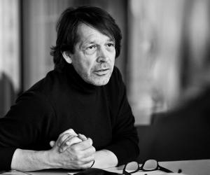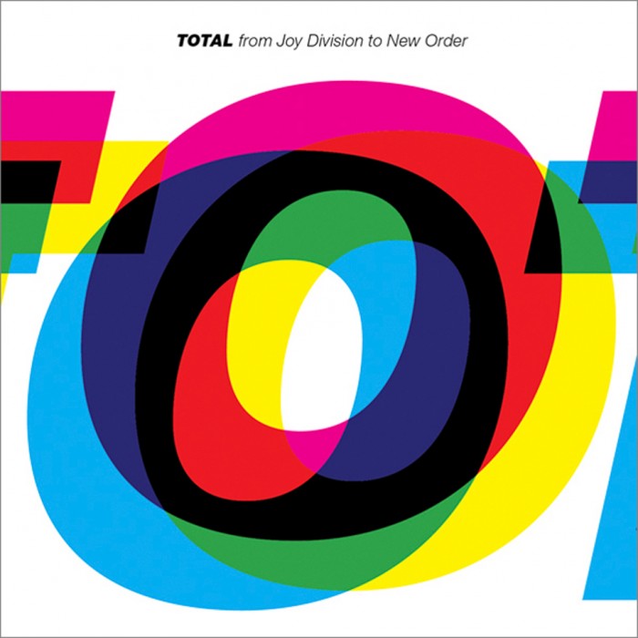
Peter Saville and Howard Wakefield of Studio Parris Wakefield worked together on the design and artwork of a new music compilation, TOTAL, featuring the sounds of Joy Division and New Order.
The duo were keen to capture the essence of both Joy Division and New Order and realised this by using upper case Helvetica Heavy Italic. This decision served as a typographic reference to the artwork on previous albums of both groups.

At first the word TOTAL was made to fit onto the front cover. But Saville and Wakefield decided that there was too much white space and decided, instead, to have the word running off the page on both sides.
Wakefield explains that “O” was the sexiest letter, and the only one that appears in New Order, Joy Division and TOTAL. Zooming into the “O”, the other letters were able to wrap around it.

