From the Series
Stefan Sagmeister is an Austrian-born, New York-based graphic designer and typographer. He is the founder of the design firm Sagmeister & Walsh Inc. that specialises in everything from print to digital and animation.
Here’s a look at some of his most recent projects:
The Happy Show
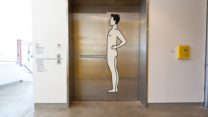
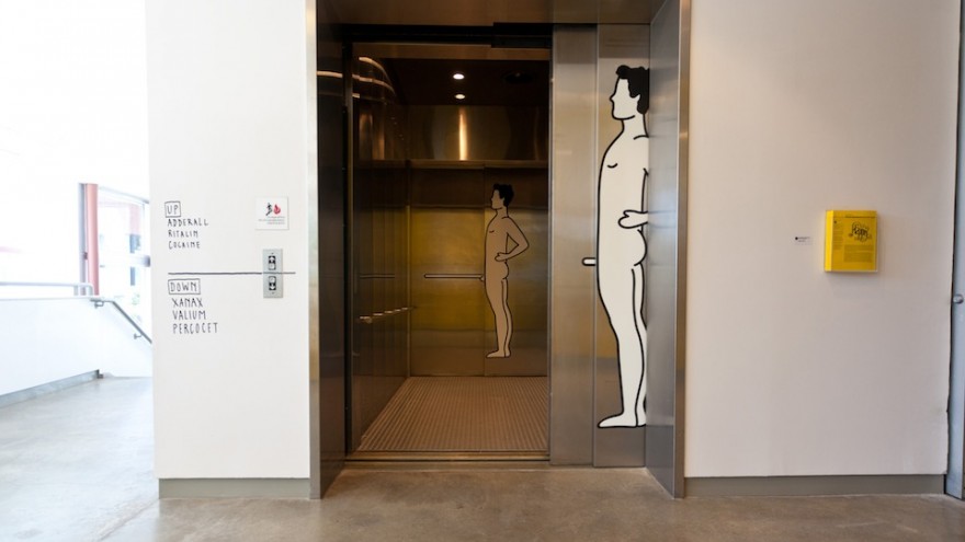
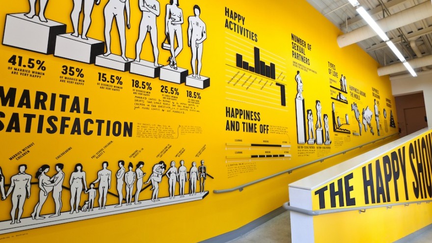
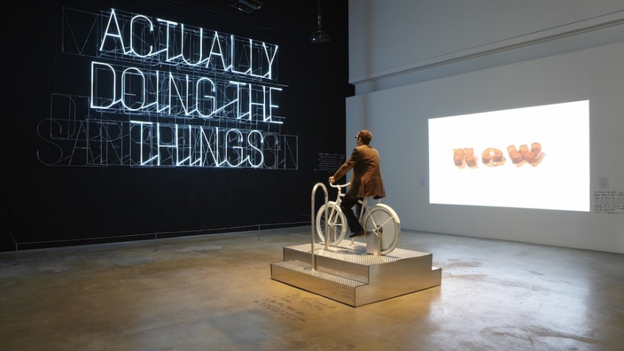
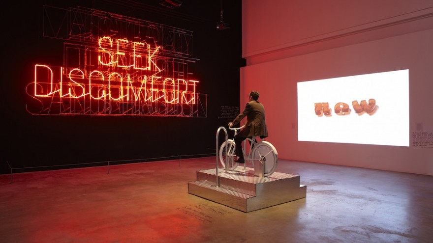
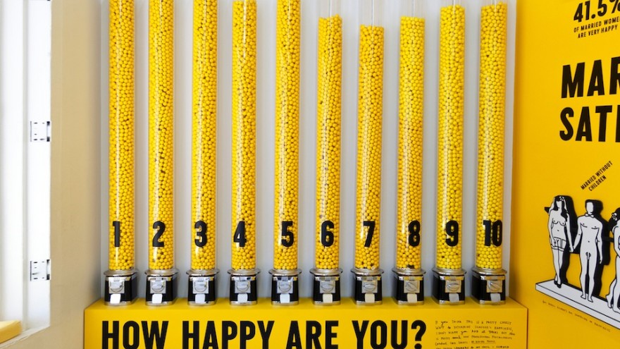
What makes us happy? This is the question that Sagmeister explores in The Happy Show an exhibition at the Institute of Chicago Art that includes various interactive pieces such as a gumball graph of visitors happiness levels. The exhibition offers visitors the chance to gain a glimpse into Sagmeister’s mind as he attempts to increase his own happiness via meditation, cognitive therapy and mood-altering pharmaceuticals.
Story
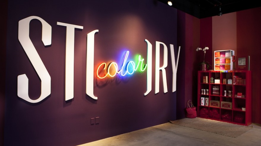
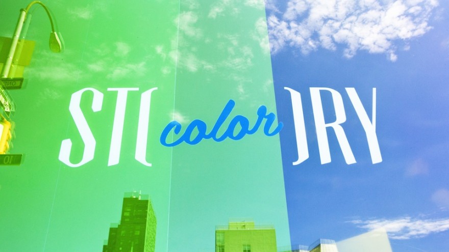
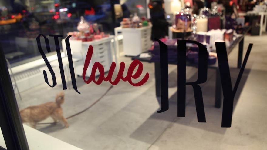
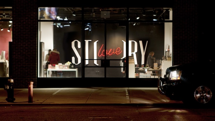
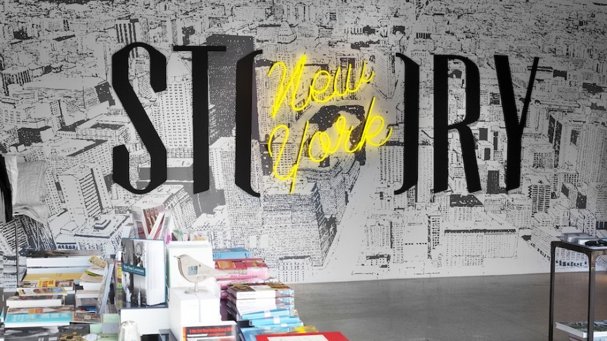
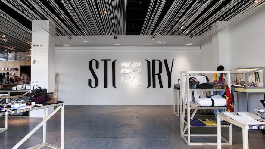
Sagmeister is responsible for the identity and logo design for Story, a store in the meatpacking district of New York City. The project is an on-going one as the store changes its theme every six weeks. The word "story" is sliced in half to create a bracket-like space to hold the name of the current theme expressed in a gigantic 3D logo on the centre wall of the store.
Standard Chartered Commercial
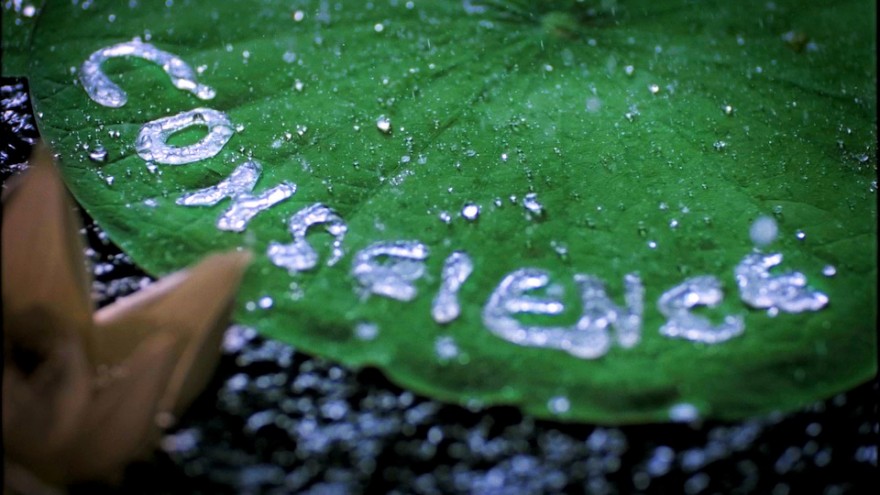
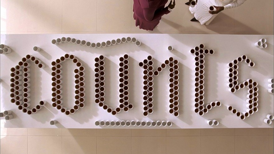
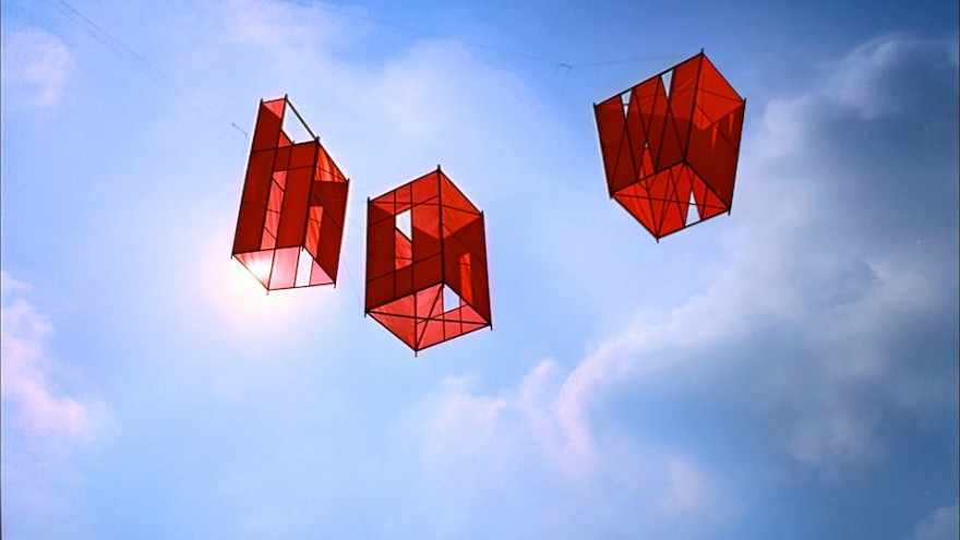
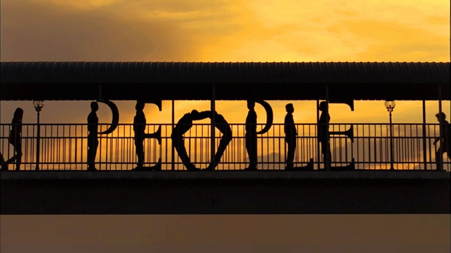
Sagmeister created a 60-second advert for Standard Chartered, a conservative and socially conscious bank. The advert takes its typographical approach from countries including Asia, Africa and the Middle East to demonstrate that a bank doesn't have to be a cold impersonal space but rather an inclusive place for all.
Halftone Satisfaction
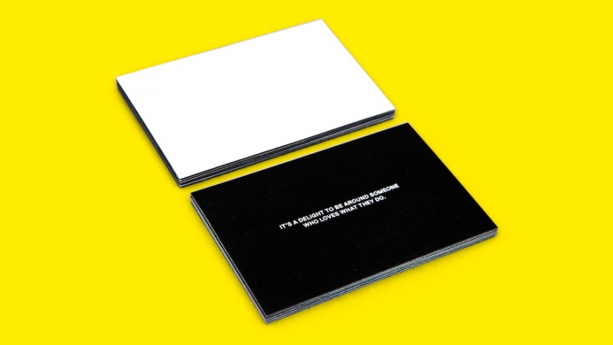
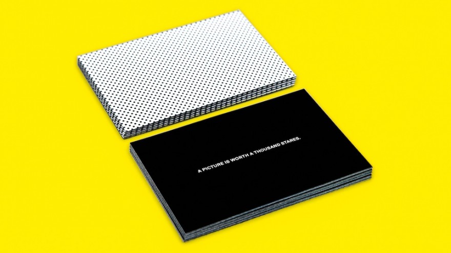
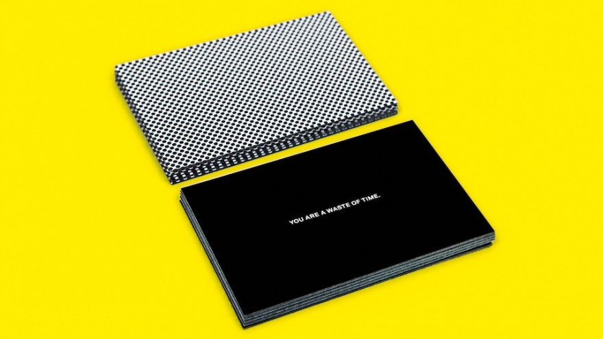
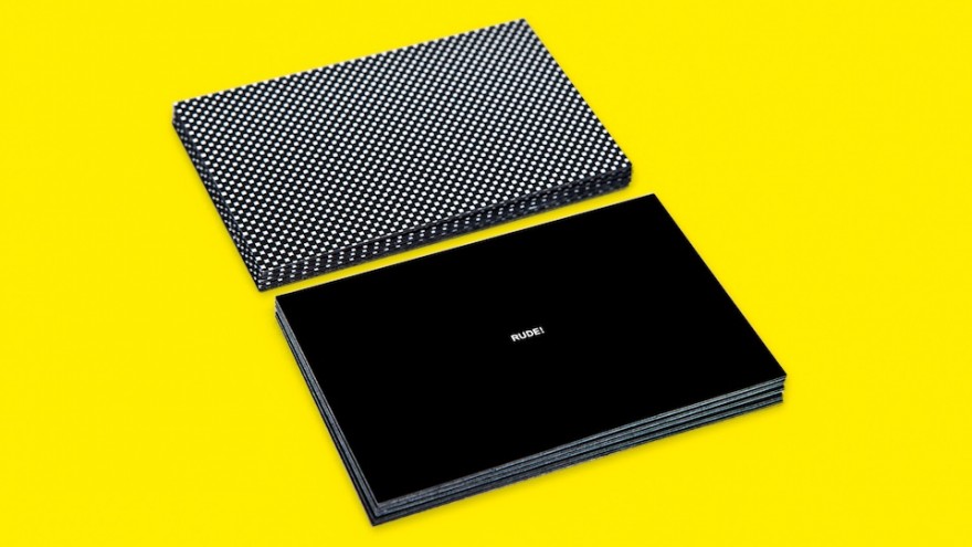
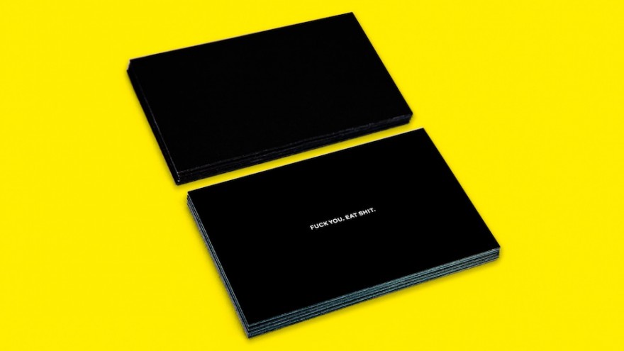
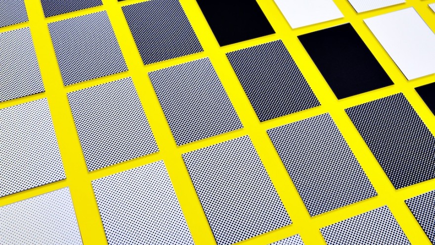
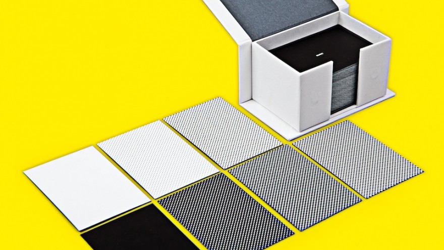
The Halftone Satisfaction project saw a collaboration between Sagmeister and moo.com in the creation of a set of cards. The idea is to hand the appropriate card to people who either annoy or delight you.The front of the cards are solid black with a message such as “you are a waste of time” and “a picture is worth a thousand stares”. The backs of the cards have a black pattern that builds from mostly white for the brighter sentiments, to a solid black for the darkest messages. The proceeds from the project are donated to New York’s Coalition for the Homeless.
Abstract
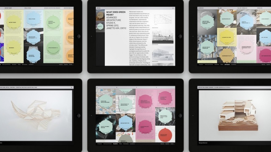
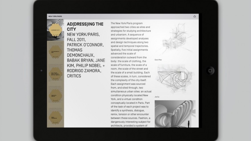
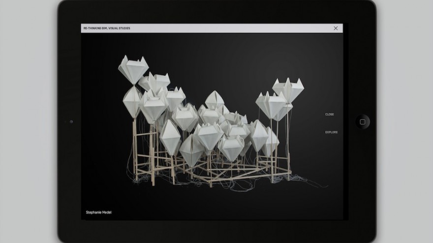
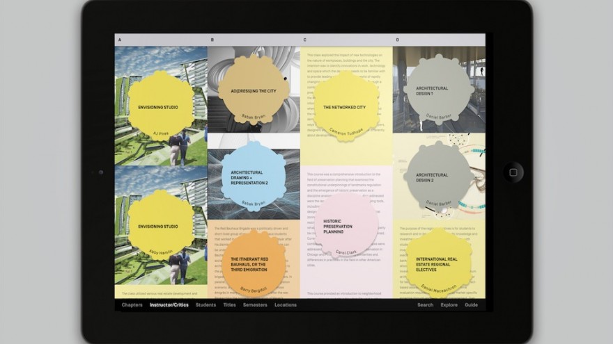
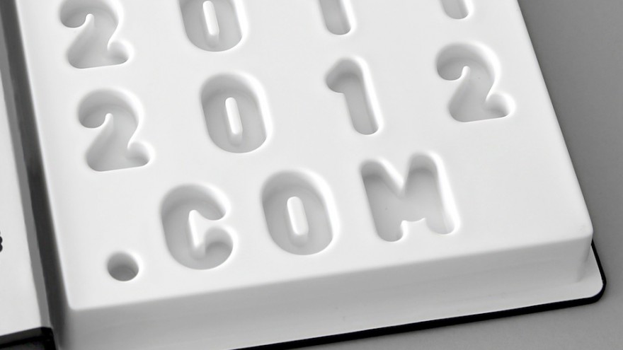
For the 2011/12 annual of Columbia University's Graduate School of Architecture, Planning and Preservation, Sagmeister designed an empty box made to look like a printed book that contained nothing but a download address for an iPad app. The idea speaks to how people have, and are increasingly moving to digital means and methods.

