Part of the Project
First Published in
Garth Walker doesn’t look much like a graphic designer. He’s over 35, wears chinos and a faded red cardigan, and uses an ordinary office chair. But this is a fine disguise for one of South Africa’s most prolific and subversive graphic designers: Walker is both the director of Orange Juice Design and editor of Ijusi magazine, OJ’s radical alter-ego. I’m visiting Walker in his modest studio off noisy Berea Road in Durban to discuss the magazine and his upcoming exhibition at the Saint-Étienne Biennale in France in November.
Ijusi is a ‘zine that Walker has been bringing out since 1995, hoping to encourage local designers to look inwards instead of to Europe and the United States for inspiration. “It’s not to say that Ijusi has convinced every graphic designer that they need to revaluate their work in the context of Africa,” Walker tells me, but its confrontational content makes it popular with anyone bristled by democracy’s patchy delivery post-1994. In an industry focused on designing a coffee table that stands on its own coolness, Walker admits that design for social comment is still a small movement.
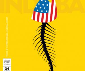
Paging through the newest Ijusi – “South African Stories” – one finds design, photography and writing inspired by and interpreting local culture: muthi-markets, street-side barber tents, and the signage of day labourers seeking work. With Ijusi, Walker has doggedly cultivated an authentically South African style that is beyond the “proudly South African” point, focusing on topics intended to provoke. Often inverting mainstream messages, the magazine is a novelty here and overseas, and its three-part collaboration with Bitterkomix was recently acquired by MOMA’s permanent design collection in New York.
Even though Walker is one of a handful of South African designers with a truly international presence, his work is less motivated by recognition than by the necessity to establish a new visual language for the country – a task that requires commitment from all sectors. “Business talks about the need to be more African and reflect the society in which we operate but they don’t put their heart and soul and money into it,” says Walker.
Instead, he notices that the country’s new elite takes direction from the West, suggesting that “all the emerging markets want to be a super Paris/London/New York… Everything is global brands, so they’ll buy a Jaguar even if it’s a crap car because it’s a Jaguar.” Brand slaves are rife in South Africa – you know what he means: BMWs, Johnny Walker whiskey, Von Dutch bags anyone?
“There is that sort of thing happening in graphic design too. Our target audience is the people of Umlazi and Soweto but brochures look like they come straight out of Milan,” Walker goes on. “Ironically the rest of the world is looking to us to be African, and they’re endeavouring to be African because they are looking for new visual resources themselves. I foresee the time when some Swedish multinational is going to do its annual report in the African style and we’re gonna miss the boat…”
So what is African design? Walker’s looking into it. Literally. With camera in hand, Walker traverses sections of Durban most white guys wouldn’t dare drive. He’s in search of Indian drag racing and Zulu memorial sites, anything that suggests the mixed-up hybrid identity that Walker believes makes South Africa so compelling. The material uncovered on these meanderings often appears in Ijusi as is, not sterilised in any way. For him, it’s imperative to take a hard look at the so-called “African Renaissance” and move beyond simplistic notions of Africa, pervasive here and abroad.
“People want to see lions from the safety of their Land Rover but they don’t really want to see the lion eating the zebra,” continues Walker. “The naked Zulu dancers are fine but then you end up with xenophobia, pangas and burning tyres, and people are like, hello, that’s not in the brochure."
By relating it truthfully, Walker bears witness to South Africa’s living history and demonstrates that even by highlighting some of the country’s ugliness, he’s sensitised to what South Africa is and could be. It is exactly this that informs Walker’s approach to his exhibition for the 2008 Saint-Étienne Design Biennale.
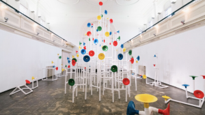
Working from the theme of Africa in 2036 (chosen by the festival as it is a twin calendar year of 2008), Walker deferred from depicting “people running around in silly outfits, playing on their cell phones that can also poach eggs”, rather showing a hardcore futuristic Africa in all its glorious wretchedness. Inviting two other South Africa designers – Wilhelm Kruger and Brandt Botes – to help fill an exhibition space that could fit a few kombis, the work is an indictment of the continued platitudes that perpetuate the myth of Africa. Taking a hair-raisingly cynical approach, the work engages directly with what the three perceive will still be threats in 18 years time – the spread of HIV/Aids, the never-ending war on terror, the hustling nature of the new political business elite, the self-perpetuating weapons trade, and the neo-colonialist economic power of China and India.
Walker, Botes and Kruger employ a number of fictional characters to vitalise the politically incorrect narrative: Jabu Ndlovu, a young Zulu designer and disillusioned activist; the Betrayed Boer, a right winger for whom everything went up in smoke; and the Cynical Columnist, a French African from Senegal who’s living in France because the mother country didn’t deliver the dream he thought it would.
The Jabu character takes the lead, representing the South Africans of all races who tend to forget about the struggle, romanticise the benefits of apartheid and generally feel that their expectations have been sold out. Walker explains: “By 2036, the G8 will have become the G13, including South Africa. We would have sold out and become complicit in the exploitation. What I’ve learned from conferences in Africa is that we’re not liked by the rest of Africa – South Africa’s not seen as part of Africa, we’re this imperialist power that’s busy fucking them over. The food, the booze, the motorcars, the banking – it’s all us. Who’s gonna be the big beneficiary in Zimbabwe? Us! Our power, our water, our goods! So we’re smiling. But I don’t think Jabu’s bitter, I think he’s just having a go, a bit of a smile.”
Turning the mirror to the West, Walker also critiques his host festival, the Saint-Étienne Design Biennale. “I discovered that Saint-Étienne is now primarily a textile region, having gone from arms to textiles, and I created a classic African print based on Saint-Étienne’s arms history. It’s quite subversive because it’s pretty to look at. I sent it over as the sort of tack that I’m taking and there was heart failure. But I let the curator fight that fight,” Walker grins.
After all, despite the inherent indictment of South Africa in Walker’s work, this country still remains the land of the free. “I’m not too fussed about being perceived as a griper. I wanted to do something about radical religion in Europe that would wind them up, but I’ve got a wife and kids back here, and I don’t want a Salman Rushdie situation,” he concedes.
At the end of the day, it remains safer to challenge the rosy lenses of 1994 African rebirth. “Until Africa actually looks at Africa realistically and truthfully we’re not gonna get anywhere. We keep finding blame elsewhere and at some point we’ll run out of apartheid, colonisation, emerging markets, etc, and realise that we’re responsible and that we must fix it,” Walker concludes.
CORPORATE STICK UP
Feeling a bit overwhelmed by all this new visual language and empowering design talk, I ask Walker to tell me about his corporate work. Walker has a wife and two kids and activist graphics rarely support a family lifestyle.
“The commercial work we have to do is driven by market forces and has nothing to do with ‘Africa’…” he says quickly. But it does. Besides paying for Ijusi, Walker’s commercial briefs can be as informative on the country’s social trends as his more “creative” projects.
Take, for example, the commission to design the logo for Blue Shield Security, a private security outfit contracted by suburbanites who make up the wealth in the sentence: the world’s greatest wealth disparity. The project motivated him to begin documenting the vernacular security companies, including the multilingual “beware of dog” signs stuck on to remote-controlled gates everywhere.
“There is a whole sub-culture that’s based on this kind of military, SWAT team approach and it ties into this fear factor we live with, the illusion of security and the belief that you’re only safe when you’ve got security personnel, an electric fence, armed response and a dog,” Walker observes.
But his insights on the security thing haven’t just inspired him artistically. When Walker tells me that Orange Juice plans to relocate because of burglaries, it becomes clear that crime isn’t simply an imagined hysteria. Still, I get the sense that Walker partially understands why burglaries occur and that in a way he’s turned on by the extremities of the city and nation.
“That’s what makes it really interesting,” he says energetically. “Creativity works best on that edge where you could fall off into the fires of hell, not where you’re safe and comfortable. You can buy a Land Rover – you can get anything here that you can get from anywhere else. But then, you drive the Land Rover out of the showroom and have some guy stick a gun in your ear and you’re dead because he wanted your shoes, never mind the car.”
As for the logo, Walker modelled the blue and white shield on the American-style sheriff badge and adorned it with slightly hypnotic zigzags suggesting either a bullet-hole through glass or carefully planned Zulu beadwork.


