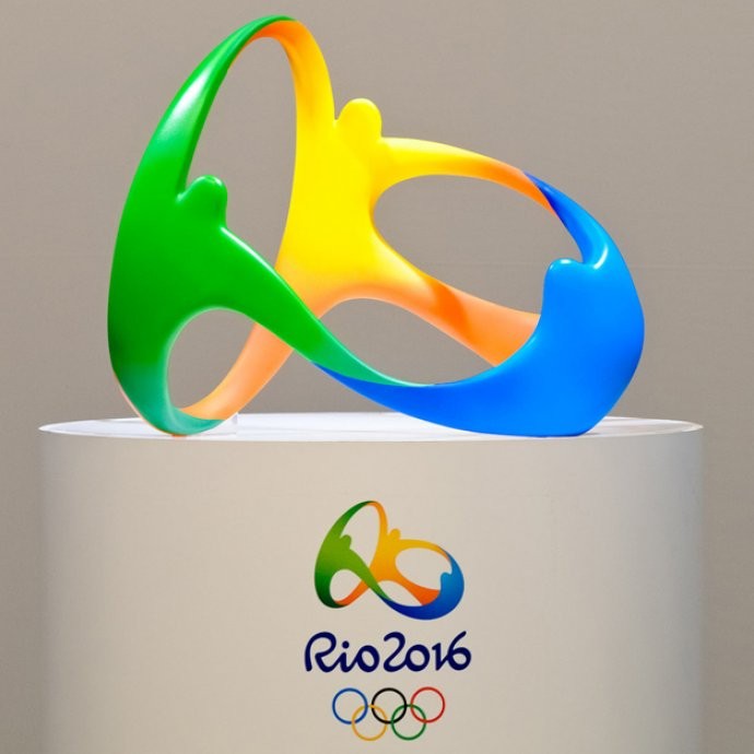
Designed by Brazilian strategic consultancy Tátil, the logo for the 2016 Olympic Games in Rio de Jainero was recently revealed.
The logo translates the Olympic spirit while the three embracing figures represent human warmth, passion and transformation. Tátil’s objective with the design was to mix volume and form, and light and shade so that the logo would work easily to facilitate brand interaction, by popping from paper to become a tangible object.
The yellow, blue and green colours are a reference to the Brazilian environment, with blue expressing the fluidity of the water and the easy-going way of life while green represents the forests, a spirit of hope and moving forward, and yellow translates to the sun and warmth. Viewed from a slight distance the logo’s embracing figures form the word Rio.


