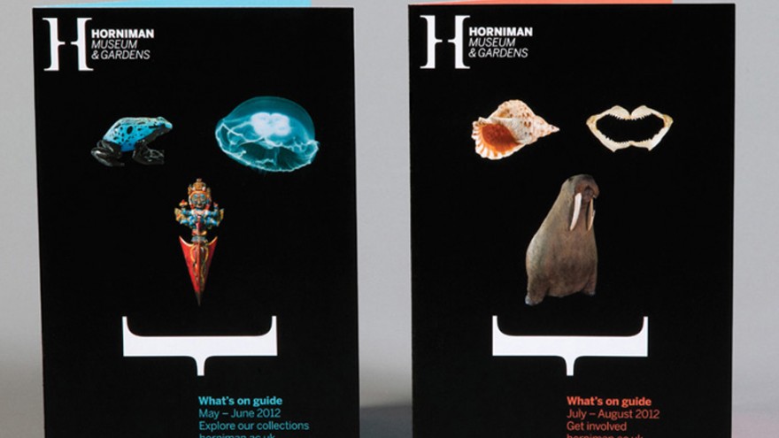
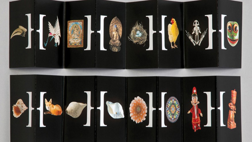
A “collection of collections” was the starting point for Hat-trick’s rebranding of the Horniman Museum and Gardens in south London.
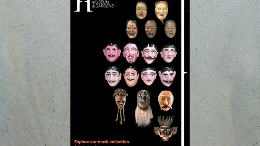
Rather than dividing things into categories, the Horniman houses anthropological artefacts alongside musical instruments, alongside an acclaimed aquarium and a natural history collection.
An important part of the museum rebranding was to ensure that the environmental graphics reflect the new unified experience of “pleasure and education” that the museum offers.
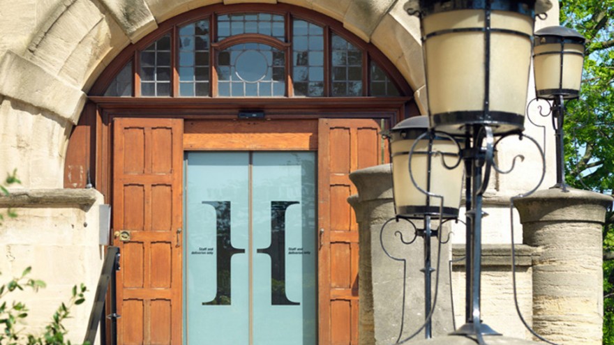
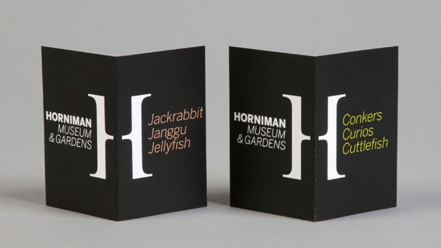
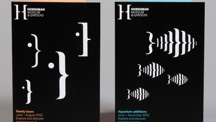
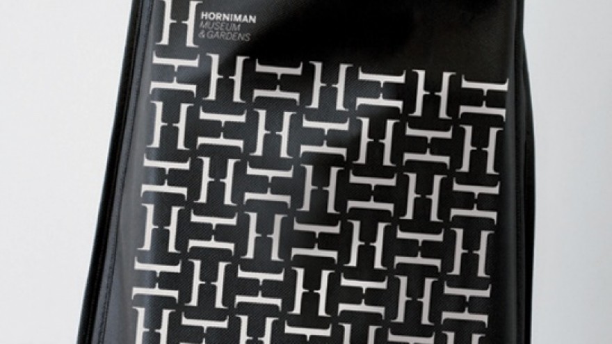
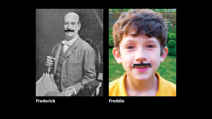
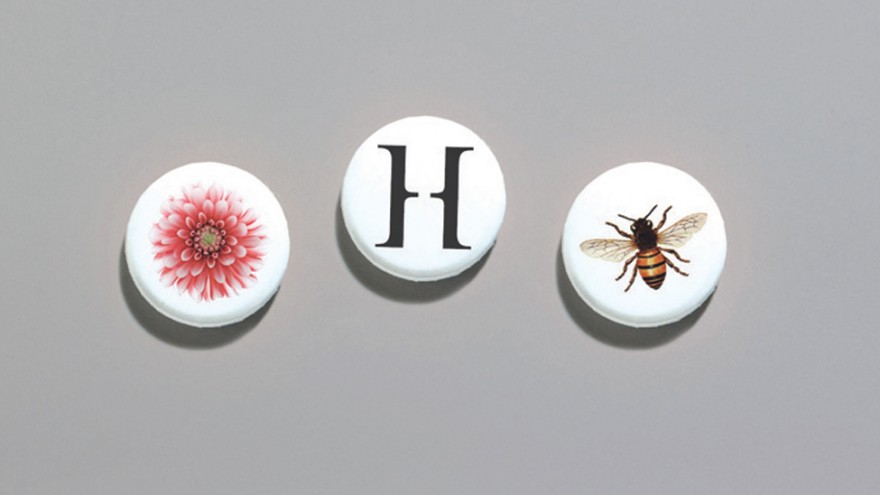
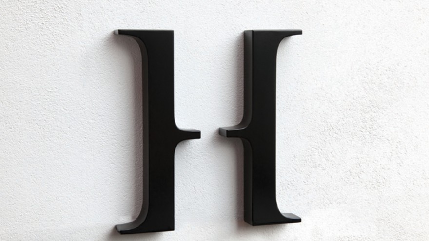
Hat-trick started with the idea of a bracket device and reimagined it to create the distinctive H mark.
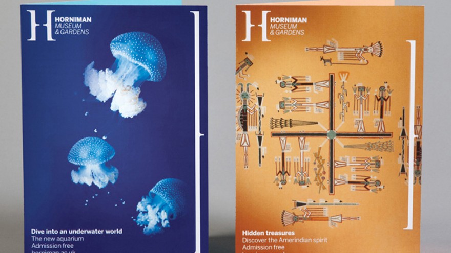
The thinking behind this mark was that it is flexible enough to be suited to all the collections and facets of the organisation – it can be used in imagery and editorial.
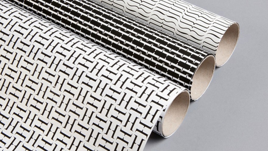
Keeping the colour palette simple, black and white form the core colours of the identity while a range of fresh, bright colours complement the black and white tones, where appropriate. A clean, modern typographic styling further enhances the simple, flexible look and feel.
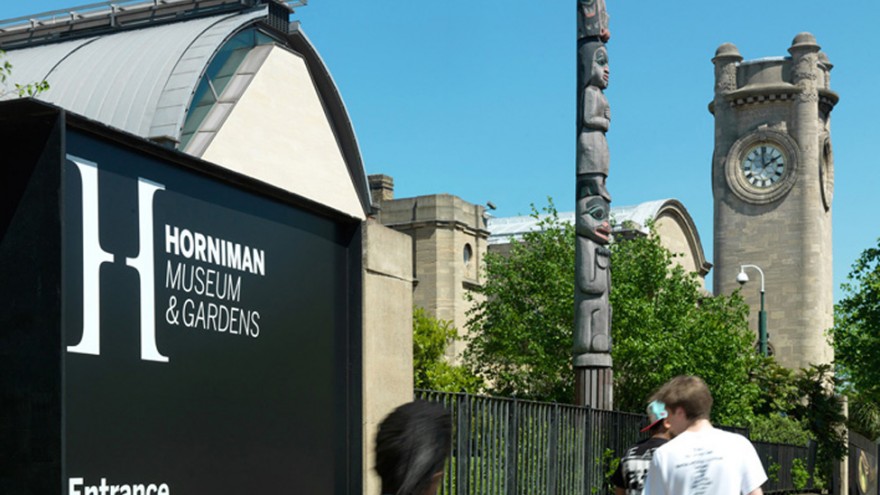
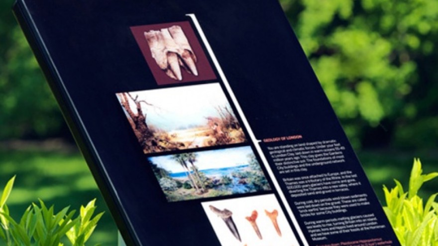
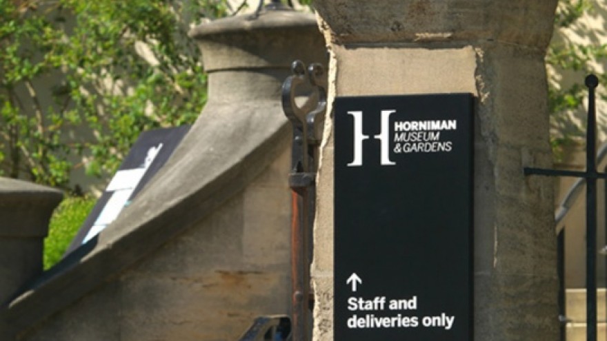
Hat-trick also designed the wayfinding and external signage around the grounds. Here the wayfinding works to highlight the connections with exhibits inside the museum.

