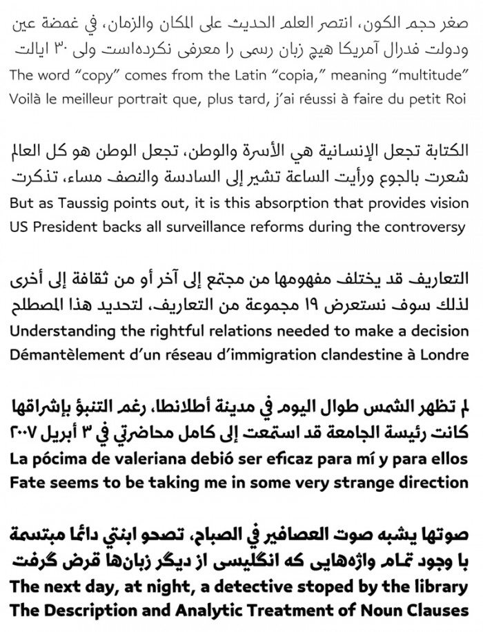
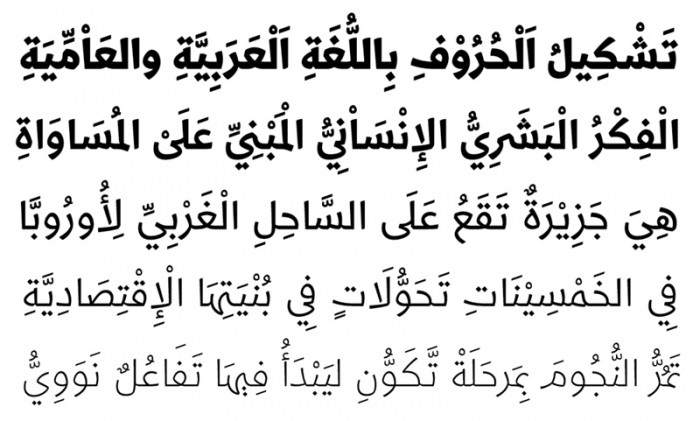
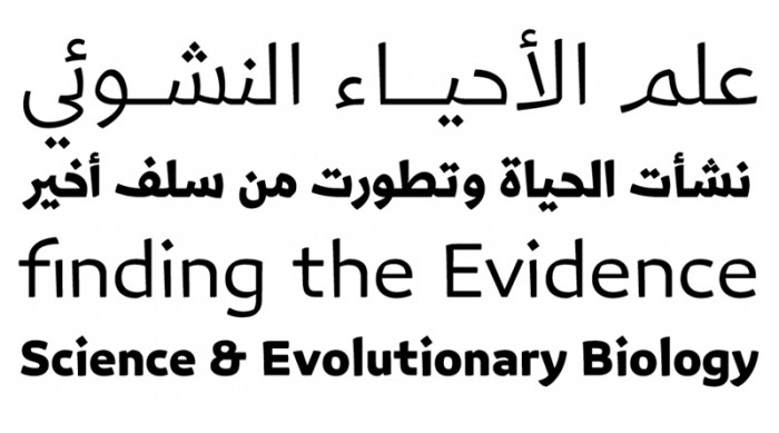
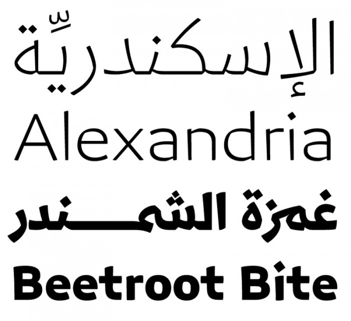
Wael Morcos has co-designed a new family of fonts that can be used in Arabic and English, and includes Latin variations for languages such as French. Called Azer, its design is approachable without being sloppy, serious without being conformist.
"Azer in Arabic means friendly, ready to assist and lend a hand," says Marcos. Azer combines simple lines with careful detailing, allowing it to be realised in various languages.
The Lebanese graphic designer worked on the font set in collaboration with typographers Pascal Zoghbi and Ian Party. Morcos, who has an abiding interest in preserving Arabic typography, has previously designed bilingual typefaces.
“The typeface retains a balance between calligraphic angular cuts and unadorned construction,” says Morcos. The Arabic typeface is a blend between Naskh, a specific calligraphic style for writing in the Arabic language, and a distinct pattern taken from a traditional Kufi, a brimless, short and rounded cap worn by men in Asia and North, East and Western Africa.


