A scary health reality in the UK is that prostate cancer kills more men than any other cancer.
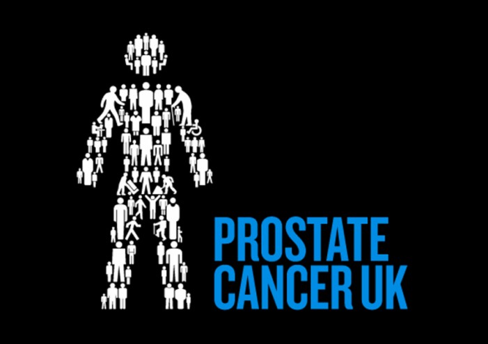
Prostate Cancer UK is the largest charity working with this cause and now the ogranisation is benefitting from a new visual identity, which includes information design, thanks to Hat-trick!
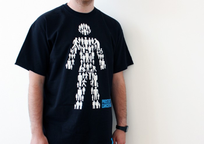
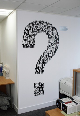
Hat-trick created new identity for the organisation in the form of a “man of men” icon that represents a man composed of many images of men in different settings and positions.
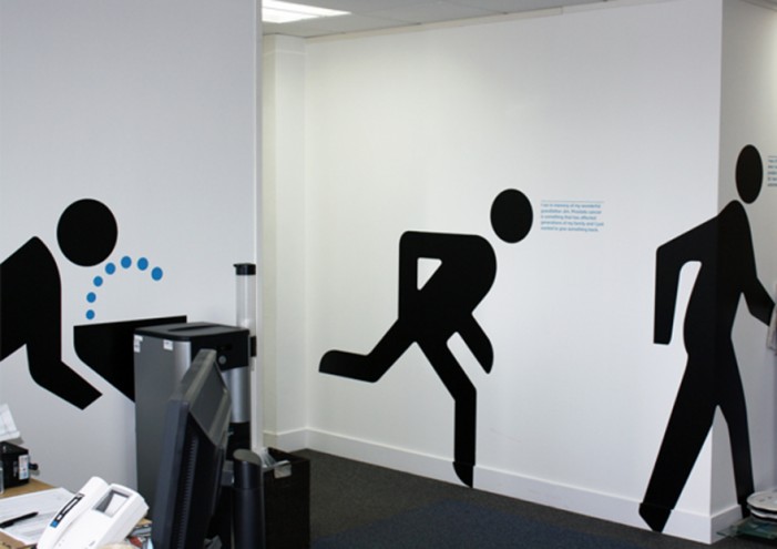
Jim Sutherland, one half of the Hat-trick duo, explains that “rather than create a new symbol of a man, we decided to use all the existing symbols; crossing the road, workmen, toilet signs etc”.
He adds that the idea with the symbol is to communicate that the disease affects all men, from all walks of life.
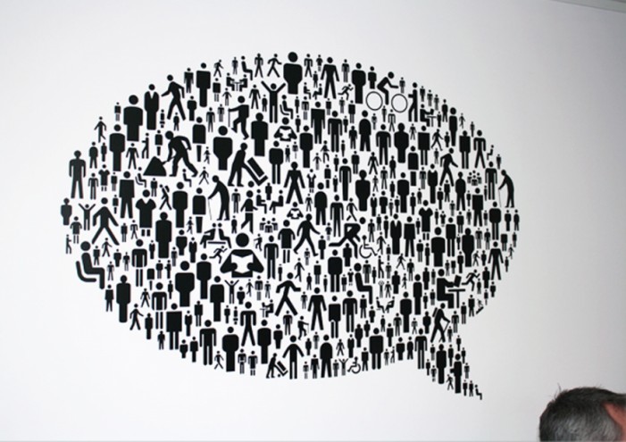
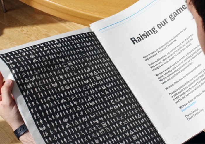
The men in the symbol can also be used separately to draw various shapes and symbols.
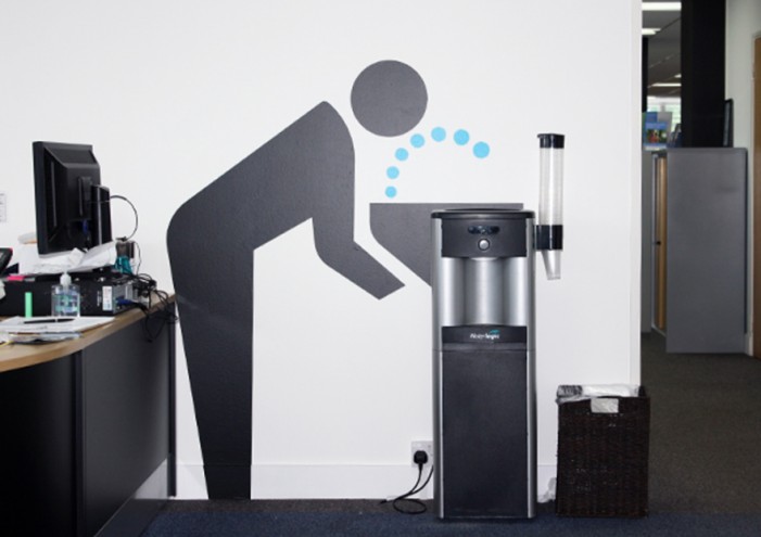
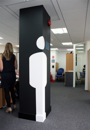
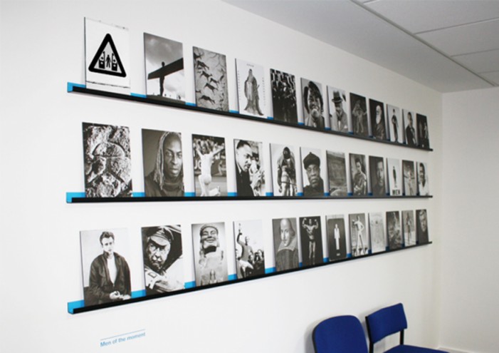
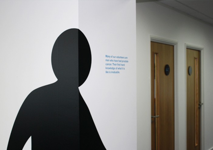
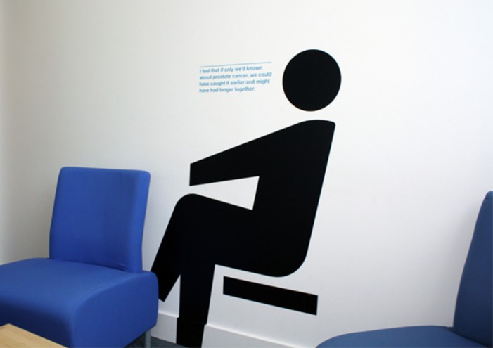
Prostate Cancer UK’s offices have been furnished with life-size symbols of these men, together with a wall of photographs of iconic men. There is also a clock in the office that serves as a reminder of the fact that every 15 minutes a man is diagnosed with prostate cancer.
Hat-trick also worked on the information graphics, diagrams and charts for Prostate Cancer UK, with informative information about the signs and symptoms of this cancer.


