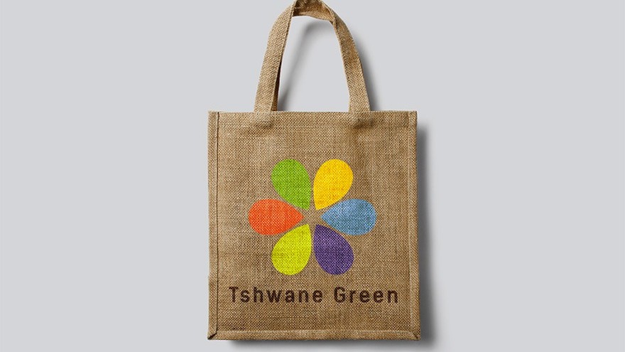
Muizenberg-based design studio K&i Design Studio has created an identity system for the City of Tshwane’s campaign to promote a sustainable and green living environment. A simple six-petaled flower, the logo alludes to the various segments of the city’s campaign to establish itself as the leading green capital in Africa. Each teardrop-shaped “petal” can also function on its own depending on the programme’s focus area.
The City of Tshwane bases its principles on the United Nations Environment Programme’s definition of a green economy: “One that results in improved human well-being and social equality, while significantly reducing environmental risks and ecological scarcities.”
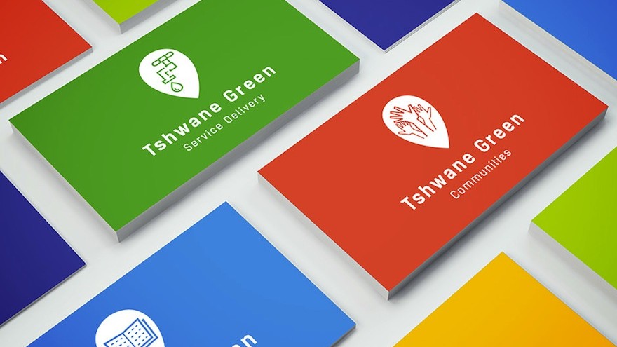
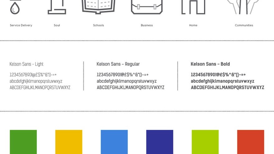
The “Tshwane Green Project” is divided into six segments: service delivery, soul (or faith organisations), schools, business, home and communities. Husband-and-wife team Karl and Ida Mynhardt designed simple icons for each segment, framing these in a teardrop shape to stand alone or to come together as the entire project’s flower logo.
Booklets for each segment educate citizens on the different ways their city can increase sustainability and how they can get involved in their city’s shift towards a green economy.

