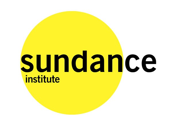
Bold, iconic and memorable, Paula Scher’s new identity for the Sundance Institute is based around the simple form of a bright yellow circle.
Pentagram’s Scher has created a flexible identity system for the Sundance Institute, founded by actor and director Robert Redford, which can be customised for the Institute’s many programmes and initiatives.
Drawing on the simple shape of a bright yellow circle, the identity’s bold motif plays on the name of the Institute.
The circles of the identity can be used to form series and patterns, as well as shapes, images and gradations, keeping the dynamic nature of the Institute intact. In communications like brochures and the website, the identity can be combined with stills from thousands of films and plays supported by Sundance.
The colourful identity appears in bright yellow and is accompanied by two variations in shades of mustard and warm orange. The new identity also sports a new typeface, Trade Gothic.
Scher further designed the graphic identity for the 2014 Sundance Film Festival using the same graphic motif and colour palette.
The Sundance Institute is a global non-profit organisation that advances the work of storytellers in a variety of disciplines. The Institute is best known for the annual Sundance Film Festival but also provides a resource to thousands of independent film, theatre and music artists through its year-round labs, programmes and initiatives including the Feature Film Programme, Documentary Film Programme, Theatre Programme, Creative Producing Initiative, Film Music Programme and many more.


