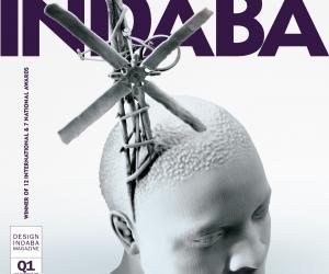
First Published in
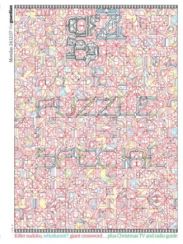
Whimsical, feisty and just plain beautiful, Marian Bantjes’s work has escaped the confines and conventions of style and genre, unfurling like a long, gorgeous ribbon, among many strands of visual communication.
With a solid background in typography and illustration, and loads of experience in design, Bantjes has taken her work from an island off the west coast of Canada to the global stage. And we are the richer for it.
Born in 1963, Bantjes began her career in visual communication as a book typesetter for 10 years (from 1984 to 1994). From 1994 to 2003, she worked as a partner and senior designer at Digitopolis in Vancouver, creating designs for corporates as well as educational and artistic organisations. In 2003, she went solo in order to pursue her own projects and ot od since then that she has come into her own.
Labels one wants to stick to her tend to slip off. As a visual designer, she has tackled a variety of media and multiple projects. Most often praised for her delicate handwork and ornamental style, her work is personal, fluid, looping and intense. Working in vector art, glitter, fur, ink, oil, dirt, sugar, pencil, watercolour and more, Bantjes is following her bliss – carefully, obsessively and exquisitely.
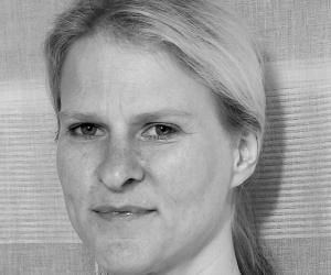
Fiona Zerbst: What techniques and formal values have you learnt from typography? How has it formed your style?
Marian Bantjes: Possibly too many to accurately list: when you know something really well, it’s hard to define or quantify what you know. But I am aware of the influence of structure on my work.
As a typesetter, 20 years ago, I worked on books, which is a very structured, rule-bound environment. That carries through to my work today, though it’s not always evident. Also, just knowing quite a bit about letterforms – although this is something I still consider myself weak on – has helped make my work be... well… a lot less sloppy than that of many other people’s.
Your influences seem to be predominantly those people, objects, buildings and artists that have surface as an independent value. How important is surface and the techniques that make it up?
I am an image maker. That is, as opposed to a “conceptual” designer, or someone who relies on process or the user experience as an interactive thing. So, in that sense I’m all about the image/the surface.
But within that there is often a complexity that goes beyond the immediate image. I like to make things that need to be figured out or pondered in some way. As such, there is some kind of intended “experience” that goes beyond the first impression.
On what basis do you choose your projects? You seem to have the luxury of choice, which is always nice. So where do you start?
It comes and goes. Sometimes I just accept everything, but then I start running into trouble: maybe the clients are asking for something I don’t want to give, or maybe we’re not communicating well, or maybe I’ve taken on too much and I get tired... and then I switch and reject everything.
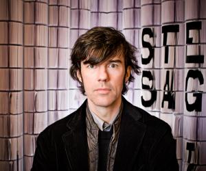
I’ve come to recognise the signs of the good and the bad. Good projects come from people whom I know and trust (such as Michael Bierut at Pentagram or Stefan Sagmeister), or which are fairly open in the brief.
I look for people who are hiring me for something new and unexpected. People who are willing to trust that I can figure it out and make the right decision. These people will give me little to no direction. On the opposite end, I am increasingly wary of people who say they like my “style” (which one would that be, I wonder). I’m nervous about those who send me selected images from my website for direction, and I outright reject anyone who sends me images of someone else’s work.
I prefer people who tell me what their budget is up front, and like them even more if it’s a healthy sum – though I will trade a smaller budget for creative freedom provided it’s not advertising or a large client. I know when people have the money and I get very pissed off when ad agencies or well-known brands approach me with small budgets! I’m prejudiced against Canadians and Canadian companies (I very seldom work for people in my own country).
These days, I’m in a difficult space because I outright reject almost anyone who asks for anything pretty or swirly. It doesn’t mean I’ll never do it again, it just means I’ll only do it if I decide I can find an interesting way of doing it. Mostly I hate to be bored, and repeating myself is usually boring, which is why I really need people who are willing to take a leap of faith with me.
Which are your favourite materials to work in, if you had to choose?
I can’t say. It depends on what I’m doing, what effect I’m trying to get – and I’m always trying new things. I really don’t have a favourite. But if I was stuck on a desert island, I’d die without a pencil.
What has been your most satisfying project to date?
Well, I think my best work is the Sustainability poster, which was done over a year ago. The Design Ignites Change poster was also very satisfying – maybe even more so than Sustainability, as the proceeds went to a good cause. And of course the Creative Review monograph, Love Stories, was very satisfying because it was all personal work.


