

Freedom of expression, in one form or another, is probably the driving force in nearly every creative discipline.
The individual techniques and methodology of creatives are often highly praised and respected – the rules are there to be broken, or at least challenged.
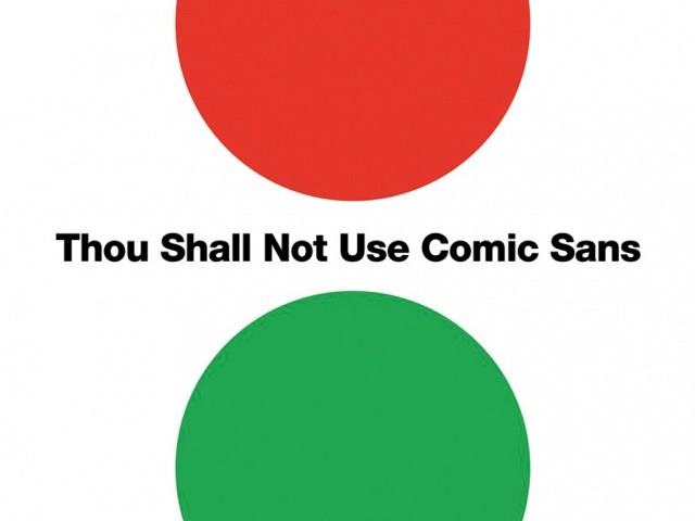
This may all be true yet when it comes to graphic design there is at least one rule/guideline that is widely agreed-upon as best avoided: Thou Shall Not Use Comic Sans!
This rule is also the title of a book by Sean Adams, one half of the AdamsMorioka creative duo. Avoiding the Comic Sans font because it “is arguably the most inappropriately used typeface in history” is commandment 001 is the book with “365 Graphic Design Commandments” – one for every day of the year.
Light-hearted and fun, the book is a collection of dos and don’ts about achieving graphic design best practice. The commandments are clearly organised in various categories, including layout and design, colour, imagery and graphics, and production and print.
The commandments range from the obvious ("Thou shall learn the difference between a typeface and a font") to the funny ("Thou shall not use beige to attract attention") to the guarding of the industry ("Thou shall allow a photographer or illustrator to input creatively whenever possible"). Though much of the tone is light-hearted the graphic jargon ensures that it is definitely one for graphic design enthusiasts, amateurs and professionals.
While there are many don’ts in the book there is one very interesting do: “Thou shall have a foreword”, and one by Stefan G Bucher no less. Here Bucher reminds the reader that for rules to be broken, you need to know and understand them first.


