Posted 10 Oct 11
By Design Indaba
Graphic Design & Illustration
Creative Work / Design News
Comments
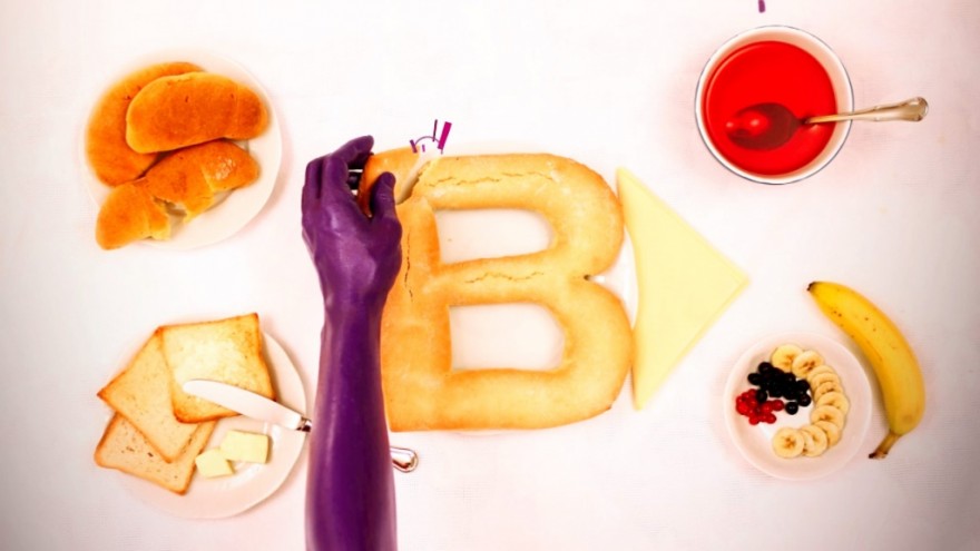
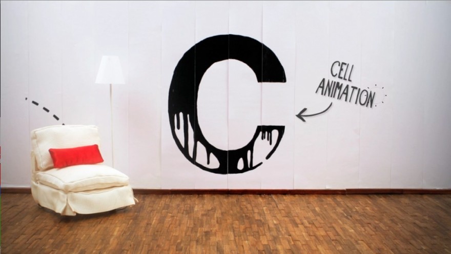
A is for “anamorphosis”, B is for “biscuit” and C is for “cell animation”.
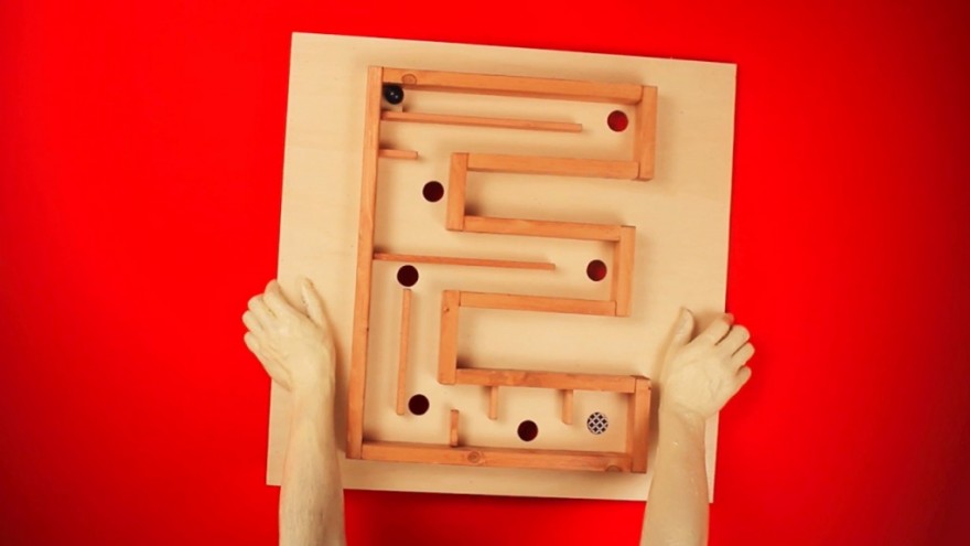
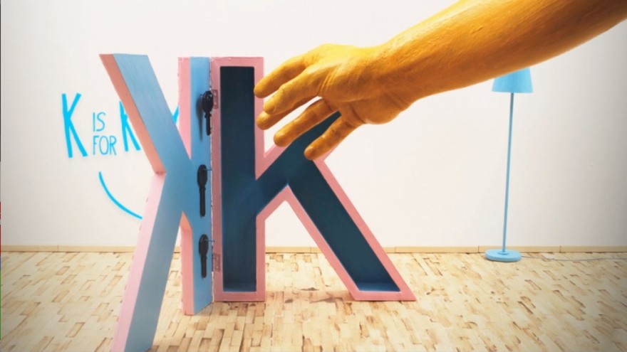
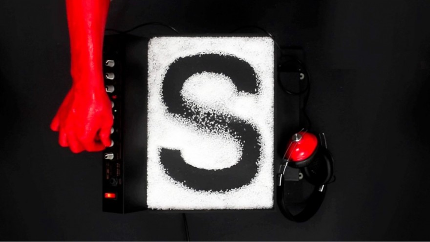
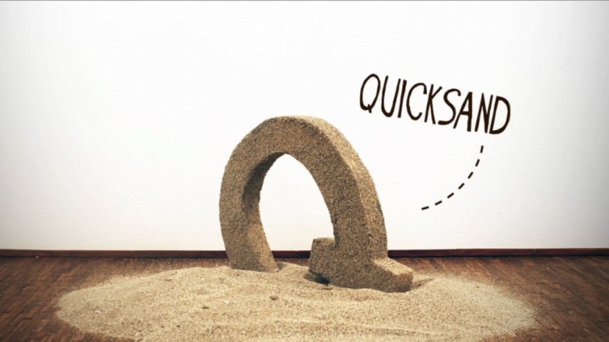
Italian creatives N9ve have taken the alphabet, using unusual fonts and playful typefaces to make a short stop-motion animation in which each letter of the alphabet becomes part of a scene involving a word that starts with that letter.
The Alphabet 2 project uses a series of Helvetica letters to teach kids the alphabet but it’s also a great way to amuse adults.
Take a look at the video:

