First Published in
The question most frequently asked of me throughout the week, concerned how from my experience, I thought this group of students compared to others in the UK, or elsewhere in the world. The second was about my first impressions of Africa, and more specifically South Africa, both now and in the past. As the workshop progressed the first question became increasingly easier to answer, the second was always difficult, and remained so.
Even as I came to know more I was always reminded of how little I actually do know or understand. I was aware of how little I had seen or experienced, and consequently how my views were, and continued to be, merely snapshots pieced together in a muddled and ill-informed way.
Happily these two questions reassured me, in a quite unexpected way, that the challenge I had set (to consider the identity of South Africa as portrayed in the design of its currency and its postage stamps) was an area of debate which was still very much on the agenda, despite any of my previous qualms. These two questions demonstrated to me that there is a genuine concern that the rest of the world gets to see the 'real' South Africa. The real South Africa is what these students feel they know and that perhaps the rest of the world does not. The 'real' South Africa is one they are proud of, despite troubles past and present, and clearly want to be able to show in its best possible light.
What I was really hoping was that the students might be able to stand a little outside the question, by being asked to come at it from a different position. Currency, which on the one hand is familiar to all, ironically allows us, by the very normality of the medium, to phrase the familiar question of identity in a suitably unfamiliar way. Currency is a basic cultural "language" common to all South Africans and to the rest of the world. I sensed that this familiarity is easily overlooked, yet the paper and metal in your hand is both the language of daily life, and one of the principal means by which cultural information may be readily conveyed to the rest of the world. Luckily, the students tackled the question with obvious relish, the question is one that concerns them as South Africans and the graphic challenges excited them as designers.
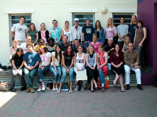
We decided to split students into smaller groups which was a simple enough task as they readily divided into nine smaller units ranging from two to five members. Without this I calculated that there simply wasn't the time in any day to speak to almost forty individuals for any meaningful length of time - only ten minutes devoted to each student would take almost seven hours with no breaks! And a bit of healthy competition between groups would make the task seem more fun. Day one was set aside for initial brainstorming of the project and discussing possible solutions, firstly within the separate groups to establish starting points and basic parameters. Then in a lengthy session later in the afternoon, each group described to the others how they would be proceeding.
Day two found a more sober collection of students arriving in the morning. After the initial joy of hastily-decided potential solutions, the group session the day before had had the desired effect of injecting some semblance of harsher reality beyond any dreamy idealism. Perhaps those first ideas weren't so marvellous, so distinctive, or unique, or practical, after all. The doubts and the questioning had set in overnight, and Tuesday looked set to be a long day. Working with each group in turn, slowly the ideas were revisited and developed, and by the end of the day each felt that a creative pain barrier had been broken and they were healthily back on track again.
For my part I was beginning to harbour a concern that there was as yet little in the way of visual work to look at, and that Wednesday (day three) must be set aside for developing these newly focused thoughts with type and imagery and concrete visual exploration. Expecting to see notes and scribbles become clearly visible as workable solutions, I called for a two hour session at the end of the day where this time each group should be able to visually describe to the others what they hoped to achieve by Friday morning.
There was, of course, a hidden agenda. It became clear to the students even as they talked that these presentations were not really for the benefit of the others, but were necessary in order to focus themselves. If they could describe their design solutions in a few sentences, illustrated with a few "work in progress" drawings, then they were very likely able to deliver a finished product by Friday, if not, it was evident, not least to themselves, that there was much work left to do. As it turned out for at least two groups this was indeed the case, and emergency meetings were called. Better to find out with still one day left to go that re-thinking was required, than to still be in that position the night before the final presentation.
I like to think that all of the groups came away from the Wednesday session with a better, clearer sense of their own tasks, and were therefore able to prioritise and delegate amongst themselves who would be responsible for each component. There would not be time on Friday morning, before the 11am deadline, for anything more than last minute printing, mounting, and detail tweaking.
From a creative perspective the nine groups had found a broad range of individual solutions to pursue. The brief had specifically allowed for different interests to be explored and permitted students to focus on fewer or more particular aspects of the brief if they could demonstrate a clear rationale for doing so. In this way the brief was seen to liberate creative thinking rather than constrain it too rigidly. There were a number of themes common to several projects, but this was inevitable given the focus of the core subject matter. These included the use of transparent materials in order to represent a multiplicity of views, a clearer view, a fresh start, or even a need for political transparency. There was healthy misuse or disregard for otherwise 'obvious' or clichéd imagery. The actual texture of finished pieces was important to give a sense of the down-to-earth physicality of South Africa. An area that excited me in particular was that, from a technology point of view, more than one group wanted to explore the potential reality of a future 'paperless' currency and offered integrated digital and conventional solutions.
The range of ideas was looking very, very strong, but there was only one day left. Where would they find time to complete the challenges they had now set themselves? About this I needn't have worried unduly. Thursday became almost a redundant day for me as I wandered from group to group trying to be of assistance, but for the most part they were all now pretty clear about their objectives and just wanted to be left to get on with it. From time to time specific problems arose, as some aspect or other didn't quite pan out, and then some 'expert' opinion was called for.
Come Friday morning the final presentations were a revelation. The mountains of work had for the most part been done. Even the teams that had seemed doubtful even the night before had come through. The students had all worked late into the night to put together universally cohesive, cogent, and well-executed PowerPoint presentations, supplemented where appropriate with printed materials to show specific details. I had also asked that this be backed up with a written rationale, explaining which aspects of the brief they had chosen to address, and their reasons for particular solutions. The brief called for bold, radical, and above all individual creative ideas. This is precisely what we got, from politically-charged social messages, via the inventive (or simply irreverent) reinterpretation of cultural icons and populist vernacular imagery, through to the abandoning of conventional currency altogether.
Thinking back to those two early questions, I was left with no doubt about my answer to the first. This group of students would happily go the distance in competition with any other institution I knew of anywhere.
The quality of analytical thinking, inventiveness, enthusiasm, sheer hard work, and unflinching tenacity, made working with them a joy. The answer to the second question, I'm still working on, but I took away a full week of rewarding cultural and personal experiences to add to the mix; and a hunger to return for more.
Work descriptions
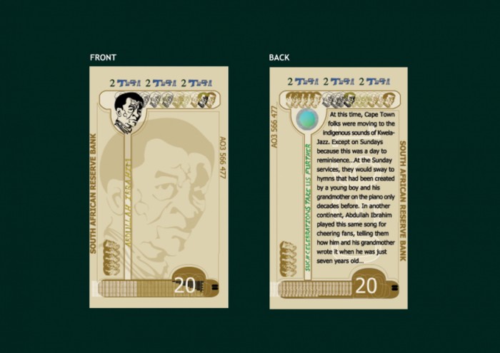
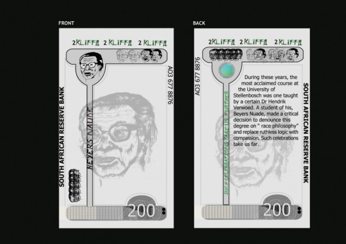
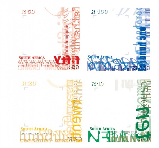
- All banknotes pass through many hands throughout their life span. What I found appealing about the design of these notes is that they use that sense of wide-reaching commonality to tell the stories of local people, who have made a difference in the social history and development of contemporary South Africa. They do this through the the voices of those who may have known them, making the stories more personal still. Although a conventional shape, the notes are rotated through ninety degrees, and thus themselves act as symbolic "portraits" for each of the individuals. It is planned that each denomination feature just one person yet there be a wide range of people to draw on, so that with each issue of new notes new stories can be told, and yet more individuals and their contribution be celebrated.
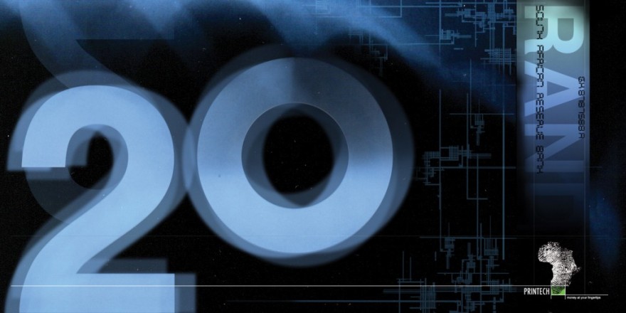
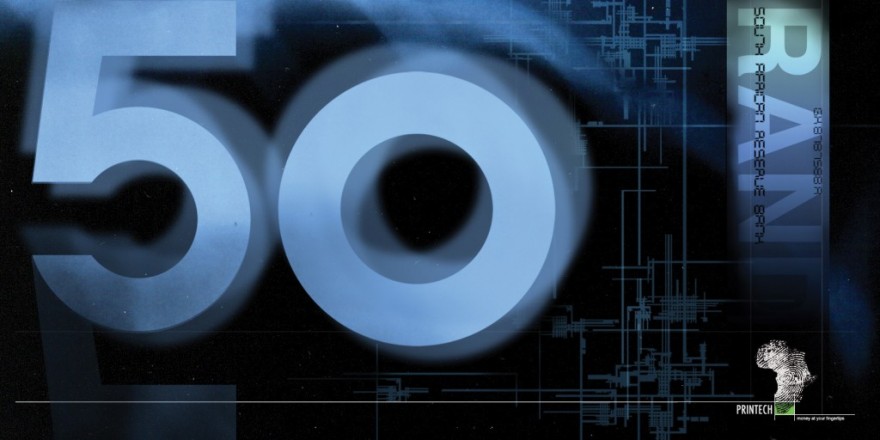
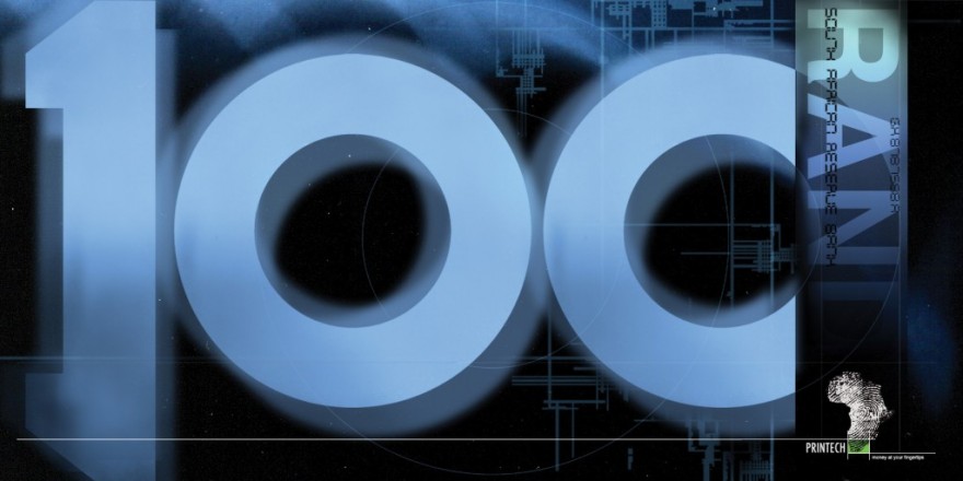
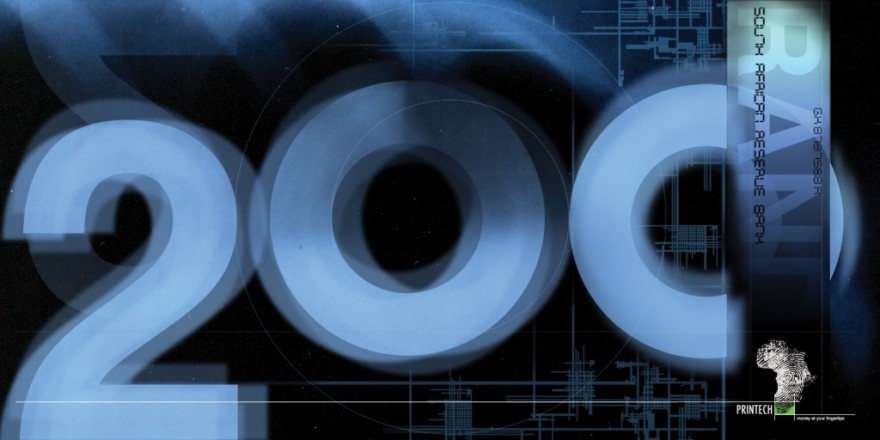
- As a first stage towards a totally electronic method of currency transfer, utilising fingerprint recognition technology, this range of banknotes has a number of notable features. Printed on transparent material they prominently display their numerical values in an ethereal setting akin to x-ray film, and are cleverly designed so that the numbers read the same from either side. Issued by a private banking organisation whose logo is a fingerprint in the shape of Africa the campaign surrounding the introduction of these notes is also a vehicle to introduce the next phase of digital cash..
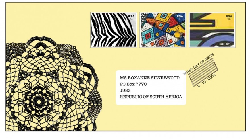
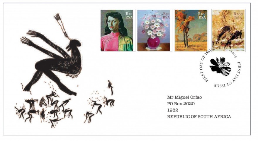
- This group took a relatively conventional approach to re-designing postage stamps, which focuses on and celebrates South African culture from an unconventional perspective. Collections of 'kitsch' images are gathered in four types or themes of South African archetypes, neatly merging the disposable with the deployable.
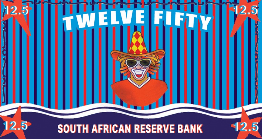
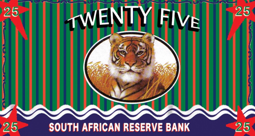
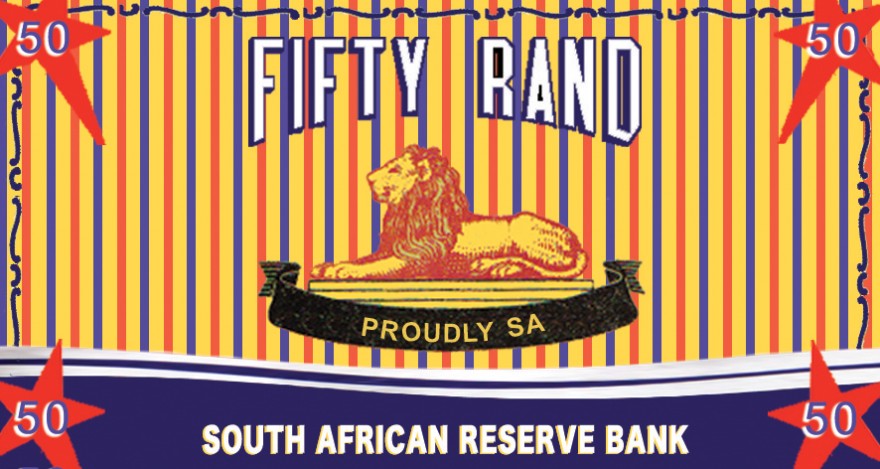
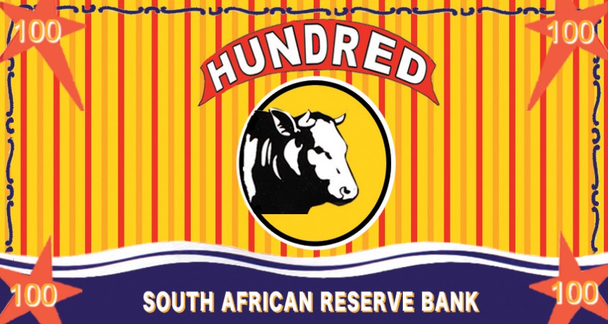
- Making playful use of visual references from across a wide range of well known local products, these banknotes blend traditional, populist vernacular images with a contemporary pop art sensibility in a way that is both fun and reassuringly 'solid'. I particularly liked the humour of the 9.95 Rand note, and was keen to see how the reverse of each note might complement the fronts in a similarly playful way.
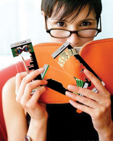
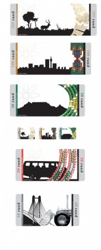
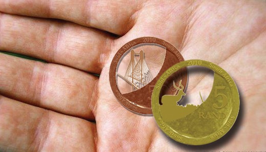
- The use of transparent materials is but one distinctive feature of this range of notes, coins and stamps. Notes are of differing lengths and have rounded corners for ease of identification and storage. They are complemented by transparent coins, transparent stamps, and a whole marketing campaign to introduce the new currency planned for the (transparent) doorways of banks and shopping malls. The imagery of each note explores two vastly different uses of basic materials, such as the wire used for a hand-made toy or a suspension bridge, and is both basic and high tech.
- The use of transparent materials is but one distinctive feature of this range of notes, coins and stamps. Notes are of differing lengths and have rounded corners for ease of identification and storage. They are complemented by transparent coins, transparent stamps, and a whole marketing campaign to introduce the new currency planned for the (transparent) doorways of banks and shopping malls. The imagery of each note explores two vastly different uses of basic materials, such as the wire used for a handmade toy or a suspension bridge, and is both basic and high tech.

