First Published in
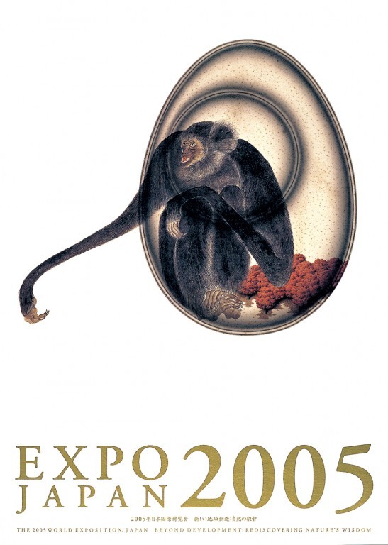
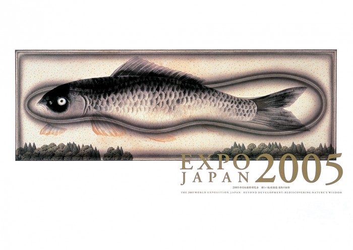
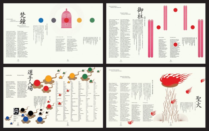
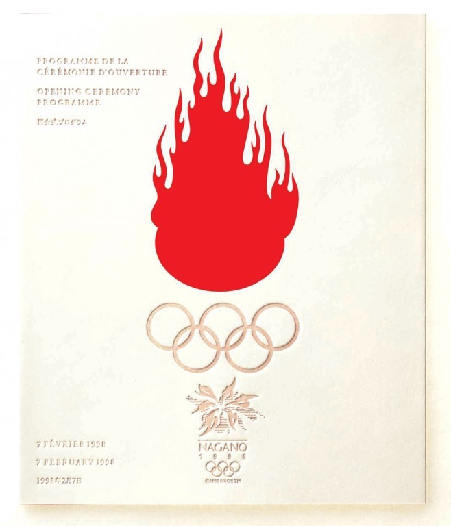
Crisp, clean form and bold primary colours, often dominated by red, characterise his designs, as demonstrated by the programmes he put together for the 1998 Nagano Winter Olympic Games and the promotional material he designed for EXPO 2005 Aichi.
His diverse projects include the remodelling of Matsuya Department Store in Ginzaca and the signage for two Japanese hospitals. Always interested in bringing good design to the public at large, Hara has curated a number of exhibitions, including Architects Macaroni and RE-DESIGN: Daily Products of The 21st Century, and lectured and toured Europe and the Americas.
Hara's publications include a collection of essays titled "Please Steal Posters" and "The Mystery of Macaroni Holes"; a co-authored package design anthology, SKELETON; and the co-authored RE-DESIGN: Daily Products of The 21st Century.
Design Indaba Magazine spoke to Kenya Hara recently, and posed a few questions that were generated by some of our readers. We hope that nothing was lost in the translation.
To the outsider, it seems that Japan takes its graphic artists very, very seriously. Do you concur? It seems to the casual observer that you have a pop star status in your country?
No, I would not say that graphic artists are esteemed more highly than is their due. As a designer, I've been involved in various communication projects. Design is supposed to skilfully perceive problems and then find a rational solution to whatever problems are discovered. Design that functions in compatibility with the essence of things is what interests me. If any branding project or other project of national scope is to be successful today, it must possess design that is subtly functional. In this sense, the role of designers dealing with communication and identification is becoming more and more crucial. But "pop star status" seems to entail some misunderstanding.
"Details of a society can be found in the objects that the society produces," was a quote by yourself a while ago. What can the objects that Japanese society produces tell us about your society?
Thanks to today's highly cultivated marketing method we are capable of precisely scanning the consciousness and desires of the general public.
And so products have become more and more accurate mirrors of the desires of the society or the market. Now we can fathom the level of a society's or cultural circle's desires by carefully observing what is manufactured. For instance, Japanese cars are generally considered to be highly efficient and relatively trouble free. They are particularly consistent in the two vectors of "comfort" and "carrying efficiency."
Our off-road vehicles and leisure vehicles also meet high performance standards. However, if you look at them as status symbol-bearing high-class sedans, their global competitiveness is comparatively weak. From this we can read that the Japanese do not have a strong sense of class consciousness, that most believe themselves to be middle class and furthermore value daily commodities, including cars, on the basis of their functional principles. On the other hand, viewing the Japanese sense of value from another standpoint, I think it is the role of designers to influence the society and the market in a positive and educational manner. The level of design quality is relative to the level of a society's and a market's desires. Therefore, just as we strive to fertilize our soil to produce good farm product, we need to enrich our market. One current project embracing the vision of making things from this point of view is "MUJI". MUJI is an attempt to give birth to a Japanese-style minimalism through a sensitivity that pursues ultimate simplicity in light of the essential and the universal, and involves a decent aesthetic consciousness cultivated in Japan and affecting peoples' consciousness concerning their daily lives.
Explain the concept behind your Project Re Design?
The purpose was to raise a question, "What is design?" by comparing conventional to newly proposed designs. Because the selected objects are very familiar, they will have a huge impact on the audience's consciousness, so that even those with no special interest in design can understand and evaluate the project. The role of design is not to surprise the audience by using an eccentric form or material but rather to design some object that used to seem extremely ordinary and common in such a way that the audience is surprisingly refreshed by it. If we can discover how to revive the ordinary as the unknown, we can reproduce an infinite number of designs from there, akin to the discovery of "decimal fractions" against "whole numbers".
The scope of your work is broad, and covers graphic design, spatial art and product design. What are your current projects about?
There are many terms describing design activities and fields, but design has only one essence. I am perhaps a designer, yet in my case the "er" would represent not a person who is capable in design, "a person who can realize his energies in the concept of 'design'." Like a gardener who sweeps up dead leaves or picks up fallen fruit, I am tending to the garden called design. Only my practical work focuses on the field relating to communication. Presently I am collaborating in the integrated design direction, identity management and advertising art direction based on the new vision for Muji. I am also in the middle of producing the successor to the Re-Design project, an exhibition called the "haptic lab." The initial design motivation of this project is finding a basis for "tactile perception". In addition to these, with some other Japanese designers and architects I am now planning the "Tokyo Design Museum", a project that will manifest itself without depending on conventional physical facilities known as a museum.
Why is it that most of your work is set against an ice white background?
Because I consider colour a function, I never use colours that I think are unnecessary. I use white often because it represents neutrality.
Some commentators describe some of your work as iconoclastic. Would you agree? Do you chase the high-profile national projects like the Nagano Winter Olympic Games and the Japan 2005 Expo or do they find you?
I can hardly agree to such a comment nor understand the viewpoint of the comment. I have no interest in destroying things like the people who often did it some time ago. This means that my meaning is not only found in innovation. We have an infinite future ahead of us and at the same time are blessed with an unlimited number of cultural accumulations behind us. My viewpoint is not to foresee the future a little ahead of the era in which the public is involved but to perceive the future that just a little ahead sustaining the present via the past. In my opinion "creative" symbolizes work that allows for a circulation of both the future and the past.
I was commissioned to design the opening as well as closing ceremony program for the Nagano Winter Olympic Games directly by the Olympic Organizing Committee through the advertising agency in charge of the program production right before its opening. It was unusual for me to concentrate only on the program design, as I had found that the planning for the Olympics was not well organized as a whole. As for the Exposition I had been working as a member of the project team that took charge in presenting Japan's plan to the BIE (International Exhibition Bureau) since Japan competed with Canada and Australia for hosting the Exposition. Since Japan was selected to host it, I engaged in the promotional activity as a member of the design professionals committee. I worked on both projects by request.
Our readers are intrigued with the Japanese form of design - its cleanliness and simplicity of forms and shapes - with typefaces and copy kept to a minimum. Is it a Japanese trend/tradition?
Japan lies on the edge of Eurasia. When this continent is turned round in 90-degree arc, it appears like a powerful upright pinball machine. Balls in the machine popping up from somewhere around Rome all roll down into the hole at the very bottom, where Japan is located, after hitting cultures here and there. That is to say, cultures have been introduced to Japan through each and all routes. Cultures have been transmitted and are still being transmitted to Japan not only by way of China and Korea but also via Russian sphere to the north as well as Polynesian areas to the south. The flow of tremendously diverse cultures into our country is beyond our imagination. I envision that "simplicity" or "emptiness" represents the sensitivity that has been attained by the Japanese people only when they have accepted all these cultures and have managed to maintain a balance among them. In this sense, the Japanese sensitivity toward minimalism is a tradition and a product born amidst influences from across the globe.
The use of red and black is very common in Japanese design - is this connected to the Japanese flag or some other cultural significance?
Both black and white are neutral monotones making a sharp contrast. With those two colours red is used as a functional colour attracting powerful attention from the audience. That's my interpretation of the use of these colours. The Japanese flag has a red, abstract circle at the centre that insures no meaning against the neutral white background.
Although one interpretation is that this red circle stands for the sun, actually it marks the figurative representation, polysemous and abstract, that allows for innumerable interpretations. It probably represents the presentation in order to attract full attention. In this term the colours of our flag shows one Japanese way of applying colours giving no account of any source of foreign cultural influences.
Did your studies begin in fine art and then develop to graphic design?
I engage in design because I like the concept of "design". I used to produce graphics as a neighbour of art, as an experiment exploring the relationship between form and texture in diverse ways. A designer needs to understand the kind of formative talents with which he or she is endowed. To me, work in which graphics are closely related to art has this aspect of improving my skills.
Of all your designs, which is your favourite and why?
My favourites include Muji's advertising campaign series Horizons, the signage system for the Umeda Hospital and the Re-Design Exhibition. Each is directly connected to its simple concept.
You seem to use icons and textures often in your designs - Is this a trademark or an experimentation of style?
I heavily emphasize texture and the sense of touch. A human being is comprised of a bundle of exquisitely delicate sensors. I am working to target this. So it is quite natural for me to value the sensory channels in addition to the sense of sight. I don't need to have a trademark or a particular style for my work.
Your portfolio tends to be very diverse. When you started out as a designer what was your main interest e.g. packaging, publishing, advertising, etc?
I never thought of myself becoming a designer, although I used to entertain the idea of living in company with the concept of design. In the early stages, I had an interest in editorial design. Books continue to be one of my favourite areas.


