


First Published in

"A landmark publication." This is how influential London bookstore Magma describe Fernando Gutierrez's Matador magazine, a leading literary and photo publication from Madrid. "Nobody has ever gone that far in designing a magazine." Gifted with a meticulous design eye and studied respect for editorial content, Fernando Gutierrez is widely regarded as a designer at the fore of contemporary magazine design. Sean O'Toole recently spoke with the London-based Real Madrid supporter.
Your professional biography includes a lot of print design, particularly in Spain. How would you characterise your relationship with the printed word?
It is definitely where everything begins. The written word is a very important part of the design process. The majority of my work is editorial based, and revolves around words. All the rest is complementary. As a designer you have to make those words engaging for the reader, you have to make them attractive. There is a certain magic involved in placing typography, in how that typography has a relationship to the format you are reading. What I try do is make the product readable by allowing the concept to express itself.
Do you think there is such a thing as Spanish design? Or is the notion of regional design something of an anachronism in this era of globalisation?
Hmm … it could be. The Matador project was born in Spain, even if it had an international vision. It would certainly have been handled in a completely different way were it done in Paris, Germany or London. Matador is definitely a Spanish product. But I don't know, it's the spirit basically. Cultures give you different insights into things. Each culture sees a situation in a different way. And that's what is interesting, how people see things.
What prompted you to get involved with Matador, establish yet another print publication?
We were all based in Spanish newspapers, and wanted to do something that worked completely differently to how newspapers worked. With newspapers today's story doesn't matter because you are already working on a story for the next day. This dynamic means that you don't really get to reflect on ideas, or question these ideas too much. You are already on to the next one. It can be exciting to begin with, but after a while it gets monotonous and you end up being part of a huge machine. What we wanted to do was something that was still about reading - but also about seeing. It had to be done in a way that demonstrated a lot of care for the information. [Laughs] The one big thing is that we went from working day-to-day to working annually now.
Were you surprised by the response Matador received, all the generous praise?
Yeah, it was great. And it gives you faith in what you do, belief. When we started out it was all done with this crazy idea in mind, but we didn't know how people would react to it.
Having worked on both Matador and Colors, what do you think defines a successful creative team on a magazine?
Friendship. Trust. Sharing.
You have written quite extensively about Tibor Kalman, even worked with him on the much-lauded issue 13 of Colors. How influential was he on you as a designer?
I was always a big admirer of what he was doing way back when I was still at college. It was fantastic when I first met and worked with him on Colors 13. He always worked with different art directors on the magazine, something very few magazines can do. The concepts he adopted in Colors were quite radical; nobody was doing what he was doing. He managed to perfect the balance between image, content and design. He always used to say design wasn't important, that communication was what was important. But he knew the value and strength of good design. He really knew this and defended it to the end. He could be really flippant, but I think that was just to keep the egos in check.
What was it like taking over the creative direction of Colors after the likes of Kalman and Toscani?
It was great to inherit a magazine that had made such a big impression on the world, not just in design terms but politically. When I took over, the magazine had been going for ten years. The readers had matured, and I thought the magazine had to move on too, keeping a part of the original spirit but also creating a new spirit, a spirit of reading.
The first issue, which I still think is our best issue, set the tone. The editors went into a community, a refugee camp in Tanzania. Since then we have stayed with the idea of communities, documenting how various communities live. What I tried to achieve with the first issue was to make the design look as if it had been run out of a printer, as if there had been no design at all. It looked very raw and basic.
The result was very powerful and moving - even emotional. The reportage photographs were colour rather than black and white. In some ways we changed how documentary photography is treated or presented. Editorially speaking, the result was amazing, particularly the sense of peace,
the integrity.
Some media commentators disagree. They have observed that Colors in its present form is less indignant, more austere. How would you respond to that?
Well, Toscani did what he had to do and he did it very well. It was fantastic. But I just thought Colors was becoming rather repetitive, going down a road that only Toscani could do. I believe that if you are talking about a serious matter, you can't make a joke of it. I don't like being sensationalist either, because that is too easy. I want to make something more neutral, but still talk about the main issues.
What are these issues?
Poverty, immigration, racism; the issues are still the same. What we have managed to do with Colors is focus in on everyday people, showing how normal people are living, how these people from different backgrounds get by in life. It is about showing the contrast without being sensationalist about it.
Looking at print generally, there was a stage a few years back when the whole dot com boom hinted at the death of print. Do you think print is undergoing a revival, or was it never seriously under threat?
I think we basically need to touch things; we still need that connection. Print is still very important because it is tactile. We need to touch things, feel them, keep them, refer back to them. These things are going to take us some time to get over.
How much attention do you give to typefaces?
It is not important for me. I look at new fonts but I am not … there are already so many. I have typefaces that I regularly use, I like them and they work well for what I am doing.
How would you describe your style?
Hmm … it's not what you say but what you don't say. More intensive. I try to give maximum emotional effect in the most simple and direct manner without any claim to authorship. I don't use a specific typeface that I then twist around or deconstruct. I am not interested in being found out, people saying oh that's so-and-so because he only uses that kind of typeface. I always try and create an emotional response, whether it is through a picture, a colour, how I place something. Personally I try stay in the background, it's not about being…
…a celebrity designer?
No, I am not very good at that. [Chuckles]
How has living and working in London influenced your work, particularly the excesses and splendour of the post-Conservative era?
I came to London about a year and half ago, so it's all new to me. When I left London for Barcelona in 1990, London was in a bad way. Barcelona was on a high after the Olympics. Coming back to London now, it seems a lot more cosmopolitan, a lot more open and positive. Creatively London is still very exciting. It is a real boomtown.
Part of the boom is certainly evident in the number of new magazines on the newsstands. What do you think of these new magazines?
Gosh, there are certainly heck of a lot. Over the past two years everybody seems to be doing their own magazine. It's bizarre. Personally I like Mindfield [PO Box 14114, Berkeley, CA 94712-5114]. Despite the fact that there are a lot of magazines, I still think there is space for doing something original. I know it sounds bizarre but there is.
Any thoughts on Spain's performance in the World Cup?
We were robbed.
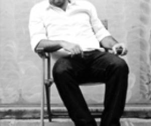
Born in London in 1963, Fernando Gutierrez graduated from the London School of Printing in 1986, learning his trade professionally with CDT Design. In 1993 he joined forces with Spanish designer Pablo Martin, forming the company that would eventually become Grafica, a highly regarded Spanish company that has won many awards from the Spanish Art Directors Club. Currently a partner with Pentagram Design in London, Fernando Gutierrez is currently creative/ art director of Colors magazine. A member of Alliance Graphique Internationale (AGI), he presided over the European Art Directors Club in 1998/9. Fernando Gutierrez will be a speaker at the 6th International Design Indaba, February 26-28, 2003, Cape Town, South Africa.


