From the Series
First Published in
Let's start with your font designs; do you think it is possible that contemporary font design can uniquely speak the concerns of an era?
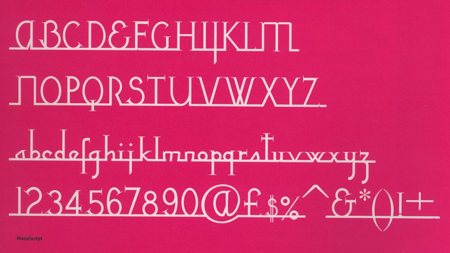
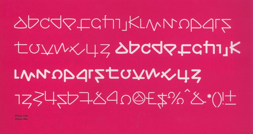
Of course, whether they want to or not, fonts are one of things that unconsciously show 'the spirit of the age'. It always astounds me that you can usually tell which decade a font was designed in, even though there was no attempt to do so. People often ask me why design another typeface? The answer: to express the sprit of the time, to speak in a particular tone of voice, to try and express the complex relationship between language and its expression in image, to produce a code for the generation that the person comes from. There are so many reasons. The naming of a font is also important. A font's name can give expression to a designer's contemporary concerns, be it with font design itself, with language or the wider world.
How would you characterise the concerns of your recent Virus-family fonts?
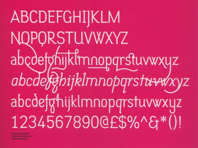
I think I am trying to make these fonts a little easier to use. Previously I always designed my fonts without giving much thought to whether people would want to use them or not. I preferred the fonts to be 'pure', and as a consequence they looked like my 'handwriting'. It did not leave much for interpretation. This can work well when the fonts are used for something extreme, but it doesn't work so well for more general usage. Therefore I made the latest fonts more usable, in a general sense. The last font I worked on, Melancholia, was our first text font. So too was our next font Priori. Actually Priori is the biggest type project we have done. It is a family of serif and sans-serif fonts that can be mixed together. Generally speaking though, I have three overall concerns when designing a font. I want to produce experimental fonts which are well drawn and are absolutely a product of this time.
How would you describe the state of contemporary font design; healthy or unhealthy?
I think it is not quite what it was 10 years ago. The scene exploded back then with lots of people having a go at font design. It was really healthy. I think people have now realised that it is actually quite a lot of work to produce a professional font, especially if it is to be used as text. I would say that it is still an exciting place to work in. There is still a lot to experiment with. The personal computer completely transformed the industry, changing font design from being an expensive time- consuming process to something cheaper and easier, something that offers a more dynamic response to the world around you. Maybe the chaotic growth of 90s font design has matured, but the potential to develop font design generally is still there.
In my view '90s print design truly reflected the fragmentary essence of post-modernism. Itv was layered, scattered, dissonant. Do you think all the recent crises (dot.bomb, the Battle of Seattle, 9/11, Afghanistan, AIDS in Africa) will in some way herald an era of introspection and austerity?
Yes and no. I think a lot of designers sensed how useless the design profession was after 9/11. For a long time designers had been far too inward looking. 9/11 signalled a chance for designers to reassess their value to society. I am, however, very cynical that anything will change. 9/11 has been used as an excuse for a lot of bad things - not just good. For instance, we can now see 'war on terrorism' is a completely subjective phrase. Austerity can also mean the squashing of good ideas, experimental projects or funds to art foundations. I think if designers start feeling a little more 'responsible', stop saying that the client's message has nothing to do with them, stop saying that they are just doing their work, then that would be a big leap forward for the design community.
You signed the First Things First Manifesto in 2000. What prompted you to sign the manifesto?
It was impossible not to sign it. It contained a message that I had always absolutely believed in. I did think quite seriously about what signing it would mean, particularly the implications for my own work. But then I think I have always thought in the same way as the message behind the manifesto.
Were you not concerned that there might have been some form of backlash against you as a signatory?
I wasn't at all concerned because, I knew for a fact that there would be some form of backlash. Sometimes I find the amount of infighting that goes on in the design industry really depressing, particularly since it has nothing to do with furthering the cause of good practice or work. After the manifesto was released, most of the criticism that appeared was pitched at the people who signed the manifesto and did not seriously discuss the issues - a very sad state of affairs. Personally I don't think worries about being criticised are a valid reason for not doing something. I often get criticised, and have consequently learnt to be thick-skinned. Designers should make the effort, stop kissing clients' asses, lead instead of follow.
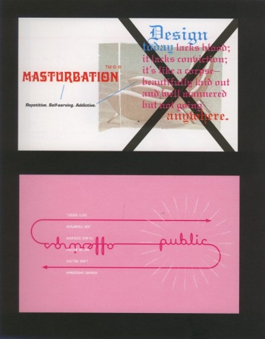
A manifesto is both a statement of intent as well as a starting point. A manifesto contains the meat that inspires other people. With the First Things First manifesto, I know that it had a very positive effect on people. Many people, for instance, wrote their own manifestos, and many colleges discussed it too. The manifesto put ethics back on to the agenda, the idea that design should try and make the world a better place rather than just concerning itself with money or being selfish. I think a lot of people however felt uncomfortable about what we were saying, which is why there was a lot shouting about the people who had signed it rather than it resulting in some form of self-examination.
One of the statements in the manifesto claims: "There are pursuits more worthy of our problem-solving skills. Unprecedented environmental, social and cultural crises demand our attention." How would you say your work has addressed some of these crises?
When I was younger I always thought I would leave design and go and do something that would directly help people, like working in hospital. Now that I am older I can see that it is all a bit more complicated than that. I think everything has value and if you are good at something it is best to stick to it and make the people you work with think about how they view their own field, both critically and ethically. On a basic 'studio' level though, I would say that around 30% of the work we do is free. It is a mix of charity and cultural work. We also have an ethical policy with regards to our clients.
Extending a bit on what you have just said, how do you think designers can incorporate their own conscience into design?
By checking on clients to see if they are acting responsibly; by not working on projects that one does not believe in; by actively doing work that is not about making money or being 'cool'; by not being self-satisfied and egotistical; by treating everybody one works with or encounters as an equal; by thinking long-term rather than short-term; by realising that as a human you often fail to live up to what you try to do - and that this is OK too.
Moving on to your collaborative projects, how did your association with Damien Hirst come about? [Jonathan designed Hirst's monograph I Want to Spend the Rest of My Life Everywhere, with Everyone, One to One, Always, Forever, Now (Booth-Clibborn) as well as Damien Hirst: Pictures from the Saatchi Gallery.]
We both worked for the same film company, he was directing an advert and I ended up doing the typography on it. A little later the publisher I worked with signed a deal to publish his book. Initially I turned down the offer to design it because I thought it would be a nightmare.
Damien Hirst has pop-star status in England and I didn't want to deal with all that sort of rubbish.
That said, and despite his 'difficult moments', I would have to say that Damien Hirst is one of the few artists that have treated me as an equal. He absolutely respected my part in the process, and was happy to go with certain things even if he didn't necessarily agree with them.
Damien Hirst has some very specific preoccupations, particularly medical. Did these prove challenging when designing for him?
No, I prefer that. I admire individuals who are specific, not vague; extreme, not lily-livered. As a designer I tried to understand what he was attempting to say, and tried to communicate that in the best way possible. I think all the books I have designed for him successfully achieve this. As it is we both have a fascination with things medical. For Damien Hirst, it is the modernist logical language and how it relates to the mystical act of dying, whereas for me it has to do with that universe of unfathomable codes and signs. Maybe my view of the medical world is a little more 'romantic' than his.
Looking at another slightly more recent collaboration, you have been involved with Kalle Lasn's Adbusters publication. Can you elaborate?
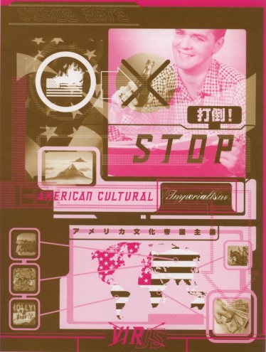
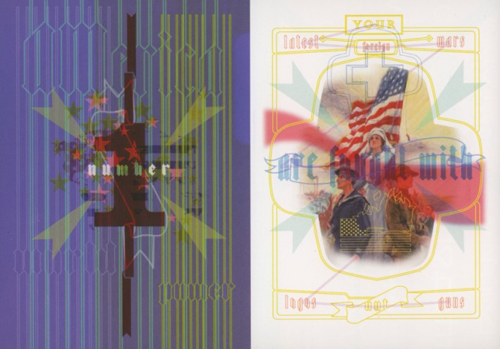
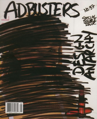
The collaboration came about after I met the Adbusters people at a talk in London. I was interested in their work but it wasn't until I had some kind of human contact with them that the relationship gained momentum. If they had been bitter, resentful 'ranters' I do not think I would have collaborated. But they weren't; they are gentle, charming, considerate human beings who want to make the world a better place. This helped inject a lot of enthusiasm into the collaboration. I have done various posters for them, even designed a complete issue. The Design Anarchy issue was about the First Things First manifesto and the whole subject of responsibility and subversion in design. I have also worked on an uncommercial for their Buy Nothing Day campaign.
A lot of people say: "I would love to work for Adbusters." But that is not really good enough, you have to suggest the project yourself, put your own energy into it.
Do something, don't expect them to call you.
The point of Adbusters is to encourage individuals to speak out and affect society.
How has living and working in London influenced your work?
I have never really spent a lot of time working elsewhere, but I think London is different for a number of reasons. Firstly you cannot talk about the Blair-era without mentioning 18 years of Conservative government. We are really living in the post-Thatcher period now. When the Conservative government was in power, many of us felt like we were fighting a 'cold war'. Margaret Thatcher was a woman that you either loved or hated. When the Conservatives were ousted it seemed completely liberating; Britain became confident once more. It felt like a modern society.
Looking at my position as a designer in London, one of the things that has spurred me on to be good at my work is the privilege of the middle and upper classes. Their position in London has nothing to do with talent or merit, and has more to do with class and parentage. There is still a strong class system here, which makes some of us here try much, much harder than those who live in other more pleasant, more equal European countries.
I am still fighting for a utopia.
That is why I find England's legacy of punk important. I still believe that graphics, like music and art, has the potential to change society's views. It is just up to designers to use that power.
Jonathan Barnbrook, born in Luton in 1966, is a graduate of St. Martins College of Art and Design and the Royal College of Art, and currently works out of Barnbrook Studio in London's sultry Soho district. His impressive resume extends back to the start of the 90s, and includes print collaborations with the artist Damien Hirst, Japan's retail chain Beams, as well as the Museum of Contemporary Art in Los Angeles. It is, however, in the field of typeface design that Jonathan Barnbrook first excelled. Aside from his famous Émigré fonts, Exocet (1991) and Mason (1992), he has recently also worked on more experimental typefaces in his own font foundry, Virus. Jonathan Barnbrook has been described as an intense character who doesn't work on anything he doesn't believe in. "He doesn't just talk the talk," Kalle Lasn has observed, "he walks the walk." Jonathan Barnbrook will be a guest speaker at the 6th International Design Indaba, February 26-28, 2003, Cape Town, South Africa.

