Featuring 60 individual artists from 60 African countries and territories, the project itself is a singularity: a broad, living e-catalogue of talent and triumph.
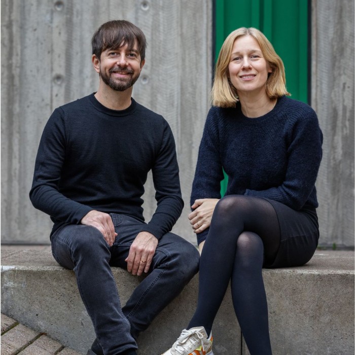
To help realise the project, Design Indaba collaborated with former Design Indaba conference speaker Noel Pretorius and his wife/creative partner Elin Sjöberg. Together, they created the design concept and user interface for the ‘Colours of Africa’ digital exhibition.
Read on for Noel’s insights on their art direction and the user interface design for ‘Colours of Africa’, and the unique approach to art, design and typography that underpins their work.
Give us a little background on your work in the fields of branding, typography and digital design.
I run my own type foundry called NM type, together with María Ramos, as well as working at the branding studio Identity Works. I really love the mix of being able to craft typefaces with NM type and of working in branding. I find that typography is one of the main assets of branding, and a custom typeface can really help give a brand strong recognition in all media channels. For the ‘Colours of Africa’ project, using the experimental font Movement felt like a perfect fit for the project, as the sharp, angular shapes of the typeface really complemented our digital kaleidoscope.
How did you come to be involved in ‘Colours of Africa’?
I am a former speaker at the Design Indaba conference, and [Design Indaba founder] Ravi Naidoo remembered that I am a multidisciplinary designer as well as a type designer. He had also seen an art project I curated and designed called ‘Them-and-Us’ together with Richard Hart. Design Indaba had already briefed and gathered most of the artworks for ‘Colours of Africa’, but they didn’t have a design concept for the exhibition. I asked if I could bring in my wife Elin, who is a digital strategist, so that is how we got on board.
What role did you and Elin play in this exhibition?
We created the design concept for the digital exhibition, based on a colour circle and the idea of a kaleidoscope, where each artist's contribution represents a facet of colour. We wanted the concept to give all artists an equal chance of being seen and to bring everything together as one – and the kaleidoscope was the perfect way to do this. We chose the circle as the shape to represent each hue in the ‘Colours of Africa’ palette, since the circle represents unity. The shape also represents the eye, and the idea of the artists helping you experience facets of Africa through their eyes, through their art.
How do you think these 60 artists have harnessed the power of colour to bring forth their unique African identities?
They have done this through their personal stories, offered in their own words and using honest reflections. Part of the beauty of this project is the diversity of viewpoints and art forms, which together help to express what Africa really is and stands for.
You speak, in a video clip on your website, about the joy of being a freelancer because you can take on projects that really mean something to you. Could you elaborate on this and mention a few projects in which your contribution has been truly heartfelt?
‘Them-and-Us’ was a very special freelance project for me. The art project brought together 20 African artists and 20 European artists to connect and explore the similarities and differences between their respective worldviews. The artists were paired – one from Europe and one from Africa. Each pairing selected a theme, such as ‘heal-and-hurt’, ‘give-and-take’, ‘reason-and-madness’, and then designed a double-sided poster, one side African, the other European. All proceeds raised from the publication were donated to Amnesty International to help in the much-needed global fight against intolerance.
Another meaningful project was creating the variable font Movement, where the art of dance was brought into type design. María Ramos and I worked together with talented South African dancer Andile Vellem: his movements inspired the design and were our reference when designing the letters. The type forms were adapted to a variable font format and the typeface was given away free at our Design Indaba talk. This allowed designers in the audience to try these variable fonts and the creative possibilities they offer.
Where do you generally draw your inspiration?
Art is a very important source of inspiration for me, and I love to collaborate with people in different fields of art, be it creating a typeface inspired by [American sculptor] Alexander Calder, or collaborating with a photographer or illustrator for a new visual identity. The collaboration process gives me energy and brings new perspectives to my work.
The worldwide launch of ‘Colours of Africa’ in November 2022 allows viewers to discover stories of Africa as told by the African creative community. Explore the extraordinary quality of the continent’s contemporary output as it relates to poetry, music, photography, fine art and more, here: https://inda.ba/3hGiUh1.
Credits: Noel Pretorius / My Matson


