From the Series
Fuelled by Oreos, coffee and talent – New York and San Francisco-based brand consultancy Collins works with some prestigious brands. From Airbnb to Coca Cola, the Guggenheim and Spotify, the agency pushes to revitalise legendary brands with effective communication and campaigns.
In this extract from an interview with The Brand Identity, co-founder Brian Collins shares some insight into the way the agency operates, what he thinks of the New York creative scene and how customer experiences are converging in this digital age.
What are the day-to-day must haves in the Collins studio?
Coffee... wine... Oreos.
Not necessarily in that order.
Truthfully, it's the people here at Collins that are the must have. The talent, curiosity, fearlessness, and experiences of our people are what continue to question and push our work forward. Here's the key: We never hire for that HR bromide called 'cultural fit'. Ever. We want you to bring - and to be - something new. Something we don't have. So we hire for cultural contribution. For what is different. Or, as Mr. Spock would say, we seek "infinite diversity in infinite combinations".
Also a sketch session in our library. There are over two thousand books on photography, business, fashion, Chinese fairy tales, Joseph Campbell, ecology, Jane Jacobs, poetry, Bel Hooks, Coco Chanel, sex, Ken Adam, pancakes, Pablo Neruda, philosophy, Corita Kent, every issue of Art & Architecture ever published, Noam Chomsky and Wonder Woman comic books. Puts the internet to shame.
How has the ‘Convergence Era’, as you call it, affected branding and how you approach it?
The future we see is one where all points converge: brand, technology, physical, social, environmental, product, digital, and biological. But the creative industries' approach to brand building remains splintered: a package design firm, an identity agency, a retail architecture office, an app shop, or an ad agency.
Mobile systems exploded from nothing to become the crucial part of every company's customer experience strategy overnight. Add now add 3D printing, virtual reality and robotics to the mix, too. Full-on. It's all converging and recombining into something we've never seen before. And that's beyond exciting.
We've entered an era where a company's success no longer hinges as it once did on crafting one perfectly controlled 'story' defined by one dominant channel. Instead, people now seek coherent information and responsive experiences that enrich their lives - everywhere. Is Uber transportation or a brilliant interface? Is Oculus Rift branded content, gaming, technology or an environment?
It's all of it. You can't pull it apart.
Here's the business implication: Nobody is competing with each other anymore. We're all in competition with the future.
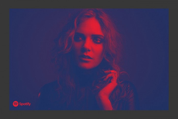
Can you give some insight into the typographic treatment used for the Spotify visual language?
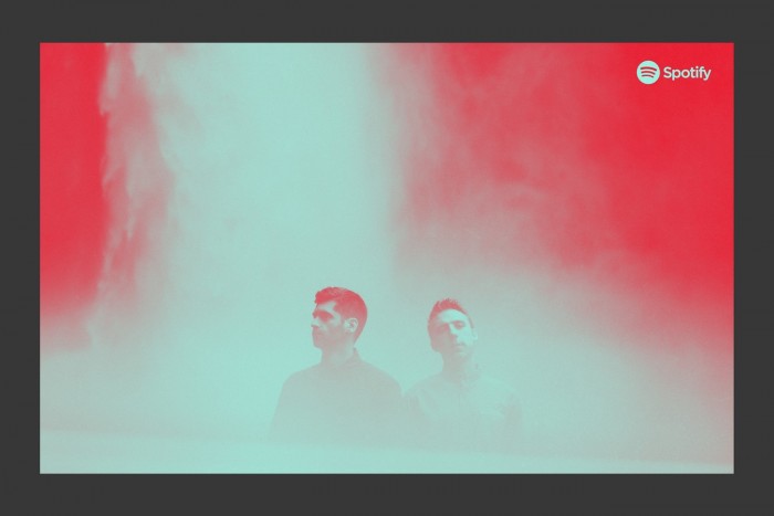
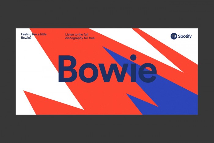
Along with creating the brand design platform and language, photography and illustration styles - we wanted to unify the brand through a single, tailored typeface.
So we worked closely with the font foundry Lineto to create customised versions of their superb fonts in 'Circular'. We wanted to ensure our typography had a clean, muscular voice to support this intense, new brand expression. Through the typography we unified the Spotify experience across mobile, web, environments and advertising.
Big ups to Benjamin Crick, Christian Widlic, Gabe Benzur, Seth Mrozcka and my Co-Founder Leland Maschmeyer for this work.
What is your dream branding project?
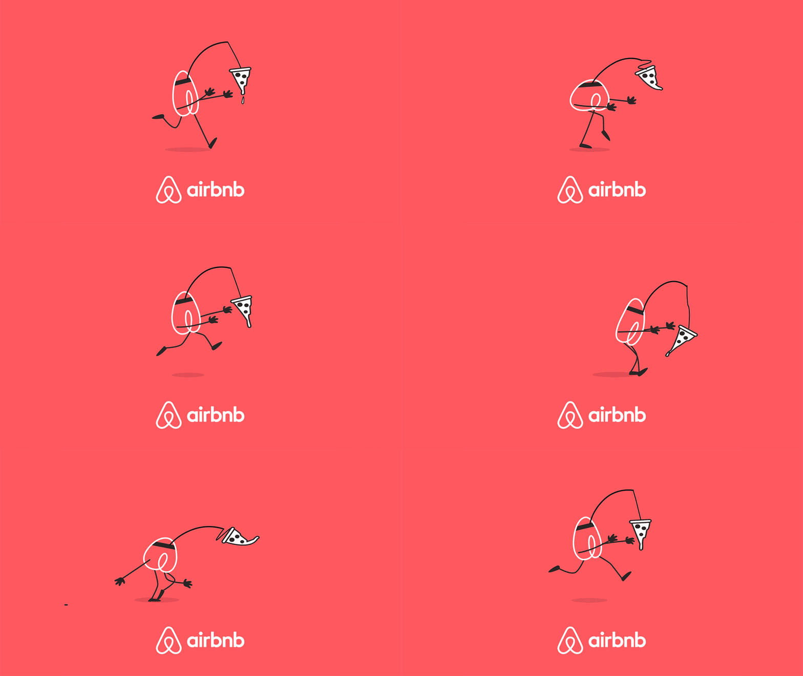
What we're doing right now. Designing responsive environments at retail. Building new products. Revitalising a legendary brand. Working with Airbnb. Chubb. Coca-Cola. Everlane. Facebook. Instagram. The Guggenheim. And Target.
Also The Muppets. But that's a story for another day. Miss Piggy is picky about her press.
I guess the best definition of what excites us most comes from a thought from Edgar Degas. 'Art is not what you see, but what you make others see'. Every project we're doing seeks to embody that ideal: what can we better enable people to understand or do?
How do you feel about the current design scene in New York?
I lived as an art student here in the very early - and outrageous - 1980s. I lived in Union Square. The words urban decay, gritty and deadly don’t even come close. One morning my roommates and I walked out of our lobby to get to school and stumbled across a body spread over the 14th Street sidewalk. The guy had been shot. Recently.
Yet the city was at the very height of its art and music scene. The Mudd Club, The Ritz, CBGBs and punk on one side. Paradise Garage, Studio 54, and the collapse of disco on the other. You could nab Keith Haring graffiti as he was painting over ads in the subway. Andy Warhol walked around Union Square passing out fresh copies of Interview. This was pre-AIDS. It was one endless, giant, colourful, glamorous and dangerous party.
So that New York informs the way I see this New York. And this New York is more sanitised. But that insane energy is still here. And everywhere. Ambition. Talent. Resilience. Grit. All propelled by hard work. We're in an amazing neighborhood in Greenwich Village. And the new Whitney Museum just opened down the street. So, artistically, it's as exciting as ever. And for design, I think we're entering a golden era.
Collins really lives in two cities now. New York and San Francisco. And in both cities we work really hard to create the kind of place we didn't have as kids. And make the kind of community where we can all learn and grow and push ourselves together to do the best work of our lives.
And, you know, eat Oreos.

