From the Series
First Published in
Wily illustrator Christoph Niemann claims to have only one trick up his sleeve. The New-York based humorist calls it: "sitting in front of a white piece of paper and thinking, staring and drawing until my head hurts."
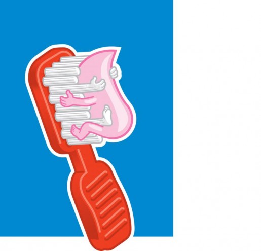
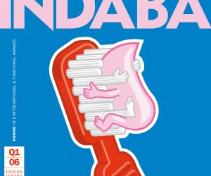
The end results, often excoriating political commentary, have in turn caused others, in places like the White House for instance, quite a few headaches. The American president George Bush is a much-loved target in Niemann's collections. He also likes to get his teeth into anthropomorphised toothbrushes that engage in human acts.
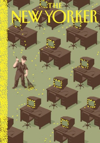
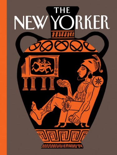
This odd take on things has garnered numerous awards from American Illustration, the American Institute of Graphic Arts (AIGA), and the Society of Publication Designers (SPD). Magazines like Atlantic Monthly, The New York Times Magazine and The New Yorker want his filled-up pieces of white paper for their covers.
Here, he let us get our head around his work:
A picture paints a thousand words, right?
Obviously I believe strongly in the power of illustrations, and in the right circumstances a picture can really communicate a very complex subject better than words could. But it is just as true that sometimes a couple of words can express an issue much more powerfully than 1 000 images possibly could.
You've done several covers for publications like The New Yorker and The New York Times Magazine. How do you meet the challenge of putting the right message across?
The way I work usually means that I try to boil down a complex issue to its core message, and then try to come up with a visual equivalent for that message.
Trying to find an unusual metaphor or adding an interesting twist comes more easily after having done it for a couple of years.
There's a lot of wit that comes through in your work. In the world outside of work, do your friends and family think of you as "the funny man"? Are you a stand-up, too, or just a sit-down drawing humorous illustrations?
I am certainly a fan of humour, but I don't think the humour in my work relates too much to my "personal" humour. Humour in graphic design is all about what the reader experiences, not about how hard the designer laughs while coming up with the idea.
I consider my illustrations the visual equivalent of headlines. A headline has to somehow contain the whole story without getting lost in details. And humour is a terrific tool (even if it is a serious story) to make a reader interested and curious.
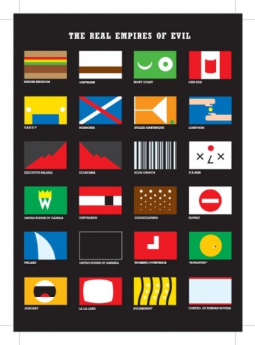
Tell us about your book 100% Evil which is co-authored by Nicholas Blechman, and introduced by Design Indaba alumnus Chip Kidd?
Nicholas and I started making these collaborative illustrated books in 1998. The first issues were on maps, architecture and love. After 9/11 and in the run-up to the Iraq war, "evil" was this omnipresent buzzword that was thrown around so mindlessly in political discussions. This angle is perfectly captured in Chip's introduction.
We didn't want to do yet another political anti-Bush piece (we did plenty of that with our other works), but in this case just treat the notion of evil as the starting point for what I like to call visual poetry.
In 2000 you did another book with Blechman, Fresh Dialogue One: New Voices in Graphic Design. How did your working relationship start? Do you have any other titles in the pipeline?
That book is actually from Nicholas, Paul Sahre and me.
We were invited by Paula Scher to present our work as part of a lecture series called "Fresh Dialogue" which had been showcasing the works of young designers for years.
We all knew each other and had collaborated on various projects. So instead of each of us just showing a bunch of slides, we tried to really present a sort of conversation amongst three people who all come from different design backgrounds but find plenty of ways to mix and share their ideas and approaches with each other.
An editor from Princeton Architectural Press saw the talk and decided to publish it as a book.
As far as future titles go, Nicholas and I are avidly discussing the next topic of the 100% series.
What of your work ethics? In previous interviews you've mentioned that you'd like to maintain your integrity as much as possible, and that even though it is probably impossible to achieve, you should still try to do so. You don't wish to be involved in companies with bad business policies, for example. Can you explain further? What jobs have you turned down for such reasons?
I just got a request today from a religious group that wanted to re-use a logo I had done for a magazine. I went to their website and despite the fact that they are doing a lot of charity work, I found plenty of statements that disturbed me ("...and the non-believers will burn in the eternal flames of Satan's hell.") so I turned them down.
Unfortunately it is not always that easy. If I do ads for a company that produces little stuffed toys, I have no way of knowing if the executives of that company use their profits to invest in some evil small-weapons factory.
So my attitude is to try my best to live up to my morals, without having illusions about being 100% successful at it.
You were born in Germany in 1970 and studied at the Stuttgart Academy of Fine Arts, before moving to the Big Apple in 1997. What kind of insights does being "a German man in New York" give you? Do you feel that the cultural distance makes it easier for you to observe and comment on American society?
What I always found surprising is how small the cultural differences are. From pop culture to music to TV to movies, I was always quite familiar with American culture. Since a lot of my visual puns come from this area, I was glad to find out that most of my ideas that I had intended for my German audience worked almost entirely here in the US. I find it much more difficult to work for British or French clients, who are geographically so much closer to where I am from, but seem to have a much more different visual culture.
Politically minded illustrators are usually unafraid to debunk anything from myths to mathematicians. Yet do you have any personal sacred cows?
I actually love mathematics and wouldn't dare debunk anything in that department.
The one thing I try to stay away from is caricatures. Even though it is really difficult to do and I admire artists who have the skill to draw striking likenesses, I have grown more and more skeptical of making fun of people's appearances. It is people's opinions and decisions that I think should be discussed (if needs be via a satirical and provocative drawing).
Would you consider yourself to be a satirist?
Satire is a terrific tool in our trade, but I try as hard as I can to be humanist.
Your work appears to develop in series. Is this because you tend to explore a particular strand of thought together with a particular illustrative style, and more than one illustration is needed before you've exercised this angle and can feel satisfied?
The appropriate style for a certain idea is very important to me. But the sequential element (which is well established in the history of illustration from Doré to Steinberg to Ungerer) is more closely connected to something that can be found in slapstick movies. The Monty Pythons are the masters of developing a certain scheme and then finding endless variations that slowly but surely turn an otherwise absurd scene into wonderful narratives.
Your toothbrush series in particular evinces what some would call a rather deviant sense of humour. Are you deliberately trying to provoke a conservative thinker, or is it just plain funny to imagine and thereby cause others to imagine, the paste having sex with the brush?
Again, as in movies, the most powerful emotions don't happen in front of, but inside the head of, the viewer. One of the ways I try to accomplish that is by taking an image that looks as benign as possible on the outside, but then add some clues so it starts twisting around once it has entered the viewer's mind.
Thanks to a lack of forward thinking from our national broadcaster, South African audiences are forced to flip through local TV channels glutted with awful American sitcoms. Please tell us you don't find this, or the shows, funny either?
I would have to lie if I said that I never watched (and laughed about) an American sitcom. I am no expert, but I guess some (Seinfeld, The Simpsons) are actually fairly intelligent and solidly crafted. What drives me crazy is not so much the sitcoms themselves, but how they are intertwined with the commercials in between (two-and-a-half jokes, then a moment that is supposed to tickle your curiosity, and then - BLAM - five minutes of car and make-up commercials, then back to the next two-and-a-half jokes).
The way we are supposed to consume TV is inevitably linked to how we are supposed to consume everything else, and this vicious, uniform education is what I really find despicable. But then again, I work for consumer magazines that are owned by the same conglomerates that give us all that magnificent television, so whether I like it or not, I am part of the same machinery.

