
For their “Reborn in India” issue Wallpaper* magazine wanted a special headline typeface that would suit the theme.
Wallpaper* approached Royal College of Art graduate Geetika Alok for the job. Her final project at the RCA, “Englishes”, was a typographic work exploing the status of English in India, while drawing inspiration from Indian decorative arts.
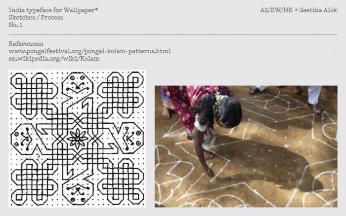
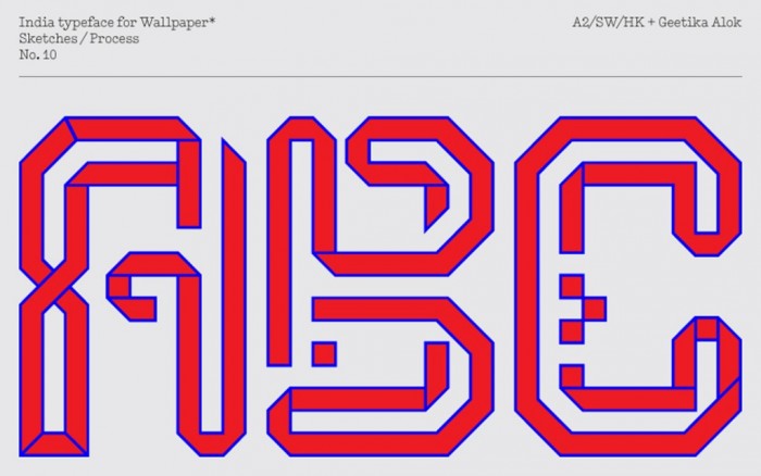
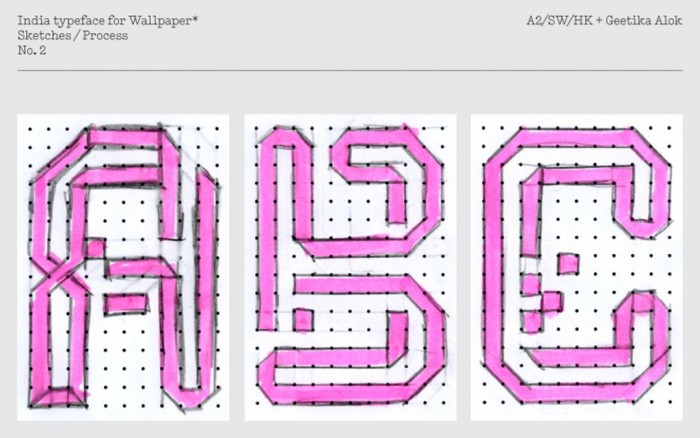
Alok worked with her former RCA tutor Henrik Kubel on the design of the typeface for Wallpaper* Kubel told the magazine that the basic structure of their India typeface is the dot grid used in traditional Indian floor drawings and pattern art, known as Kolam.
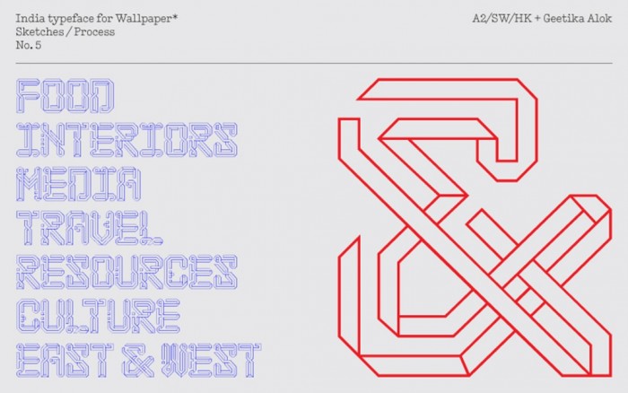
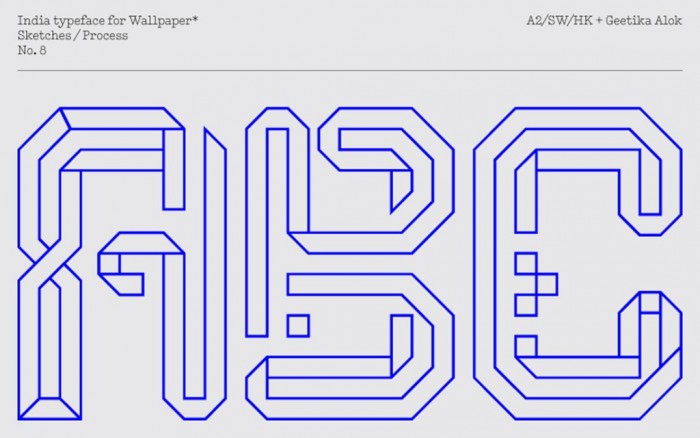
For the duo the process of designing the typeface started with researching Indian culture, in particular patterns and ornaments. With a brief to create a contemporary typeface that references the rich visual culture of India, Alok and Kubel produced eight different directions for the typeface, which were presented to Wallpaper* as a selection of options.
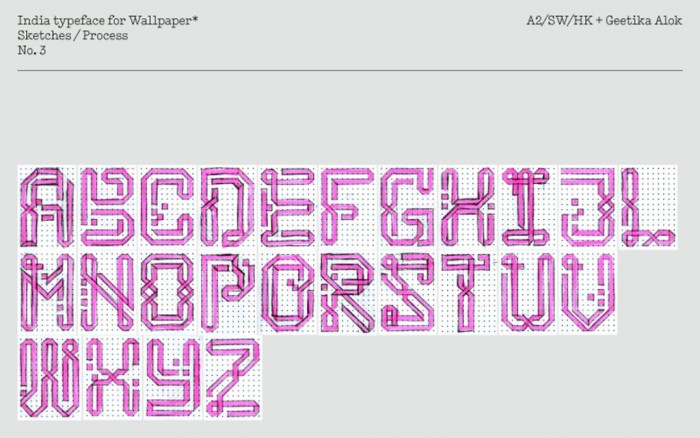
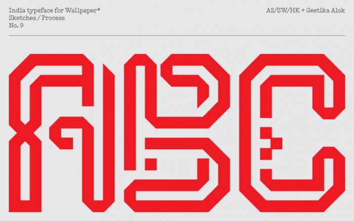
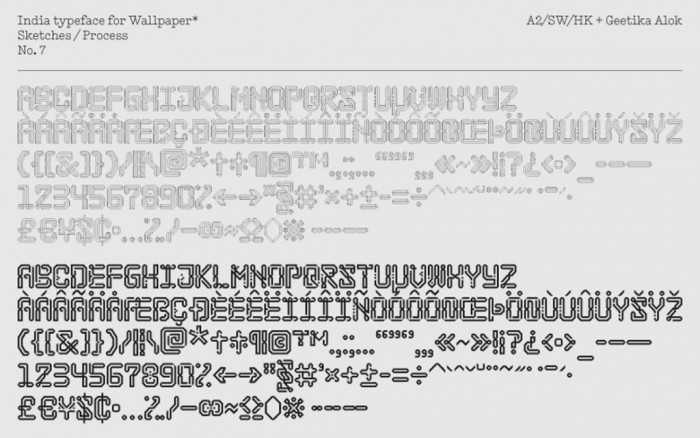
The individual letters of the India typeface were created on a 11 x 16 dot grid. All the letters were drawn by hand before they were scanned and traced in Illustrator. This allowed the typographers to do trial setting before every glyph was drawn from scratch again. Using FontLab, Alok and Kubel made two versions of the typeface: an outline and a solid typeface. Both versions can be used separately, or together to create a filled third design.


