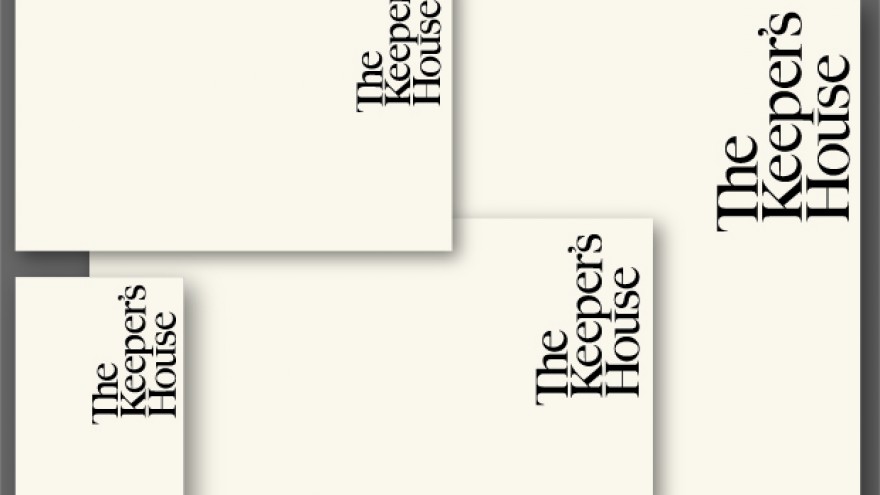
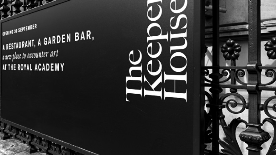
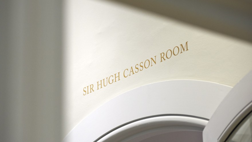
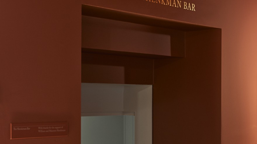
The Keeper’s House is a grand 19th century townhouse that was once used as a residence for the Royal Academy’s keeper. Harry Pearce and his team designed the identity for the Royal Academy in 2012. For the Keeper’s House logotype now, they redrew a version of Caslon – one of the core fonts of that original identity.
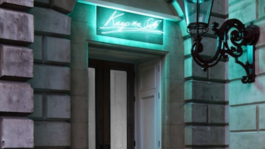
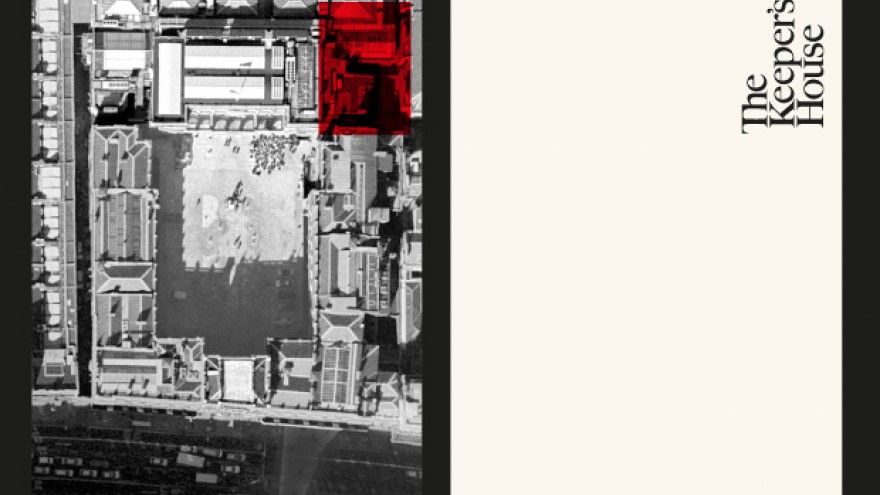
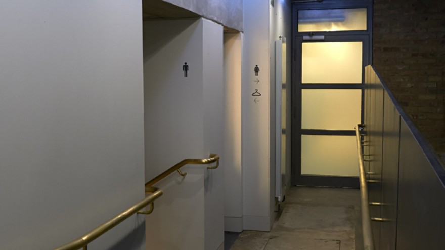
This time around the serifs and inner curves have been accentuated to make the logo more elegant, but also to retain its association with the Royal Academy mark. The logotype is placed vertically in the top right-hand corner to mimic the position of the house in the Annenberg Courtyard. Caslon and Akzidenz Grotesk feature in all printed material and wayfinding. Tracy Emin created a unique neon sculpture to sit above the Keeper’s House front door.
“Harry’s identity has given us just what we were looking for. It’s got a quirky, domestic twist – reflecting the building’s history and the Keeper’s House vision to be a home for artists and art lovers – but vitally, it has great affinity with the main RA brand,” said Will Dallimore, director of communications at the Royal Academy.
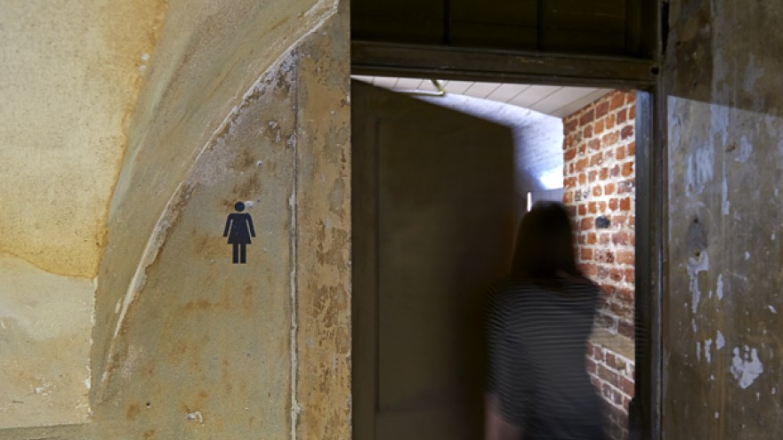
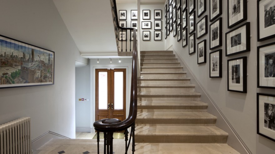
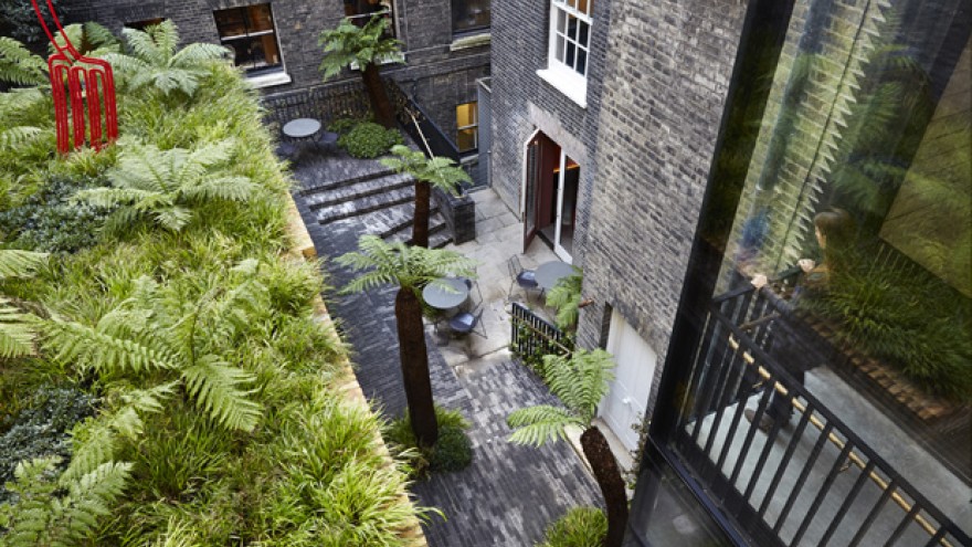
The building has undergone a restoration retaining many of its original details, including vaulted wine cellars, old ceiling beams and hearths dating back to the 1660s. It now includes a new restaurant, bar, lounge and secret garden.

